A collection of utility plugins and functions when using media queries in Vue.
Use Media Query
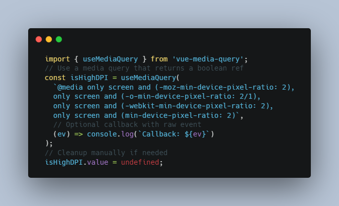
Import and use the useMediaQuery function to evaluate a raw media query and return a boolean ref that will update with the media query.
If you wish to receive a callback of the raw media query event, provide the callback function as the second argument.
Event cleanup happens automatically when the component is unmounted, but can be manually triggered by setting the ref value to undefined.
<template>
  <div>
    <h3 v-if="isHighDPI">This must look really sharp to you!</h3>
    <h3 v-else>Can you even read this?</h3>
  </div>
</template>
<script setup>
  import { useMediaQuery } from 'vue-media-query';

  // Use a media query that returns a boolean ref
  const isHighDPI = useMediaQuery(
    `@media only screen and (-moz-min-device-pixel-ratio: 2),
    only screen and (-o-min-device-pixel-ratio: 2/1),
    only screen and (-webkit-min-device-pixel-ratio: 2),
    only screen and (min-device-pixel-ratio: 2)`,
    // Optional callback with raw event
    (ev) => console.log(`Callback: ${ev}`)
  );

  // Cleanup manually if needed
  isHighDPI.value = undefined;
</script>
Use Screens
Use the useScreens function to easily create computed refs derived from custom screen size keys.
- Import and use the
useScreensfunction within parent components that will provide the$screensfunction to nested components. Pass a config object that maps custom screen size keys to media query values.
<!--Parent.vue-->
<script setup>
  import { useScreens } from 'vue-media-query';

  useScreens({
    sm: '640px', // (min-width: 640px)
    md: '768px', // (min-width: 768px)
    lg: '1024px', // (min-width: 1024px)
    xl: '1280px', // (min-width: 1280px)
  });
</script>
- Inject
$screensfunction in nested components. Call the function with a mapping of screen size keys (with optional default value) to any values you wish.
<!-- MyComponent.vue -->
<script setup>
  import { inject } from 'vue';

  const screens = inject('$screens');

  // Create computed prop that will update any time the specified key boundaries have been crossed
  const columnCount = screens({
    default: 1,
    md: 2,
    xl: 3,
  });
</script>
Queries are evaluated using a mobile-first approach, so columnCount.value will evaluate to 1 (the default) until the screen size crosses the md boundary, at which point it will evaluate to 2 until it crosses the xl boundary, at which point it will evaluate to 3.
Screens Plugin
The screens plugin is exactly like the useMethod, but allows for a screen configuration to be used application-wide.
- Import the plugin.
// main.js
import { screens } from 'vue-media-query';

// Use plugin with optional config
app.use(screens, {
  sm: '640px', // (min-width: 640px)
  md: '768px', // (min-width: 768px)
  lg: '1024px', // (min-width: 1024px)
  xl: '1280px', // (min-width: 1280px)
});
- Repeat step 2 from the Use Screens method above.


