vue-c2c
Transforming Vue components to composable functions (Draw UI with components, Access/Control with composables)


When should I use this?
In certain use cases (e.g. confirm, dialog, toast), composable functions can provide greater flexibility and ease of use than components.
Install
npm i vue-c2c
Usage
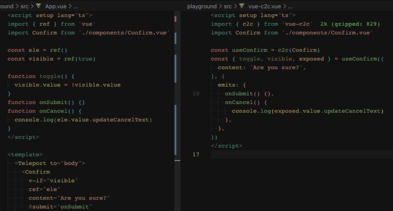
c2c
Options
interface VueC2COptions {
  /**
   * Display style of the component.
   * @default 'v-if'
   */
  display?: 'v-if' | 'v-show'
  /**
   * Visible of the component.
   * @default false
   */
  visible?: boolean
  /**
   * Return a placeholder component that allows specifying the insertion position.
   * @default false
   */
  withPlaceholder?: T
  /**
   * Function that returns an HTMLElement where the component should be appended to.
   * Only applies if `withPlaceholder` option is false.
   * @default ()=> document.body
   */
  appendTo?: () => HTMLElement
}
<script setup>
  import { c2c } from 'vue-c2c'
  import Dialog from './Dialog.vue'

  const useDialog = c2c(Dialog, VueC2COptions)

  const { visible, show, hide, toggle, exposed } = useDialog(props, {
    emits: {
      onOk: () => {},
      onCancel: () => {},
    }
  })
</script>
Example
withPlaceholder Option
withPlaceholder option provides two additional features:
-
Element placeholder:
The element placeholder functionality allows us to specify the location of created elements in a more flexible manner.
-
Friendly SSR support:
If you’re working on an SSR project (e.g. Nuxt), use
withPlaceholderoption for better SSR support.
<script setup>
  import { c2c } from 'vue-c2c'
  import Dialog from './Dialog.vue'

  const useDialog = c2c(Dialog, {
    withPlaceholder: true,
  })

  const { Placeholder, visible, show, hide, toggle, exposed } = useDialog(props, {
    emits: {
      onOk: () => {},
      onCancel: () => {},
    }
  })
</script>

<template>
  <Placeholder>
    Hello World
  </Placeholder>
</template>
Example
License
MIT License © 2023