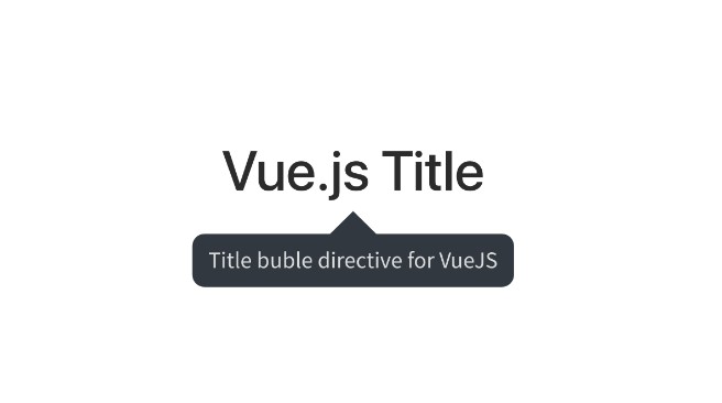
v-tooltip
Vue 3 tooltip custom directive.
Installation
Paste tooltip.js in your src folder, I personally create folder directives inside for the sake of clarity. Next step is to paste tooltip.css inside your assets folder.
When you have all the files, open your main.js file (or whatever it is called, the one where you mount your app) and import those files. Then use app.directive to globally add v-tooltip custom directive. It should look similar to that:
import { createApp } from "vue";
import App from "./App.vue";
import tooltip from "./directives/tooltip.js";
import "@/assets/tooltip.css";

const app = createApp(App);
// app.directive's first argument is the directive's name you will use
// it can be whatever you wish
app.directive("tooltip", tooltip);
app.mount("#app");
And that's it! Now you can use it everywhere (there are some limitations though, f.e. it doesn't work for <select> element, you have add v-tooltip to its wrapper).
Usage
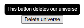
Using v-tooltip is really simple. Just like any other directive you add it to the element and provide some data. The easiest example look like this:
<template>
    <button v-tooltip="'This button deletes our universe'">
        Delete universe
    </button>
</template>
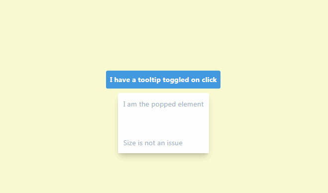
You just provide a string to the v-tooltip and it does its magic to create your own reactive tooltip. On hover it will look like that:
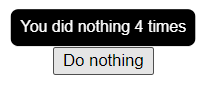
String notation
V-tooltip accepts both strings as well as objects. If you don't need any local customization, strings are the way to go. V-tooltip updates automatically, so you can have live changing tooltip.
<template>
<button
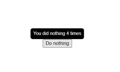
v-tooltip="`You did nothing ${count} times`"
@click="increaseCount"
>
Do nothing
</button>
</template>
<script>
export default {
data() {
return {
count: 0
};
},
methods: {
increaseCount() {
this.count++;
}
}
}
</script>
Result after clicking 4 times:
Object notation
Object notation gives many more possibilities. If you want to have tooltips which differ from each other, this can be easily done (you would probably use computed property to declutter template):
<template>
    <button
        v-tooltip="{
                    text: 'Lorem ipsum dolor',
                    theme: {
                        color: '#000000',
                        border: '1px solid red',
                        'background-color': 'pink',
                        'font-size': '2rem',
                    },
                }"
    >
        Button with fancy/ugly tooltip
    </button>
</template>
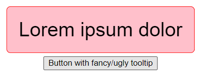
Worth noting: text property is optional, so you can do some tricky stuff, like adding only v-tooltip theme to some <div> and every tooltip inside that <div> will inherit that theme instead of the default one.
Customizing tooltips globally
It's more likely that you want to have all tooltips look the same, but different than the default. You have two options:
- edit
tooltip.cssfile - use object notations with
globalproperty
Option 1
At the top of tooltip.css there are a bunch of CSS variables which define all of the customizable properties of v-tooltip. Just change them and that will work globally as a default.
Option 2
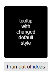
You can also don't touch the tooltip.css and do the same thing using v-tooltip with property global: true:
<template>
    <div
        v-tooltip="{
                    global: true,
                    theme: {
                        position: 'bottom',
                        width: 'fit-content',
                        padding: '2rem',
                    },
                }"
    >
        <button v-tooltip="'tooltip with changed default style'">
            I run out of ideas
        </button>
    </div>
</template>
This will affect every tooltip in the app, because it changes the CSS variables in the :root. You can place it wherever you want, I suggest adding it to the top element in the app, using it as semi-"layout" component.
API reference
v-tooltip
- Expects:
string | Object - Options (all of them are non-mandatory):
- text - text inside created tooltip
- theme - takes care of styling tooltips of the element and its children. Accepted properties:
- position -
top (default), bottom, left, right: placement of the tooltip relative to the element its called on - width - default
max-content - background-color - default
#000000 - color - default
#ffffff - border-radius - default
0.4rem - padding - default
0.6em - font-size - default
0.8rem - border - default
none - transition-duration - default
0.25s - transition-delay - default
0.3s - transition-timing-function - default
ease
- position -
- global - when added, tooltip won't be shown on this element. Instead it modifies CSS variables in the
:root, therefore changing theme for all of the tooltips on the page