Vue-Responsive
Is a directive to use responsive breakpoints on html elements. Because sometimes it's nice to have a chance to let the view do resolution specific things.
Dependencies: Only Vue.js 2.0
Browsers tested: Chrome, Firefox and IE11+
Planned:
Mixin to trigger methods on breakpoint change
Add and remove classes instead of changing only the style
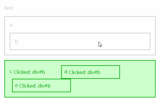
Live Demo
http://bamberger.rocks/Vue-Responsive/Demo.html
Features
This directive adds responsive Feautures to single HTML-Elements without CSS or @Media.
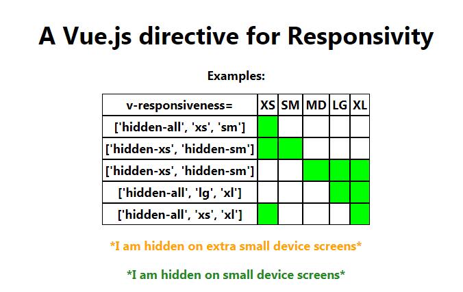
The default Responsive breaks follow Bootstrap 4 Responsive Utils.
The Bootstrap 3 breakpoints are includes as well.
Usage
With npm and ES6/babel please use the common module:
npm install vue-responsive -save
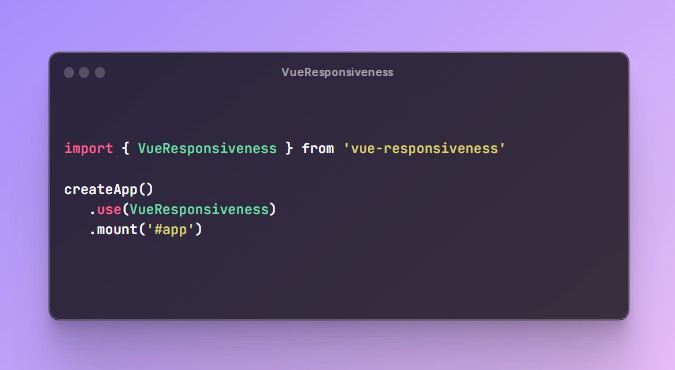
import vueResponsive from 'vue-responsive/dist/Vue_Responsive.common'
In the browser just include the script and use the directive on a Html-Element inside a Vue Element
<script src="Vue-Responsive.js"></script>
Advanced: If you do not want the directive to be globally available just add the attribute notGlobal with a not empty value in the script tag and define it the components with:
<script src="Vue-Responsive.min.js" notGlobal="true" ></script>
...
direcitves:{
	responsiveness: v_responsiveness
}
Module Systems: The commonJs file has to be included manually in every component or set golbally with Vue.directive('responsiveness', Vue_Responsive);
For Bootstrap 4 breakpoints
At default every resolution is visible, the hidden-all tag changes this to everything hidden (display:none). These tags are valid hidden-all, xs, sm, md, lg, xl, hidden-xs,...,hidden-xl.
<h1 v-responsiveness="'hidden-xs'">Big Title</h1>
<div v-responsiveness="['hidden-all','md','lg']">Only visible in Middle and large Size View</div>
<div v-responsiveness="['hidden-lg']">Only hidden at lg</div>

<h1 v-responsiveness="middleSize">Jumbotron</h1>
...	//in the vue object
data:{
	middleSize:['hidden-all','lg','xl']
}
For Bootstrap 3 breakpoints
Just add :bs3 after the directive to use bootstrap 3 breakpoints:
<p v-responsiveness:bs3="['hidden-xs']">As you can see on the big picture below.<br /><img ... /></p>
In this defintion the xl breakpoint doesn't exist.
For self defined breakpoints
First you have to declar your own breakpoints in the component/root wich wraps the html-elements with the directive. Every definition must start with responsiveMarks$$ and a following name. So you can easily create breakpoints to differentiate between desktop and smartphones for instance, as you can see in the demo.html:
... //in the vue object
data:{
        responsiveMarks$$twoMarks:   //setting custom responsive breakpoints with the name "twoMarks"
        { smartphone: { show: true, min: -1, max: 767 }, desktop: { show: true, min: 768, max: Infinity } }
}

<p v-responsiveness:twoMarks="'hidden-desktop'">Visible on smartphone<br /><img src="http://lorempixel.com/360/240/animals" /></p>
You can declar as much own definitions as you wish. Every defintion should have min:-1 for its smalles breakpoint and max:Infinity for its biggest.