vue-bulma-accordion
A simple, easily configurable accordion or collapsible for Vue, styled with Bulma.
Changes in 0.3.0:
Responsiveness and animation
- Added interval based checking to react to height changes of the accordion body (usually caused by adding or removing list items inside the component)
Fixes
- the dropdown option now correctly toggles multiple open items
Installation
npm install --save vue-bulma-accordion
Import
Single File Component:
import { BulmaAccordion, BulmaAccordionItem } from 'vue-bulma-accordion'

export default {
    name: 'cool-component',
    data () {
        return {
        }
    },
    components: {
        BulmaAccordion,
        BulmaAccordionItem,
    },
}
Browser
<link rel="stylesheet" href="vue-bulma-accordion/dist/vue-bulma-accordion.css"/>

<script src="vue.js"></script>
<script src="vue-bulma-accordion/dist/vue-bulma-accordion.browser.js"></script>
The plugin should be auto-installed. If not, you can install it manually with the instructions below.
Install all the components:
Vue.use(VueBulmaAccordion)
Use specific components:
Vue.component('bulma-accordion', VueBulmaAccordion.BulmaAccordion)
Vue.component('bulma-accordion-item', VueBulmaAccordion.BulmaAccordionItem)
Usage
Put a <BulmaAccordion> item on your page. There are a few options for the accordion, though they have sensible defaults if you dont want to change anything:
-
dropdown
- Boolean
- If
true, allows any number of items to be expanded simultaneously, rather than only 1 at a time
-
icon
- String
- The icon on the right hand side of the title bar
- There are 3 options
'caret''plus-minus''custom'- with this selected, you can provide your own icon in a slot, inside each accordion item. Either provide one icon in the'icon'slot, or a separate icon for when that accordion item is open or closed, in the'icon-open'and'icon-closed'slots
-
caretAnimation
- Object
- duration: String - CSS valid duration, like
'450ms' - timerFunc: String - CSS valid timer function, like
'ease' - none: Boolean - set to false to disable animation
- duration: String - CSS valid duration, like
- If you select the 'caret' icon, this tunes the animation
- 'none' - the default. The arrow simply switches instantly
- 'spin' - the arrow rotates and expands slightly
- Object
-
slide
- Object
- duration: String - CSS valid duration, like
'700ms' - timerFunc: String - CSS valid timer function, like
'ease'
- duration: String - CSS valid duration, like
- Allows configuration of the slide animation for each accordion item
- Object
Fill the <BulmaAccordion> with as many <BulmaAccordionItem> components as you need. Each of the <BulmaAccordionItem> components has 3 slots, if you're not using a custom icon:
title- I've found<h4 class="title is-4 has-text-weight-normal" slot="title">The Title</h4>to look quite nicecontentfooter
There are a further 3 slots for custom icons:
icon- when you just want 1 icon, DON'T USE WITHicon-openandicon-closedicon-open- the icon shown when the<BulmaAccordionItem>is openicon-closed- the icon shown when the<BulmaAccordionItem>is closed
Examples
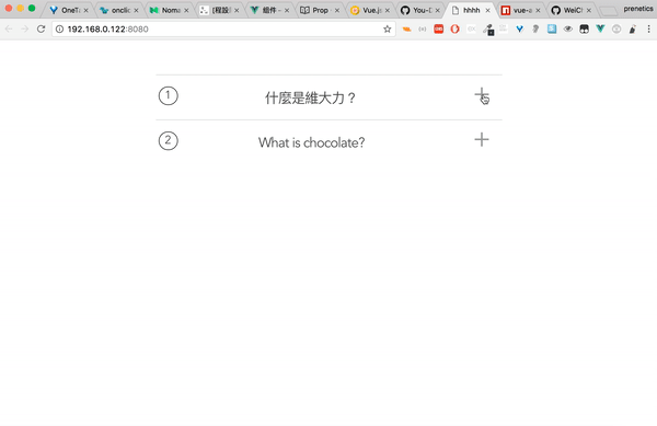
Using built in icons
<BulmaAccordion
:dropdown="true"
:icon="'caret'"
:caretAnimation="{
    duration: '.6s',
    timerFunc: 'ease-in-out',
}"
:slide="{
    duration: '.9s',
    timerFunc: 'ease',
}"
> <!-- The wrapper component for all the items -->
    <BulmaAccordionItem>
        <h4 slot="title">Just a title</h4>
    </BulmaAccordionItem> <!-- add as many of these items as you need - fill them with content via the slots -->
    <BulmaAccordionItem>
        <h4 slot="title">A title with content</h4>
        <p slot="content">Lorem ipsum dolor sit amet consectetur adipisicing elit. Natus eos illo expedita asperiores rem iure aliquid dolore, pariatur dignissimos, minima inventore? Minima voluptatum nulla, error omnis laboriosam voluptatibus rem aperiam.</p>
    </BulmaAccordionItem>
    <BulmaAccordionItem>
        <h4 slot="title">All of it</h4>
        <p slot="content">boo</p>
        <button class="button is-primary" slot="footer">Click Me!</button>
    </BulmaAccordionItem>
</BulmaAccordion>
Using custom icons
The icons used here are from https://material.io/icons/
<BulmaAccordion
:dropdown="false"
:icon="'custom'"
> <!-- The wrapper component for all the items -->
    <BulmaAccordionItem>
        <p class="title is-4 has-text-weight-normal" slot="title">Title</p>
        <i slot="icon" class="material-icons">more_vert</i>
        <div class="high" slot="content">
                <p>This is a div with content</p>
        </div>
        <button class="button is-primary" slot="footer">Click Me!</button>
    </BulmaAccordionItem> <!-- add as many of these items as you need - fill them with content via the slots -->
    <BulmaAccordionItem>
        <h4 slot="title">A title with content</h4>
        <i slot="icon-closed" class="material-icons">flight_takeoff</i>
        <i slot="icon-open" class="material-icons">flight_land</i>
        <p slot="content">Lorem ipsum dolor sit amet consectetur adipisicing elit. Natus eos illo expedita asperiores rem iure aliquid dolore, pariatur dignissimos, minima inventore? Minima voluptatum nulla, error omnis laboriosam voluptatibus rem aperiam.</p>
    </BulmaAccordionItem>
</BulmaAccordion>
Plugin Development
Installation
The first time you create or clone your plugin, you need to install the default dependencies:
npm install
Watch and compile
This will run webpack in watching mode and output the compiled files in the dist folder.
npm run dev
Use it in another project
While developping, you can follow the install instructions of your plugin and link it into the project that uses it.
In the plugin folder:
npm link
In the other project folder:
npm link vue-bulma-accordion
This will install it in the dependencies as a symlink, so that it gets any modifications made to the plugin.
Manual build
This will build the plugin into the dist folder in production mode.
npm run build