Vue Described-Data Form
A fresh way to create simple or complex forms – without programming!
vue-dd-form aims to reduce the of time creating forms, while keeping the flexibility and data-model persistence. This project is a first implementation of the Described-Data approach.
What is Descibed-Data?
Described-Data is a concept inspired by the JSON Schema. Basically, each node in the data set is assigned a view (input), which it then represents on the UI. In practise, vue-dd-form only needs your data and descriptions to render itself!
"I use a JSON Schema, what is the difference?"
- clarity: data is described by a dotted-notation, which makes the whole set much more readable
- view-oriented: each node as assigned a specific view (eg. image-upload), not a general type (eg. string)
?️ Getting started
- Install the package
npm install --save vue-dd-form
- Import the component
import ddForm from 'vue-dd-form';
components: {
  ddForm,
}
- And use it!
<dd-form
    :data="exampleDataSet"
    :descriptions="exampleDescriptions"
    @submit="submit">
</dd-form>
...inside your data() tag
exampleDataSet: {},
exampleDescriptions: {
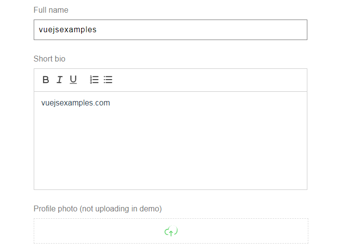
"name": { view: 'text', label: 'Full name'}
}
Output of this simple example looks like this:
⬇️ More about all params & events below.
? Usage
Descriptions
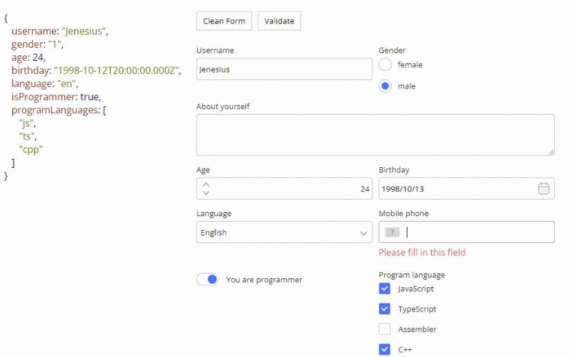
Your JS Data is described by another JS Object targeting all nodes which should be rendered on the screen. Imagine a data model of a IMDB movie:
{
   author: {
      name: "J. Cameron",
      birth: "2020-09-08T12:11:03.332Z",
      active: true
    }
    title: "Titanic",
    description: "Lorem ipsum ...",
    language: "English",
    genres: ["Action", "Drama"]
}
...the descriptions could look something like this:
{
  author: { view: "group", label: "Author" },
  author.name: { view: "text", label: "Name of author" },
  author.birth: { view: "datetime", label: "Date of birth" },
  author.active: { view: "tick", label: "Is the author still active?" },
  title: { view: "text", label: "Movie title" },
  description: { view: "area", "label": "Description" },
  genres: { view: "checkbox", "label: "Genres", options: ["Action", "Comedy", "Drama"] },
  language: { view: "select", label: "Original language", "options: ["English", "Spanish", "Korean"] }
}
Description paths
So as you can see nodes are targeted by a dotted notation. Each description object has a required value of view, which specifies, to which UI element should the node be rendered. Currently there is 11 basic view types, though you can specify your own (see Custom views).
Wildcard paths
If you want to describe every array's child, you can use the wildcard path. Look closely at this data set:
{
    programme: [
	    // Day 1
          {
            header: 'Friday',
            subheader: '25th September 2020',
            items: [
            // Item 1
              {
                title: 'Arrival',
                subtitle: 'please be on time',
                time: '9AM'
              },
            // Item 2
			 {
                title: 'Workshop 1',
                subtitle: 'hosted by John Doe',
                time: '11AM'
             }
             // Item 3 ...
          },
	    // Day 2 ...
        ],
}
The wildcard paths can be leveraged like this:
programme: { view: 'collection' },
programme[*]: { view: 'group', label: 'Day no. {_index}' }, // more about the {_index} at Dynamic values
programme[*].header: { type: 'text', label: 'Title' },
programme[*].subheader: { type: 'text', label: 'Short description' },
programme[*].items: { type: 'collection', label: 'Sessions' },
programme[*].items[*]: { type: 'group' },
programme[*].items[*].title: { type: 'text', label: 'Session name' },
programme[*].items[*].subtitle: { type: 'area', label: 'About' },
programme[*].items[*].time: { type: 'text', label: 'Time of start' },
Dynamic values
Any view type can have a String in description value. If the string is found in provided functions set, given function gets executed. The function also receives the child's path and value as a parameter.
{
   view: 'group'
   hidden: '_groupHidden'
}
...while in JS code
<dd-form
  ...
  :functions="myFunctions"
>
</dd-form>

data() {
  return {
      myFunctions: {
        '_groupHidden': this.groupHidden,
        '_groupIndex': this.groupIndex,
      },
    };
},

methods: {
  groupHidden({path, value}) {
    return value.item < 0;
  },
  groupIndex({path}) {
    return this.getIndex(path);
   }
},
Methods can be also put inline to the string. For these cases, the dynamic value needs to be wrapped inside the brackets.
{
   view: 'group'
   label: 'Day no. {_groupIndex}'
}
Check the demo's source code to see it in use.
Side note to Descriptions
The order of descriptions defines the order of the views on the UI. It is also needed to describe first the Object and then it's sub-nodes.
View types
There is 11 basic view types included in this package:
- group
- collection
- text
- area
- select
- checkbox
- counter
- datetime
- upload
- radio
- tick
collection
Serves as Array container and expects to have multiple inner children. Collection shows just an add-child button by default. It is only an abstraction and has no visual representation.
Usage
{
    view: 'collection',
}
Possible value types
(Array): Consumes only array
Arguments
label(String): Shows title on the top of the viewclass(String or Array): View's assigned classwrapper(String): Name of the view's wrapperhidden(Boolean): Hides or shows the viewdraggable(Boolean): Allows or disallows children draggingdeletable(Boolean): Allows or disallows children deleteaddable(Boolean): Allows or disallows to add children
group
Serves as Object container and expects to have nested children. It is only an abstraction and has no visual representation.
Usage
{
    view: 'group',
}
Possible value types
(Object) or null: Consumes only object
Arguments
label(String): Shows title on the top of the viewclass(String or Array): View's assigned classwrapper(String): Name of the view's wrapperhidden(Boolean): Shows or hides the viewappend(Object): Specifies the UI invisible appendant data to be merged with the object (triggered while adding new item to array)
text
Acts as a basic single-line text field.
Usage
{
    view: 'text',
}
Possible value types
String: Consumes only String
Arguments
label(String): Shows title on the top of the viewclass(String or Array): View's assigned classhidden(Boolean): Hides or shows the viewwrapper(String): Name of the view's wrapper
select
Acts as a drow-down box.
Usage
{
    view: 'select',
}
Possible value types
String or null: Consumes String or null
Arguments
-
label(String): Shows title on the top of the view -
class(String or Array): View's assigned class -
hidden(Boolean): Hides or shows the view -
wrapper(String): Name of the view's wrapper -
options(Array): Field option values -
Plain mode
["Dog", "Cat"] -
Value-text mode
[
    { text: "Dog", value: "doggo" },
	{ text: "Cat", value: "caterpillar" }
]
checkbox
Acts as a checkbox set.
Usage
{
    view: 'checkbox',
}
Possible value types
Array: Consumes Array of strings
Arguments
-
label(String): Shows title on the top of the view -
class(String or Array): View's assigned class -
hidden(Boolean): Hides or shows the view -
wrapper(String): Name of the view's wrapper -
options(Array): Field option values -
Plain mode
["Dog", "Cat"] -
Value-text mode
[
	{ text: "Dog", value: "doggo" },
	{ text: "Cat", value: "caterpillar" }
]
counter
Acts as a counter box.
Usage
{
    view: 'counter',
}
Possible value types
Number: Consumes a Number
Arguments
label(String): Shows title on the top of the viewclass(String or Array): View's assigned classhidden(Boolean): Hides or shows the viewwrapper(String): Name of the view's wrappermin(Number): Minimum value to selectmax(Number): Maximum value to select
datetime
Acts as a date-time selection field.
Usage
{
    view: 'datetime',
}
Possible value types
Date or String: Consumes a Date, String or Timestamp (Firebase) but always returns Date
Arguments
label(String): Shows title on the top of the viewclass(String or Array): View's assigned classhidden(Boolean): Hides or shows the viewwrapper(String): Name of the view's wrappermin(String)*: Minimum date valuemax(String)*: Maximum date value
* String in a Date format
upload
Acts as a box for file uploads and renders into preview box, if consumable by web (image, video, ...).
Usage
{
    view: 'upload',
}
Possible value types
String: Consumes a String
Arguments
label(String): Shows title on the top of the viewclass(String or Array): View's assigned classendpoint(String): API endpoint URL*payload(Object or String): API payload data*hidden(Boolean): Hides or shows the viewwrapper(String): Name of the view's wrapper
* Endpoint URL receives a POST call with FormData (image and payload)
⚠️ Note from author
File upload functionality is heavily domain-oriented, thus I'd advise you to clone the ViewUpload.vue, modify it by your needs and use it as a Custom view.
area
Acts as a multi-line text field with optional WYSIWYG editor.
Usage
{
  view: 'area',
}
Possible value types
String: Consumes only String
Arguments
label(String): Shows title on the top of the viewclass(String or Array): View's assigned classhidden(Boolean): Hides or shows the viewwrapper(String): Name of the view's wrapperhtml(Boolean): Whether or not to allow WYSIWYG features
radio
Acts as a radio button set.
Usage
{
  view: 'radio',
}
Possible value types
String: Consumes a String or null
Arguments
-
label(String): Shows title on the top of the view -
class(String or Array): View's assigned class -
hidden(Boolean): Hides or shows the view -
wrapper(String): Name of the view's wrapper -
options(Array): Field option values -
Plain mode
["Dog", "Cat"] -
Value-text mode
[
	{ text: "Dog", value: "doggo" },
	{ text: "Cat", value: "caterpillar" }
]
tick
Acts as a single checkbox.
Usage
{
  view: 'tick',
}
Possible value types
Boolean: Consumes a Boolean
Arguments
label(String): Shows title on the top of the viewclass(String or Array): View's assigned classhidden(Boolean): Hides or shows the viewwrapper(String): Name of the view's wrapper
Custom views
Any custom view can be inserted via :views property. Custom views are superior to the default ones, so text can be overwritten by a custom one.
Usage:
-
pass a Object of components to
:viewsproperty in dd-form -
component will receive
path, value and descriptionproperties -
the component must emit a @change event with
value and pathpropertiescustomViews: { 'text': customTextView, 'generator': generatorView, }import customTextView from 'path/to/custom-view';...and bind the data in dd-form
<dd-form
	:views="customViews",
	...
></dd-form>
Check the demo's source code to see it in use.
Advanced: Sub-elements
Some sub-elements can be replaced too: button-add, button-remove, button-submit, headline.
    customViews: {
	   'collection.button-add': customButtonAdd,
	   'collection.headline': customHeadline,
	   'collection.button-remove': customButtonRemove,
	   'group.headline': customHeadline,
	   'group.button-submit': customButtonSubmit,
    }
Other features
Language customization
vue-dd-form provides a :lang property, which can rewrite the default language wording.
<dd-form
  :lang="customLang",
  ...
></dd-form>
...and the lang object
customLang: {
  add: 'Add item',
  remove: 'Remove item',
  save: 'Save data'
}
Wrappers (beta)
Views can be wrapped inside separate boxes (DIVs) so we can position them in any way. Look at example data:
{
    programme: [
    {
      header: 'Friday',
      subheader: '25th September 2020',
      items: [
        ...
	],
      }
If we wanted, for instance, to have header and sub-header on the left side of the screen and items on the right, the descriptions would look as follows:
programme[*].header: { type: 'text' },
programme[*].subheader: { type: 'text', wrapper: 'left' },
programme[*].items: { type: 'collection', wrapper: 'left' },
In result HTML, the views would look like this
<div class="left">
	<!-- header div -->
	<div>...</div>
	<!-- subheader div-->
	<div>...</div>
</div>
<div class="right">
	<!-- items div-->
	<div>...</div>
</div>
Afterwards, only thing to be defined are the CSS classes. Check the demo's source code to see it in use.
Events
@change fired after any value change, emits path, value changed & current data set
change({ path, value, data }) {
      // eslint-disable-next-line no-console
      console.log(path, value); // ex. => 'programme[*].header', 'Friday'
      console.log(data); // ex. => { ... }
},
@submit fired after form submit, emits data value
submit({ data }) {
  // eslint-disable-next-line no-console
  console.log(data); // ex. => { ... }
},
@add fired after a item is added to a collection, emits path, value added & current data set
add({ path, value, data }) {
      // eslint-disable-next-line no-console
      console.log(path, value); // ex. => 'programme[*].options', { header: 'Friday', ... }
      console.log(data); // ex. => { ... }
},
@remove fired after a item is added to a collection, emits path, value removed, index & current data set
remove({ path, value, data, index }) {
      // eslint-disable-next-line no-console
      console.log(path, value); //  ex. => 'programme[*].options', { header: 'Friday', ... }
      console.log(data); // ex. => { ... }
      console.log(index); // ex. => 1
},
Styling
Form can be styled in verious ways depending on the depth of the adjustment:
- Any view can be assigned a class parameter. Class can be your custom one or one of the helper classes below.
- Any view in a group view can be assigned a wrapper parameter (see Wrappers).
- If none of above does not fulfill your needs, you can override or define your own views (see Custom views)
Helper classes
col--1-3(sets width to 1/3 of the available space)col--2-3(sets width to 2/3 of the available space)col--1-2(sets width to one half of the available space)col--1-1(sets full-width)row(makes the div's direction inline)row--boxed(makes the div's direction inline & puts it in a shadowed box)row-responsive(makes the div's direction inline, but wraps on mobile)
Other classes appearing in UI
viewview—rootview—branchview—leafview__containerview__container—removableview__wrapper—removablebuttonbutton—addbutton—removebutton—submitheadline