ve-calendar
This is a high-performance and highly scalable calendar component. It is convenient to define the to-do list.
Current function:
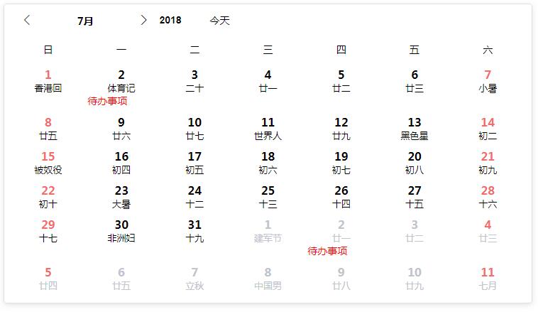
1, display the lunar calendar, solar terms, festivals before 2050
2, can specify the maximum number of selected dates
3, available slots custom date number, lunar calendar, event area
4, Available slots define the left and right key menus (the right-click menu has a default item)
5, Multi-language support
6, two size display modes
Quick Start
The first step:
Npm install ve-calendar --save
The second step, on your vue page
Import veCalendar from "ve-calendar";

// in your vue <script>
Export default {
    Components: {
        veCalendar
    }
}
The third step, loading the template:
<veCalendar v-model="selectDateList"></veCalendar>
props parameter
| Parameter Name | Type | Default | Description |
|---|---|---|---|
| Value | array | none | v-model binding value, is the current selected date list |
| Activate-date | object | date of the year | contains two values year current year, month current month |
| Most-choice | number | 0 | up to choose the number of days, 0 infinity. Negative number indicates prohibition of selection |
| Cross-month | boolean | false | whether to allow cross-month selection |
| pick-mode | boolean | true | Pick mode: When true, the number of newly selected days exceeds the number of most-choice settings, and the oldest date will be discarded. When false, more than most-choice settings will no longer be selected |
| right-menu | boolean | true | Whether to display the right mouse menu |
| day-event-menu | string | day-event-menu | Popup menu's class name |
| day-event-menu-item | string | day-event-menu-item | popup menu item class name |
| lang | string | zh-cn | Multi-language support, default Simplified Chinese. Lu and Lunar Holidays are not displayed in en mode, and can only be customized using slots |
| mode | string | normal | normal/mini/auto Three display modes, auto is automatically switched according to the width. |
| lunar | boolean | true | Whether to display the lunar region or not, the corresponding slot cannot be used. |
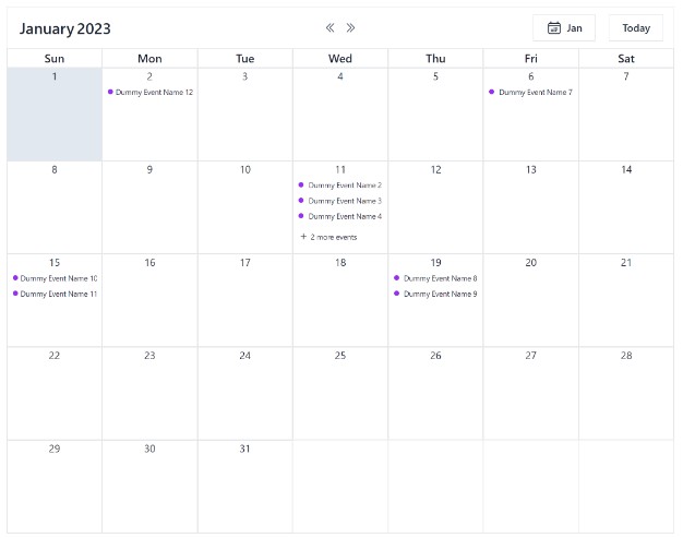
| event | boolean | true | Whether to display the event area, if prohibited, the corresponding slot can not be used. |
| height | string | auto | The height of the component's rendering. |
| enabled-list | array | [] | Only allow dates in the list to be selected |
| disabled-list | array | [] | The date in the list cannot be selected, and the enabled-list should not be used at the same time |
event
| Name | Parameter | Description |
|---|---|---|
| Refresh-calendar | None | Trigger/change activation year when switching calendars |
| Change | selectedDate/array | Fired when the selected date changes, the parameter is the list of currently selected dates (string) |
| append-event | day | The default right-click menu is followed by an outgoing event. day is the day of the mouse click. If you use the right-menu slot, this event is invalidated and you need to write it yourself. |
slot
| Name | Parameter | Description |
|---|---|---|
| day-number | day | is used to replace the default upper-left digit, day is the data object of the day |
| day-lunar | day | It is used to replace the lunar calendar, festivals, and solar terms in the upper right corner. day is the data object of the day |
| day-event | slot-scope="{day,popMenu}" | Used to display the functions such as to-do items, day is the data object of the day, popMenu is the method of the pop-up left-click menu passed by the component, you must call as follows: @click="popMenu($event,{day,item} Only the item is the data that needs to be passed in. Only the other parameters are necessary. |
| day-event-left-menu | slot-scope="{currentEvent,eventMenuShow}" | When there is a to-do item, click the left mouse button to pop up the menu slot; currentEvent is the {day,item} parameter passed in by the popMenu above. |
| day-event-right-menu | slot-scope="{currentEvent,eventRightMenuShow}" | Menu slot that pops up when the right mouse button clicks on a blank event area |
day data content
isToday = false;
//solar calendar
sYear = sYear; //4 digits in AD
sMonth = sMonth; //number of the month
sDay = sDay; //AD figures
Week = week; //weeks, 1 Chinese

// Lunar
lYear = lYear; //4 digits in AD
lMonth = lMonth; // Lunar month number
lMonthChinese = ''
lDay = lDay; // Chinese lunar calendar number
isLeap = isLeap; // Is it a lunar month?
lDayChinese = 'First Day'

//character
cYear = cYear; //yearly column, 2 Chinese
cMonth = cMonth; //Moon, 2 Chinese
cDay = cDay; //Japanese, 2 Chinese

Color = ''; // The color of the holiday display

lunarFestival = ''; // Lunar Holidays
solarFestival = ''; // Gregorian calendar
solarTerms = ''; // Solar Terms

If (`${sMonth}`.length == 1) sMonth = `0${sMonth}`;
If (`${sDay}`.length == 1) sDay = `0${sDay}`;
sDate = `${sYear}-${sMonth}-${sDay}` // string date
demo
<template>
<div id="app" >
<ve-calendar v-model="selected" :height="height" :lunar="lunar" :event="event" :pick-mode="pickMode" :offDays="offDays" :mode="mode" :most-choice="mostChoice" @refresh-calendar="refreshC" :cross-month="crossMonth" @append-event="appendEvent" @click-event="clickEvent" >
<!--<div slot="day-number" slot-scope="{day}">-->
<!--<span :style="day.sMonth===month&&test.indexOf(day.sDay)>=0?'color:red;':''">{{day.sDay}}</span>-->
<!--</div>-->
<div slot="day-event" slot-scope="{day,popMenu}">
<div v-if="test.indexOf(day.sDay)>=0">
<div @click="popMenu($event,{day,item})" style="color:red;">{{item}}</div>
</div>
</div>
<div slot="day-event-left-menu" slot-scope="{currentEvent,eventMenuShow}">
<!-- 这里如果需要调用多重包装的数据,请放到v-if里面 -->
<div v-if="currentEvent.day">{{currentEvent.day.sDate}}</div>
<div @click="deleteEvent(currentEvent.item)" class="day-event-menu-item">使用插槽控制菜单</div>
</div>
<div slot="day-event-right-menu" slot-scope="{currentEvent,eventRightMenuShow}" >
<div v-if="currentEvent.day">{{currentEvent.day.sDate}}</div>
<div class="day-event-menu-item">右键插槽控制菜单</div>
</div>
</ve-calendar>
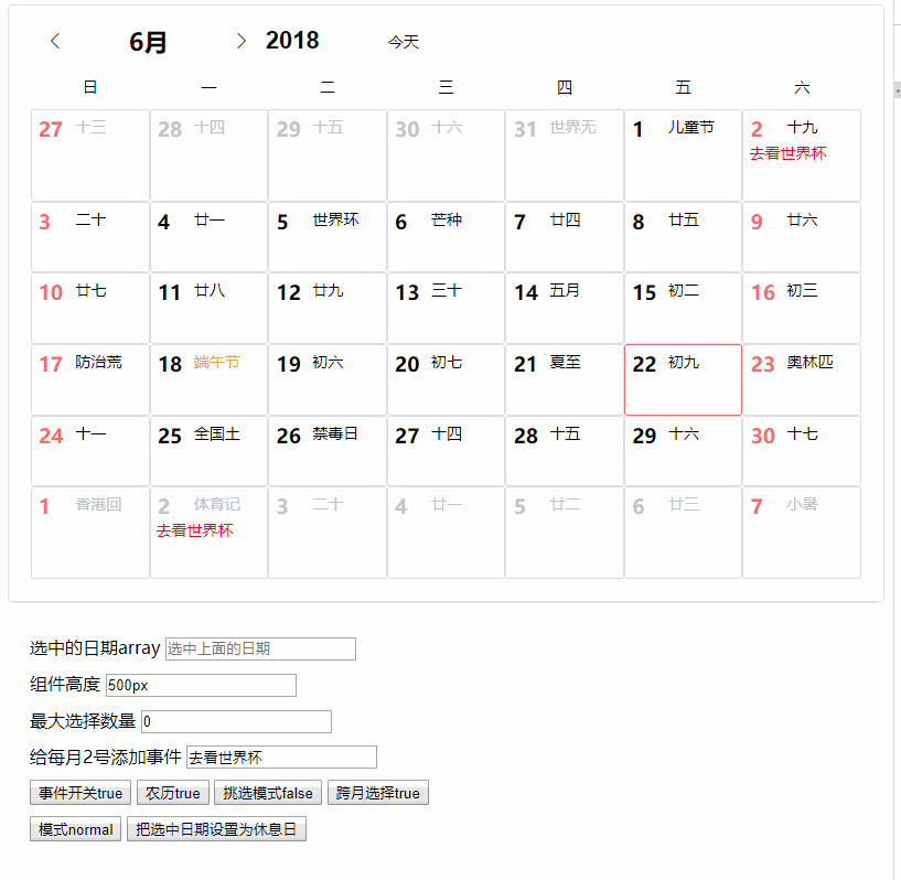
<div class="demo-div" >
<div>
<label for="selected">选中的日期array</label>
<input id="selected" type="text" :value="selected" placeholder="选中上面的日期">
</div>
<div>
<label for="height">组件高度</label>
<input id="height" type="text" v-model="height">
</div>
<div>
<label for="mostChoice">最大选择数量</label>
<input id="mostChoice" type="number" v-model="mostChoice" title="0是无限,-1是禁止">
</div>
<div>
<label for="item">给每月2号添加事件</label>
<input id="item" type="text" v-model="item">
</div>
<div>
<button @click="event=!event">事件开关{{event}}</button>
<button @click="lunar=!lunar">农历{{lunar}}</button>
<button @click="pickMode=!pickMode">挑选模式{{pickMode}}</button>
<button @click="crossMonth=!crossMonth">跨月选择{{crossMonth}}</button>
</div>
<div>
<button @click="changeMode">模式{{mode}}</button>
<button @click="setOffDays">把选中日期设置为休息日</button>
</div>
</div>
</div>
</template>
<script>
import veCalendar from "ve-calendar";
export default {
name: "App",
data() {
return {
modeList: ["mini", "normal", "auto"],
modeIndex: 0,
mode: "",
item:"去看世界杯",
lunar:true,
offDays:[],
pickMode:false,
mostChoice:0,
crossMonth:true,
event:true,
activateDate: {
year: 2017,
month: 6
},
height:'500px',
month: 6,
test: [2],
selected: []
};
},
methods: {
changeMode() {
this.modeIndex++;
this.mode = this.modeList[this.modeIndex % 3];
},
setOffDays(){
this.offDays = JSON.parse(JSON.stringify(this.selected))
this.selected = []
},
refreshC(yearmonth, data) {
console.log(yearmonth, data);
},
clickEvent(e, data) {
console.log(e, data);
},
deleteEvent(item) {
console.log(`你打算删除事情${item}`);
},
appendEvent(day) {
console.log("appendEvent", day);
}
},
mounted() {
this.changeMode();
},
components: {
veCalendar
}
};
</script>
<style>
.demo-div {
padding: 20px;
height: 200px;
}
.demo-div div {
margin-top: 10px;
}
</style>