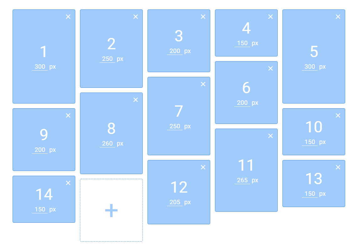
vue-flex-waterfall
A horizontal sorting waterfall layout component for Vue.js, realized by flex layout.
Installation
npm i vue-flex-waterfall
Usage
Vue project
<vue-flex-waterfall
  :col="4"
  :col-spacing="15"
  :break-at="{ 900: 3, 600: 2, 300: 1 }"
  :break-by-container="false"
  @order-update="onOrderUpdate"
>
  <!-- items -->
</vue-flex-waterfall>
import VueFlexWaterfall from 'vue-flex-waterfall';

export default {
  // ...
  components: {
    VueFlexWaterfall,
    // ...
  },
  // ...
}
Browser
<script src="https://cdn.jsdelivr.net/npm/[email protected]/dist/vue-flex-waterfall.min.js"></script>
Props
col
Type: Number
Default: 1
Default number of column. Use the break-at prop to specify breakpoints for this value.
col-spacing
Type: Number | String
Default: 0
Column spacing. The unit is px when it is a number.
break-at
Type: Object
Default: null
This object allows you to specify how the number of columns will change based on the width of the viewport. Setting this option to { 900: 3 } for example will adjust the number of columns to 3 when the viewport change and is <= 900px.
break-by-container
Type: Boolean
Default: false
When enable, the breakpoints will be based on the container width instead of the window width.
Events
order-update
Will be emited after flex orders of slot elements are updated.
Tips
- You can set
margin-bottomstyle for slot elements to control their vertical spacing. - You can set
align-contentstyle for vue-flex-waterfall component to control column alignment.