Elucidate
A library that makes it a breeze to "shed light" on your Vue component.
Installation (Yarn)
yarn add vue-elucidate
Installation (in a Vue project)
import Elucidate from 'vue-elucidate'
Vue.use(Elucidate)
Usage
<elucidate :component="button" :example="example"></elucidate>
The <elucidate> component takes two props, component and example.
The former is, quite literally, a single Vue component (either imported into your current app, or defined inline), or an array of Vue components.
The latter is either a single example object shaped thusly, or an array of example objects shaped thusly:
| Key | Value |
|---|---|
markup |
An HTML code snippet that you would like to document |
props |
An object defining the props referenced by your HTML code snippet |
methods |
An object defining the methods referenced by your HTML code snippet |
name |
(OPTIONAL) A display name for the given component if part of an array of examples |
How does it work?
Let's assume you have a component named custom-button. It's defined in custom-button.vue thusly:
<template>
  <button :class="classList">
    <slot></slot>
  </button>
</template>

<script>
  export default {
    name: 'custom-button',
    props: {
      variant: {
        type: String,
        default: 'primary'
      },
      size: {
        type: String,
        default: 'medium'
      }
    },
    computed: {
      classList () {
        return `btn-${this.variant} btn-${this.size}`
      }
    }
  }
</script>

<style>
  .btn-primary {
    background: blue;
    color: white;
  }

  .btn-small {
    font-size: 12px;
  }
</style>
Elucidate works by:
- Rendering an example code snippet, e.g.,
<custom-button size="small">Hello</custom-button> - Documenting that snippet, as well as any props/functions that were passed to it
- Documenting all of the props exposed by
<custom-button>, in this casevariantandsize.
So, the following code:
<elucidate :component="button" :example="example"></elucidate>
import CustomButton from '@/components/CustomButton'
import '@/darcula.css'

export default {
  data () {
    return {
      button: CustomButton,
      example: {
        markup: `<custom-button size="small">Hello</custom-button>`
      }
    }
  }
}
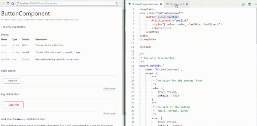
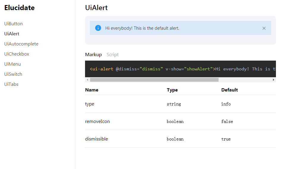
...would produce the following result:

Customization
Elucidate is very customizable. I've included some light CSS here and there to make things look half-way decent. Here are a few guidelines for customization.
BYOCSS
Elucidate uses Prism JS for syntax highlighting. Elucidate doesn't ship out-of-the-box with a particular syntax highlighting theme, so feel free to pick one from Prism Themes
Default CSS
Include Elucidate's default styles by including the following line of code in your project:
import 'vue-elucidate/dist/style.css'
Elucidate maintains a light footprint, and affords you the following classes for purposes of customization:
.elucidate-example-picker {}

.elucidate-example-picker label {}

.elucidate-select {}

.elucidate-select select {}

.elucidate-select::after {}

@supports (-webkit-appearance: none) or (appearance: none) or ((-moz-appearance: none) and (mask-type: alpha)) {
  .elucidate-select::after {
  }

  .elucidate-select select {}

  .elucidate-select select:focus {}
}

.elucidate-preview {}

.elucidate-tabs {}

.elucidate-tabs .nav-tabs {}

.elucidate-tabs .tab {}

.elucidate-tabs .tab:hover {}

.elucidate-tabs .tab.active {}

.elucidate-tabs .tab:not(:last-of-type) {}

.elucidate-tabs .tab a {}

.elucidate-table-wrap {}

.elucidate-table {}

.elucidate-table th {}

.elucidate-table td {}
To-Do
- [ ] Test Coverage
- [x] Accommodate multiple components in a single example
- [x] Accommodate multiple examples
- [ ] Investigate slot-based API for further customization of sub-components