Vuenimate
Elevate your Vue applications with vuenimate, a carefully crafted library of Vue animation components. Enhance user interfaces with fluid, engaging animations that are easy to integrate and customize.
Features
- Seamless Integration: Works out-of-the-box with any Vue project.
- Customizable: Extensive configuration options for each animation.
- Performance Optimized: Ensures smooth animations for a responsive UI.
- Diverse Animation Set: Choose from a wide range of animation types.
- Reactive & Controllable: Animations respond dynamically to user interactions.
Installation
Install vuenimate using npm:
npm install vuenimate
Usage
Import and use vuenimate in your Vue components:
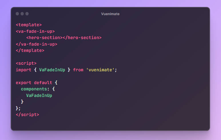
<template>
<va-fade-in-up>
    <hero-section></hero-section>
</va-fade-in-up>
</template>

<script>
import { VaFadeInUp } from 'vuenimate';

export default {
  components: {
    VaFadeInUp
  }
};
</script>
You can also specify animation properties with the config prop.
<template>
<va-fade-in-up :config="{duartion: 2000, delay: 50}">
    <hero-section></hero-section>
</va-fade-in-up>
</template>
Using triggers you can specify when do you want your animation to start, the default trigger is on mount.
<template>
<va-fade-in-up on-click> //This animation will start when we click firstElementChild (in this case, hero-section)
    <hero-section></hero-section>
</va-fade-in-up>
</template>
You can start an animation when you scroll to the element and it is visible on the page using on-scroll-to-element. You can specify the threshold which indicate how much of the element should be visible to start animation.
<template>
<va-fade-in-up on-scroll-to-element :threashold="0.3"> //hero-section will fade in when 0.3 of it is visible on scroll
    <hero-section></hero-section>
</va-fade-in-up>
</template>
API Reference
Below are some of the components available in vuenimate (more animations comming soon):
<va-fade-in-up>
<va-fade-in-down>
<va-fade-in-left>
<va-fade-in-right>
Props:
config: a configuration object with basic css animation properties.
//config object for <va-fade-in-up> component, each component has its config object
config = {
        duration: 1000, //animation duration in ms
        delay: 0, //animation delay in ms
        easing: "ease-out", //animation easing type
        iterations: 1, // animation number of iteration
        fill: "forwards", //animation fill type
        offset: 20, // this is the number of pixels to move
      };
Events:
animation-ended: Emitted when the animation is complete. This is true to all animations.
Triggers:
// Similar structure as above for each component
Customization:
You can use the component to make different types of custom animations. The VaBase component has a keyframes property in its config prop, you can set it to whatever animation you want to make.
config = {
        duration: 1000,
        delay: 0,
        easing: "ease",
        iterations: 1,
        fill: "forwards",
        keyframes: [
          { transform: "translateY(0)", opacity: 1 },
          { transform: "translateY(-100%)", opacity: 0 },
        ], //CSS keyframes Array
      };
You can set the keyframes values as you would set it when using the Browser Web Animations API.
Contributing
Contributions to vuenimate are welcome! Please read our contributing guide for details on our code of conduct and the process for submitting pull requests.
License
This project is licensed under the MIT License – see the LICENSE.md file for details.
Acknowledgments
- Vue community
- Contributors and maintainers of vuenimate