Vue OnOff Toggle
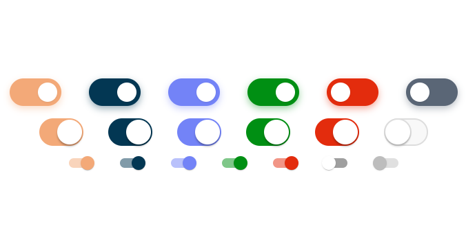
A simple, lightweight on/off toggle component made with Vue.js. Provides multiple themes with default configurations. You can also customize size, color and borders.
Installation
npm install vue-onoff-toggle --save
or with yarn,
yarn add vue-onoff-toggle
How to use
import OnoffToggle from 'vue-onoff-toggle'

new Vue({
  components: {
    OnoffToggle
  },
  data() {
    return {
      checked: false
    }
  }
})
<onoff-toggle v-model="checked" />

<onoff-toggle v-model="checked" theme="ios" />

<onoff-toggle v-model="checked" theme="material" />

<onoff-toggle
  v-model="checked"
  onColor="#008F13"
  :shadow="false"
/>

<onoff-toggle
  v-model="checked"
  theme="ios"
  onColor="#008F13"
/>

<onoff-toggle
  v-model="checked"
  theme="material"
  thumbColor="#008F13"
/>
Props
| Prop | Description |
|---|---|
| theme | Theme to use. "default", "ios" and "material" are available. |
| name | Name to attach to checkbox input. Useful when the toggle is used inside a form. |
| disabled | Toggle is disabled |
| onColor | Background color of checked toggle |
| offColor | Background color of unchecked toggle |
| thumbColor | Background color of the thumb. For "material" theme, if you don't specify onColor, it will be thumbColor with opacity 0.5 by default |
| borderColor | Color of the thumb's border. Only available for "ios" theme. |
| width | Width of the toggle |
| height | Height of the toggle |
| margin | Space around the thumb |
| shadow | Only works on default theme. When set to true, a glow effect will be added around the toggle. |
Browser Compatibility
- Chrome: 40+
- Firefox: 25+
- IE: 11+