VuetifyColorInput
A color input component for Vuetify.
setup
npm
npm i vuetify-color-input
import VuetifyColorInput from 'vuetify-color-input';
Use the treeshaking system.
import VuetifyColorInput from 'vuetify-color-input/a-la-carte';
browser
<link
  href="https://unpkg.com/vuetify@2/dist/vuetify.min.css"
  rel="stylesheet"
/>
<script src="https://unpkg.com/vue@2"></script>
<script src="https://unpkg.com/vuetify@2/dist/vuetify.min.js"></script>
<script src="https://unpkg.com/vuetify-color-input"></script>
The component is globally available as VuetifyColorInput. If Vue is detected, the component is registered automatically.
usage
Register the component globally.
import Vue from 'vue';
import VColorInput from 'vuetify-color-input';

Vue.component(VColorInput.name, VColorInput);
or
Register the component locally.
import VColorInput from 'vuetify-color-input';

export default {
  components: {
    VColorInput,
  },
  // ...
};
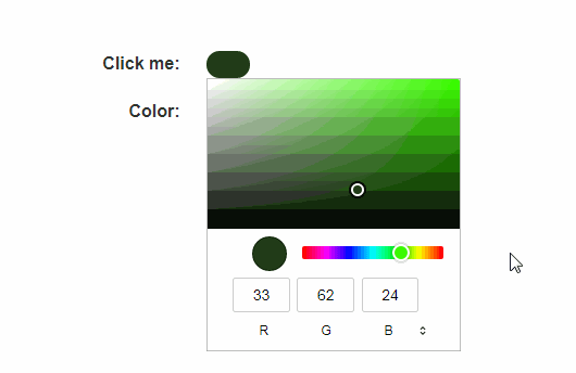
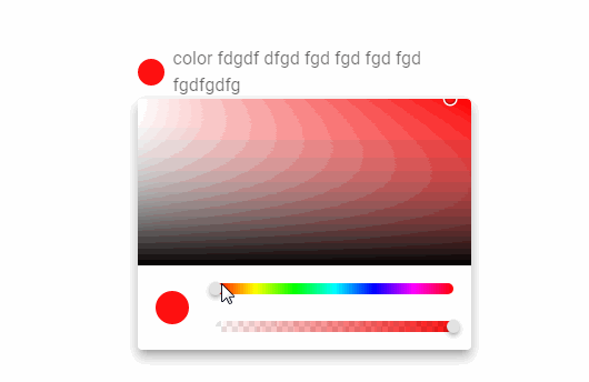
Use the component inside a template.
<v-color-input
  v-model="backgroundColor"
  label="background color"
/>
properties
| name | type | default |
|---|---|---|
appendIcon |
String |
|
disabled |
Boolean |
|
error |
Boolean |
|
errorCount |
[Number, String] |
1 |
errorMessages |
[String, Array] |
[] |
hideDetails |
[Boolean, String] |
|
hint |
String |
|
id |
String |
|
label |
String |
|
messages |
[String, Array] |
[] |
noAlpha |
Boolean |
|
persistentHint |
Boolean |
|
prependIcon |
String |
|
rules |
Array |
[] |
success |
Boolean |
|
successMessages |
[String, Array] |
[] |
validateOnBlur |
Boolean |
|
value |
slots
| name |
|---|
append |
label |
message |
prepend |
events
| name |
|---|
click:append |
click:prepend |
input |
update:error |