Mosha Vue Toastify
A lightweight and fun Vue 3 toast or notification or snack bar or however you wanna call it library.
Features
- Super easy to setup!
- Swipe to close
- Support for Composition API
- Written in typescript, full typescript support
- Super light weight
- Define behavior per toast
- Fun progress bar to display remaining time
- A lot more coming!
Installation
With NPM:
$ npm install mosha-vue-toastify
With Yarn:
$ yarn add mosha-vue-toastify
The gist
<template>
  <button @click="toast">Toast it!</button>
</template>
<script lang='ts'>
import { defineComponent } from 'vue'
import { createToast } from 'mosha-vue-toastify';
import 'mosha-vue-toastify/dist/style.css'

export default defineComponent({
  name: 'HelloWorld',
  setup () {
    const toast = () => {
        createToast('Wow, easy')
    }
    return { toast }
  }
})
</script>
Configuration
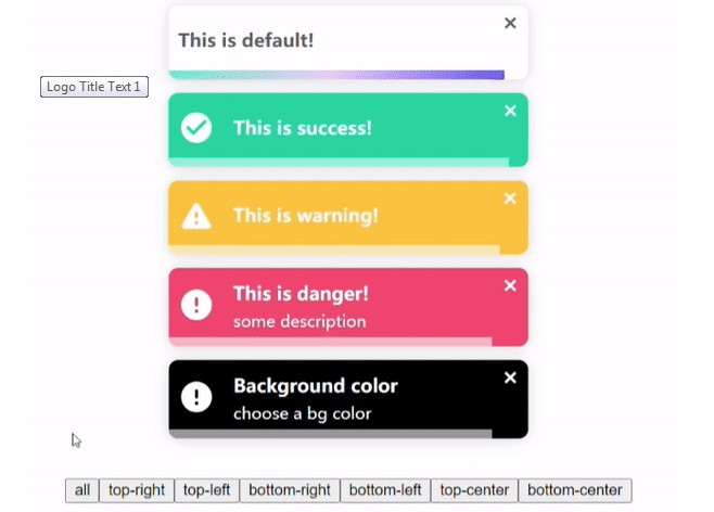
The createToast function accepts 2 arguments, the first argument can be just a string or a object like this { title: 'some title', description: 'some good description'}, the second argument is an options object.
Options:
| name | type | default | description |
|---|---|---|---|
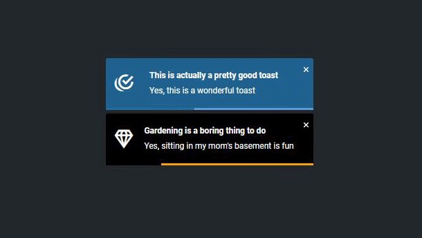
| type | 'info', 'danger', 'warning', 'success', 'default' | 'default' | Give the toast different styles and icons. |
| timeout | number | 5000 | How many ms you want the toggle to close itself? |
| position | 'top-left', 'top-right', 'bottom-left', 'bottom-right', 'top-center', 'bottom-center' | 'top-right' | Where do you want the toast to appear? |
| showCloseButton | boolean | true | Do you wanna show the close button ? |
| showIcon | boolean | false | Do you wanna show the icon ? |
| transition | 'bounce', 'zoom', 'slide' | 'bounce' | Which animation do you want? |
| hideProgressBar | boolean | false | Do we wanna hide the fancy progress bar? |
| swipeClose | boolean | true | Allows the user swipe close the toast |
| toastBackgroundColor | string | default color | Customize the background color of the toast. |
| onClose | function | N/A | This function will be called at the end of the toast's lifecycle |