vue2-dialog
This plugin is just only adapted for mobile.
You can use it to make several kinds of dialog components such as Alert,Confirm,ActionSheet,Toast.And you can also use the components like AddressPicker,Loading and Scroller
How to use
- NPM install the vue2-dialog plugin
npm install vue2-dialog --save
1.vue spa
- import the plugin and use (global use)
import {VueDialog} from 'vue2-dialog'
Vue.use(VueDialog)
- import some components that you need and use (local use)
import {Scroller,Alert,Confirm} from 'vue2-dialog'
Vue.component(Scroller.name,Scroller)
Vue.component(Alert.name,Alert)
Vue.component(Confirm.name,Confirm)
2.script html
- directly write the script,in deed you have to
insert the vue.jsscript firstly
<script src="dist/vue2-dialog.js"></script>
- use the components directly in your vue spa file or the Vue instance ,like
<Alert />
<Confirm />
<Toast />
<Scroller />
...
Options
1. Alert
props
alert [Object]
| key | value | description |
|---|---|---|
| title | [String] or [HTML Tag] |
title of the alert |
| content | [String] or [HTML Tag] |
content of the alert |
| alertBtn | [String] |
alertBtn of the alert |
| isShow | [Boolean] |
whether show the alert |
closeOnClickModal [Boolean]
| prop name | description | required | default |
|---|---|---|---|
closeOnClickModal |
[Boolean]whether close alert by clicking the mask modal |
No | false |
emit events
okwhen you click the alertBtn,the component will close.
DEMO Codes
//template
<Alert :alert="alert" :closeOnClickModal="true" @ok="ok" />

//script
export default {
	data(){
		return{
			alert:{
				title:'tip',
				content:'Hello World!'
				alertBtn:'Happy',
				isShow:false
			}
		}
	},
	methods:{
		ok(){
			console.log('I click the alertBtn~')
		}
	}
}
2. Confirm
props
confirm [Object]
| key | value | description |
|---|---|---|
| title | [String] or [HTML Tag] |
title of the Confirm |
| content | [String] or [HTML Tag] |
content of the Confirm |
| cancelBtn | [String] |
cancelBtn of the Confirm |
| confirmBtn | [String] |
confirmBtn of the Confirm |
| isShow | [Boolean] |
whether show the Confirm |
closeOnClickModal [Boolean]
| prop name | description | required | default |
|---|---|---|---|
closeOnClickModal |
[Boolean]whether close Confirm by clicking the mask modal |
No | false |
emit events
okwhen you click the confirmBtn,the component will close.cancelwhen you click the cancelBtn,the component will close.
DEMO Codes
//template
<Confirm :confirm="confirm" :closeOnClickModal="true" @ok="ok" @cancel="cancel" />

//script
export default {
	data(){
		return{
			confirm:{
				title:'tip',
				content:'Are you sure to close the window?'
				confirmBtn:'Yes,please',
				cancelBtn:"No,thanks"
				isShow:false
			}
		}
	},
	methods:{
		ok(){
			console.log('I click the confirmBtn~')
		},
		cancel(){
			console.log('I click the cancelBtn~')
		}
	}
}
3. Toast

props
toast [Object]
| key | value | description | required | default |
|---|---|---|---|---|
| time | [Number] |
control the time of the Toast | No | 500 |
| type | [String] |
how to show Toast,has 12 types | No | default |
| content | [String] or [HTML Tag] |
content of the Toast | Yes | / |
| isShow | [Boolean] |
whether show the Toast | Yes | / |
type
| type name | description |
|---|---|
| top | slide from the top |
| bottom | slide from the bottom |
| default | show on the window of 30% |
| middle | show on the window of 50% |
| succes | show with success icon |
| fail | show with fail icon |
| warn | show with warn icon |
| text | show with lots of words |
| loading-circle | show with a circle loading |
| loading-ball | show with a ball loading |
| loading-wave | show with a wave loading |
| mini-loading | show with a mini loading |
DEMO Codes
//template
<Toast :toast="toast" />

//script
export default {
	data(){
		return{
			toast:{
				isShow:false,
				time:2000,
				content:'waiting to delete...',
				type:'mini-loading'
			}
		}
	}
}
4. ActionSheet
props
actionSheet [Object]
| key | value | description |
|---|---|---|
| menu | [Array - Object] |
items and the content of the ActionSheet |
| isShow | [Boolean] |
whether show the ActionSheet |
menu must has structure like
[label:'del',content:'delete the data']
cancelMode [Boolean]
| prop name | description | required | default |
|---|---|---|---|
cancelMode |
[Boolean]whether show the cancel item |
No | false |
closeOnClickModal [Boolean]
| prop name | description | required | default |
|---|---|---|---|
closeOnClickModal |
[Boolean]whether close ActionSheet by clicking the mask modal |
No | false |
emit events
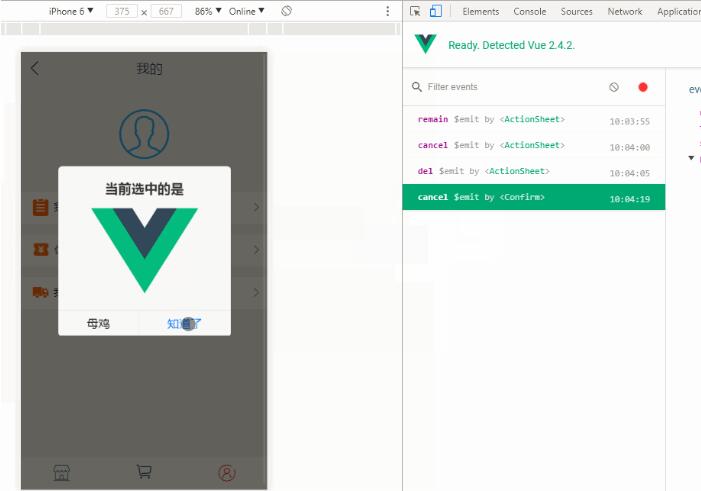
cancelwhen you click the cancel item (make sure you turn on the cancelMode).- Other emit events depends on the label of menu(actionSheet).Such as :
 actionSheet:{
	isShow:false,
	menu:[
		{label:'title',content:`<span style=color:blue>Sure?</span><br /><span style=color:#bbb;font-size:12px>You will delete the data...</span>`},
		{label:'remain',content:'No,i wanna remain'},
		{label:'del',content:`<p style=color:red>Yes,delete it!`}
	]
	/*
	 * ActionSheet has 2 emit evnets like 'remain' and 'del'.Attention! The label 'title' won't return emit event!
	 */
}
DEMO Codes
//template
	<ActionSheet
		:actionSheet="actionSheet"
		:cancelMode="cancelMode"
		@del="del"
		@remain="remain"
		@cancel="cancel"
	/>

//script
export default {
	data(){
		return{
			actionSheet:{
				isShow:false,
				menu:[
					{label:'title',content:`<span style=color:blue>Sure?</span><br /><span style=color:#bbb;font-size:12px>You will delete the data...</span>`},
					{label:'remain',content:'No,i wanna remain'},
					{label:'del',content:`<p style=color:red>Yes,delete it!`}
				]
			}
		}
	},
	methods:{
		del(){
			console.log('I delete the data~')
		},
		remain(){
			console.log('I remain the data~')
		},
		cancel(){
			console.log('I click the cancel item~')
		}
	}
}
5. Loading
props
| prop name | description | required | default |
|---|---|---|---|
loading |
[Boolean]whether show the Loading |
Yes | / |
DEMO Codes
//template
	<Loading :loading="loading" />

//script
export default {
	data(){
		return{
			loading:false
		}
	},
	created(){
		this.loading = true;
		//request for data
		this.$http.post('test/productDetail',{}).then(
			res => {
				//if the data has been loaded. make the loading false
				...
				this.loading = false
			}
		).catch(
			err =>console.log(err)
		)
	}
}
6. AddressPicker
props
| prop name | description | required | default |
|---|---|---|---|
addressShow |
[Boolean]whether show the AddressPicker |
Yes | / |
closeOnClickModal [Boolean]
| prop name | description | required | default |
|---|---|---|---|
closeOnClickModal |
[Boolean]whether close AddressPicker by clicking the mask modal |
No | false |
emit events
okwhen you click the sure button,the AddressPicker will close and return the address data as the event param.cancelwhen you click the cancel button,the AddressPicker will close.
DEMO Codes
//template
	<AddressPicker
		:addressShow="addressShow"
		@ok="ok"
		@cancel="addressShow=false"
	/>

//script
export default {
	data(){
		return{
			addressShow:false
		}
	},
	methods:{
		ok(cont){
			this.addressShow = false
			alert(`You choose ${cont.province}-${cont.city}-${cont.town || ''})
		},
	}
}
Attention: if there is not town ,the return param doesn't inclucde 'town' key!
Please go the AddressPicker to see the details.
7. Scroller
Please go the v-scroller to see the details.