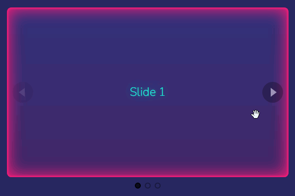
vue-horizontal-list
A pure vue horizontal list implementation with ssr, mobile, touch screen support. I created this because I like how AirBnb does their horizontal list, I couldn't find a library that is close to it.
Features
- Invisible scroll bar
- Snap to nearest item in the horizontal-list
- Windowed & Full-screen mode
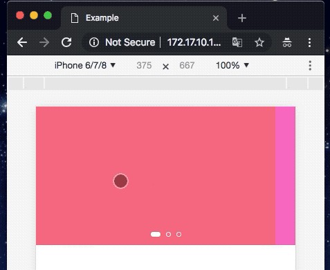
- Windowed mode will respect the container and not show overflowing item
- Full-screen mode will show overflowing item, best result for small screen
- Dynamic responsive breakpoint configuration
- Navigation control will show up dynamically for larger screen
- Touch screen friendly
- Minimal config setup
Options Overview
const options = {
  item: {
    // css class to inject into each individual item
    class: '',
    // padding between each item
    padding: 12
  },
  list: {
    // css class for the parent of item
    class: '',
    // maximum width of the list it can extend to before switching to windowed mode, basically think of the bootstrap container max-width
    // windowed is used to toggle between full-screen mode and container mode
    windowed: 1200,
    // padding of the list, if container < windowed what is the left-right padding of the list
    // during full-screen mode the padding will added to left & right to centralise the item
    padding: 24
  },
  responsive: [
    // responsive breakpoints to calculate how many items to show in the list at each width interval
    // it will always fall back to these:
    {end: 576, size: 1},
    {start: 576, end: 768, size: 2},
    {start: 768, end: 992, size: 3},
    {start: 992, end: 1200, size: 4},
    {start: 1200, size: 5}
  ],
  navigation: {
    // when to show navigation
    start: 992
  }
}
Basic Responsive Usage
- Width between 0 - 576, show 1
- Width between 576 - 768, show 2
- Width catch all, show 3
<vue-horizontal-list :items="items" :options="{responsive: [{end: 576, size: 1}, {start: 576, end: 768, size: 2},{size: 3}]}">
  <template v-slot:default="{item}">
    <div class="item">
      <h5>{{item.title}}</h5>
      <p>{{item.content}}</p>
    </div>
  </template>
</vue-horizontal-list>
Full Example
<template>
  <div id="app">
    <section>
      <vue-horizontal-list :items="items" :options="options">
        <template v-slot:default="{item}">
          <div class="item">
            <h5>{{item.title}}</h5>
            <p>{{item.content}}</p>
          </div>
        </template>
      </vue-horizontal-list>
    </section>
  </div>
</template>

<script>
  import Vue from 'vue';
  import VueHorizontalList from '@/vue-horizontal-list.vue';

  export default Vue.extend({
    name: 'ServeDev',
    components: {
      VueHorizontalList
    },
    data() {
      return {
        options: {
          responsive: [
            {end: 576, size: 1},
            {start: 576, end: 768, size: 2},
            {start: 768, end: 992, size: 3},
            {size: 4}
          ],
          list: {
            // 1200 because @media (min-width: 1200px) and therefore I want to switch to windowed mode
            windowed: 1200,

            // Because: #app {padding: 80px 24px;}
            padding: 24
          }
        },
        items: [
          {title: 'Item 0', content: 'Content item with description'},
        ]
      }
    }
  });
</script>

<style>
  body {
    margin: 0;
    padding: 0;
  }

  #app {
    max-width: 1400px;

    margin-left: auto;
    margin-right: auto;

    padding: 80px 24px;
  }

  @media (min-width: 1200px) {
    #app {
      padding-left: 80px;
      padding-right: 80px;
    }
  }
</style>
Installation
NPM
npm i vue-horizontal-list
Yarn
yarn add vue-horizontal-list
Building & Publishing
yarn run build
yarn publish