vue-material-modal-dialog
A reusable modal dialog for Vue Material.
Purpose
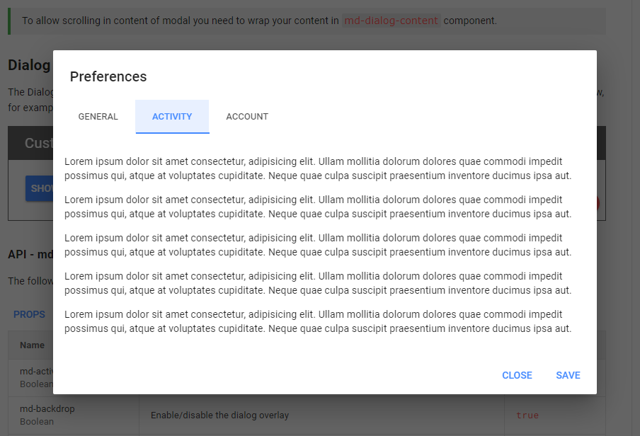
In Vue Material, components showing a dialog have to contain an MdDialog, or a component based on an MdDialog.
There will be a separate dialog instance nested in each such component, even if different components use the same dialog or if components are repeated by v-for.
This repository provides a new component, MdModalDialog, as a substitute for Vue Material's MdDialog. It offers the following features:
- For each dialog there is only a single instance, no matter how many components use it
MdModalDialogsupports the same props and events asMdDialog- Simple API: showing the dialog returns a promise which will be fulfilled or rejected
when the dialog is closed - Custom properties can be passed to a dialog
Usage
Installation
npm install vue-material-modal-dialog
yarn add vue-material-modal-dialog
Registering MdModalDialog
import MdModalDialog from 'vue-material-modal-dialog'
import 'vue-material-modal-dialog/dist/md-modal-dialog.css'

    ...
// This must come after Vue.use(VueMaterial):
Vue.use(MdModalDialog)
Controlling modal dialogs
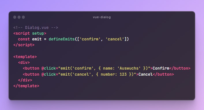
MdModalDialog provides these functions:
-
vm.$modal.show(dialog, [props]){Vue component} dialog{Object} [props]
Shows a dialog component, can pass properties to the dialog instance.
Returns a
Promisethat can be fulfilled byvm.$modal.submit()and
rejected byvm.$modal.cancel(). Both functions close the dialog. -
vm.$modal.submit([result]){Any} [result]
Closes the dialog and fulfills the
Promise; can return a result. -
vm.$modal.cancel([reason]){Any} [reason]
Closes the dialog and rejects the
Promise; can return a reason.
Creating modal dialog components
Just use MdModalDialog in the same way as MdDialog (without md-active),
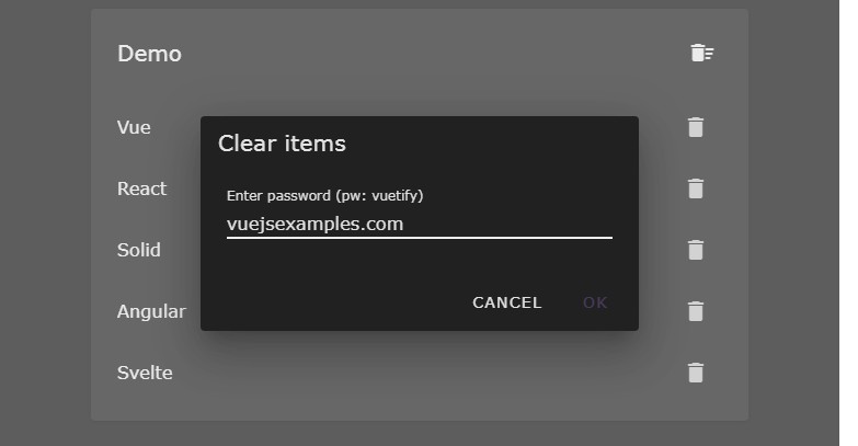
for example for an input dialog:
<template>
  <md-modal-dialog>
    <md-dialog-title>Guess a number</md-dialog-title>

    <md-dialog-content>
      <md-field>
        <label>A number</label>
        <md-input type="number" v-model="number" />
      </md-field>
    </md-dialog-content>

    <md-dialog-actions>
      <md-button @click="$modal.submit(number)">Submit</md-button>
      <md-button @click="$modal.cancel()">Cancel</md-button>
    </md-dialog-actions>
  </md-modal-dialog>
</template>

<script>
  export default {
    name: 'GuessDialog',
      ...
  }
</script>
Some other component will show GuessDialog and receive the guessed number:
<template>
    ...
  <md-button @click="guess">Guess a number</md-button>
    ...
</template>

<script>
import GuessDialog from '@/components/guess-dialog'

export default {
    ...
  methods: {
    guess() {
      this.$modal
          .show(GuessDialog)
          .then(number => {
            // Do something with the guessed number
          })
          .catch(reason => {
            // Must be specified even if the reason is
            // irrelevant in order to avoid runtime warnings.
          })
    }
  },
}
</script>
Passing properties to modal dialogs
Let's extend the example with an upper limit to the guessed number.
Use v-slot to make GuessDialog accept property max:
<template>
  <md-modal-dialog v-slot="{ max }">
    <md-dialog-title>Guess a number up to {{ max }}</md-dialog-title>

    <md-dialog-content>
      <md-field>
        <label>A number</label>
        <md-input type="number" v-model="number" :max="max" />
      </md-field>
    </md-dialog-content>
    ...
</template>
...
Elsewhere, show GuessDialog and pass a value for max:
this.$modal.show(GuessDialog, { max: 42 })
           ...
