Vue3 Accessible Accordion
A simple accordion component plugin for Vue 3. Follows the Accordion Design Pattern in WAI-ARIA Authoring Practices 1.1 for accessibility best practices automatically built into the plugin.
Install
npm i vue3-accessible-accordion
or
yarn add vue3-acccessible-accordion
Register as a Global Component
import { createApp } from 'vue';
import App from './App.vue'
import vue3_accessible_accordion from 'vue3-accessible-accordion';

const app = createApp(App)
			.use(vue3_accessible_accordion);
			.mount('#app')
Register Components Individually
import Accordion, AccordionPanel, AccordionPanelHeader, AccordionPanelContent from 'vue3-accessible-accordion';

export default {
	components: {
    	Accordion,
		AccordionPanel,
		AccordionPanelHeader,
		AccordionPanelContent
    }
}
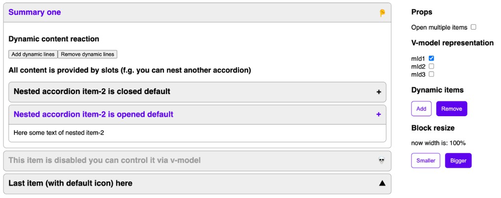
Example Usage
<accordion>
	<accordion-panel>
		<accordion-panel-header>Question 1</accordion-panel-header>
		<accordion-panel-content>Answer to FAQ 1</accordion-panel-content>
	</accordion-panel>

	<accordion-panel>
		<accordion-panel-header>Question 2</accordion-panel-header>
		<accordion-panel-content>Answer to FAQ 2</accordion-panel-content>
	</accordion-panel>
	</accordion-panel>
</accordion>
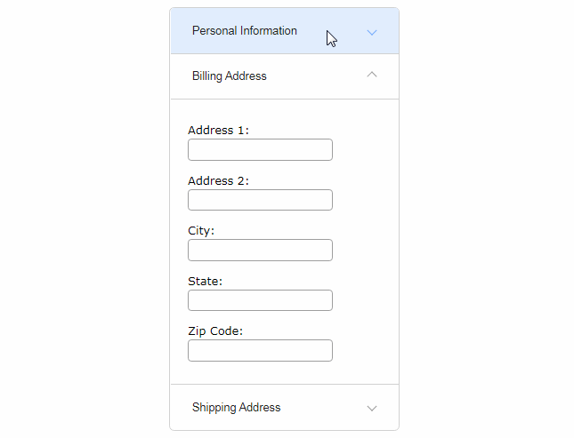
Components
<accordion>
Props
| Prop | Type | Default | Required | Description |
|---|---|---|---|---|
| modelValue | Array | [] | No | Array of indexes of active tab panels. Defaults to an empty array - no panels will be open |
| headerTag | String | h3 | No | HTML tag to be used for rendering around the button toggle of each accordion panel header |
| collapsible | Boolean | true | false | Controls whether all accordion panels can be collapsed or if at least one has to be open at all times |
| expandable | Boolean | false | false | Controls whether multiple accordion panels can be open at the same time |
Events
None
<accordion-panel>
Props
None
Events
None
<accordion-panel-header>
Props
None
Events
None
<accordion-panel-content>
Props
None
Events
None
Project setup
yarn
Compiles and hot-reloads for development
yarn serve
Compiles and minifies for production
yarn build