Vue Step Progress Indicator
This is a simple, very customizable step progress indicator, which can be used to indicate available steps in situations where the user has to fill a multi step form.

Installation
Use the package manager npm to install Vue Step Progress Indicator.
npm install --save vue-step-progress-indicator
Usage
Installation
Import the component, register the component and you are good to go!
import VueStepProgressIndicator from "vue-step-progress-indicator";

// register as component
components: {
    VueStepProgressIndicator,
},
Using component
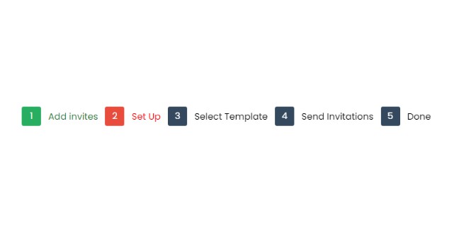
<vue-step-progress-indicator
    :steps="[
        'Add invites',
        'Set Up',
        'Select Template',
        'Send Invitations',
        'Done',
    ]"
    :active-step="0"
    :is-reactive="true"
    @onStepChanged="onStepChanged"
    @onEnterFinalStep="onEnterFinalStep"
/>
Props
| Name | Type | Usage |
|---|---|---|
| steps | Array | Indicates a list of labels to be displayed for each step |
| active-step | Number | Indicates the currently active step |
| is-reactive | Boolean | If true, the progress bubbles will be clickable, and events will be emitted on user click |
| reactivity-type | String | If is-reactive is true, this can be used to define which step indicators the user can click. Values that can be passed are: all, backward, forward, single-step. All will make all the indicators clickable, backward will be only clicking previous steps possible, forward will make only forward buttons clickable, single-step will make one step backward and forward clickable |
| show-label | Boolean | If true, labels will be displayed |
| show-bridge | Boolean | If true, the bridges will be displayed (bridges will be displayed on small devices, irrespective of this) |
| show-bridge-on-small-devices | Boolean | If false, the bridges will be hidden even on smaller devices |
| styles | Object | Provide custom style for various UI components |
| colors | Object | Provide colors for various UI components |
Events
| Name | Usage |
|---|---|
| onStepChanged | Fired if is-reactive is true, and user clicks on some step |
| onEnterFinalStep | Fired if is-reactive is true, and user is on the final step |
Customization
This package has been created by taking your customization needs in mind. You can not only provide colors for components for different states (active, inactive and completed), you can do custom styling for each component in the UI. Here is an example.
// this is the default style being used in the package
// set this as data in the parent component
styleData: {
    progress__wrapper: {
        display: "-ms-flexbox",
        display: "flex",
        flexWrap: "wrap",
        display: "flex",
        justifyContent: "flex-start",
        margin: "1rem 0",
    },
    progress__block: {
        display: "flex",
        alignItems: "center",
    },
    progress__bridge: {
        backgroundColor: "grey",
        height: "2px",
        flexGrow: "1",
        width: "20px",
    },
    progress__bubble: {
        margin: "0",
        padding: "0",
        lineHeight: "30px",
        display: "flex",
        justifyContent: "center",
        alignItems: "center",
        height: "30px",
        width: "30px",
        borderRadius: "100%",
        backgroundColor: "transparent",
        border: "2px grey solid",
        textAlign: "center",
    },
    progress__label: {
        margin: "0 0.8rem",
    },
}

// use above data as prop
<vue-step-progress-indicator
    :styles="styleData"
/>
You may also want to customize the colors of components. The progress bubbles can have one of three states, active, inactive & completed. You can set color, backgroundColor, borderColor for each component. You can pass colors for each component as:
// this is the default colors being used in the package
// set this as data in the parent component
colorData: {
    progress__bubble: {
        active: {
            color: "#fff",
            backgroundColor: "#e74c3c",
            borderColor: "#e74c3c",
        },
        inactive: {
            color: "#fff",
            backgroundColor: "#34495e",
            borderColor: "#34495e",
        },
        completed: {
            color: "#fff",
            borderColor: "#27ae60",
            backgroundColor: "#27ae60",
        },
    },
    progress__label: {
        active: {
            color: "#e74c3c",
        },
        inactive: {
            color: "#34495e",
        },
        completed: {
            color: "#27ae60",
        },
    },
    progress__bridge: {
        active: {
            backgroundColor: "#e74c3c",
        },
        inactive: {
            backgroundColor: "#34495e",
        },
        completed: {
            backgroundColor: "#27ae60",
        },
    },
},

// use above data as prop
<vue-step-progress-indicator
    :colors="colorData"
/>
Screenshots
On large devices, the labels are shown and the bridges are hidden by default.
On smaller devices, the labels are hidden and the bridges are shown by default.