Vue3 Multi Stepper
A simple vue3 multi-stepper component
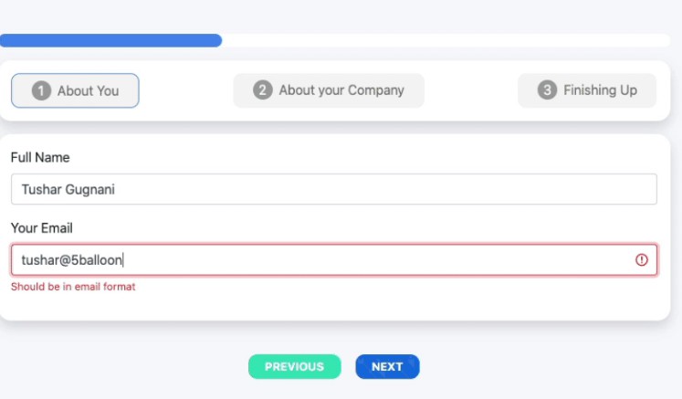
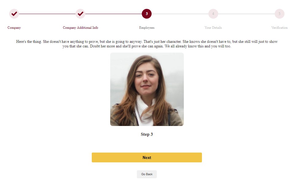
Demo
You can try a live demo here
Video Demo
vue3-stepper.mp4
Key Features
- Keep track of current step
- Change step content
- Step Validation using the validateStep function
- Configure finalization
- Show loading spinner
- Customizable
- Colors
- Titles
- Icons
- Button text
How To Use
Install
$ npm install vue3-multi-stepper
Template & Script
<Vue3MultiStepper
    v-model:step="step"
    :tabs="tabs"
    primaryColor1="#79031D"
    primaryColor2="#F2E6E8"
    backText="Go Back"
    nextText="Next"
    doneText="Finish"
    :loading="loading"
    :finalize="handleFormSubmission"
    :validateStep="validateStep"
  >
  <template #1><!-- Step 1 Content --></template>
  <template #2><!-- Step 2 Content --></template>
  <template #3><!-- Step 3 Content --></template>
  <template #3><!-- Step 4 Content --></template>
  <template #3><!-- Step 5 Content --></template>
</Vue3MultiStepper>
<script>
import { computed } from "vue";
import { Vue3MultiStepper } from "vue3-multi-stepper";

export default {
  components: {
    Vue3MultiStepper,
  },
  name: "App",
  data() {
    return {
      step: 1,
      loading: false,
      // NB: Use computed properties just in case you intend using translations (e.g this.$t)
      tabs: computed(() => {
        return [
          {
            title: "Company",
            iconSuccess: null,
            isValid: true,
          },
          {
            title: "Company Additional Info",
            iconSuccess: null,
            isValid: true,
          },
          {
            title: "Employees",
            iconSuccess: null,
            isValid: true,
          },

          {
            title: "Your Details",
            iconSuccess: null,
            isValid: true,
          },
          {
            title: "Verification",
            iconSuccess: null,
            isValid: true,
          },
        ];
      }),
    };
  },

  methods: {
    async handleFormSubmission() {
      this.loading = true;

      // After 2 seconds, reload the page and start the flow again
      setTimeout(() => {
        location.reload();
      }, 2000);
    },

    validateStep(step) {
      // Perform validation based on the current step
      // Return true if the step is valid, otherwise return false
      if (step === 1) {
        return this.step1Check();
      } else if (step === 2) {
        return this.step2Check();
      } else if (step === 3) {
        return this.step3Check();
      } else if (step === 4) {
        return this.step4Check();
      }

      return true; // Default to true if no validation is implemented
    },


    /* <<<CHECKER FUNCTIONS>>>
     * These functions are responsible for performing a check or validation and returning a boolean value.
     * If the returned value is `true`, it indicates that the check has passed successfully, allowing the code to proceed to the next step in the JavaScript execution flow.
     *
     * This function is commonly used in multi-step processes or conditional branching scenarios. It helps determine whether the conditions required for the next step to be executed have been met.
     *
     * The implementation details of the check performed in each function may vary depending on the specific requirements of the software being developed. It could involve verifying certain data, validating user input, or checking the state of the application.
     *
     * Upon receiving a `true` result from the function, the calling code can safely proceed to execute the subsequent steps or perform further actions. If `false` is returned, it indicates that the check failed, and appropriate actions can be taken to handle the failed condition.
     *
     * It is important to note that this function plays a crucial role in determining whether the code can progress to the next step based on the successful completion of a specific check or condition.
     *
     * @returns {boolean} - `true` if the check succeeds, allowing the code to proceed to the next step; `false` if the check fails, indicating the need for alternative actions.
     */

    step1Check() {
      return true;
    },
    step2Check() {
      return true;
    },
    step3Check() {
      return true;
    },
    step4Check() {
      return true;
    },
    step5Check() {
      return true;
    },
  },
};
</script>
API Props
/**
 * Contains the current step. Very similar to a
 * `value` attribute on an input. In most cases, you'll want
 * to set this as a two-way binding, using the `v-model` directive.
 * @type {Number}
 */
step: {
  type: Number,
  default: 1
},

/**
 * Contains the steps with custom titles and icons.
 * @type {Array}
 *
 * @param {Image} iconSuccess - You can point to an imported icon from you assets like:
 * import CheckMark from '../assets/check-mark.png'
 * If you set it to null, a default SVG will be used with primary color 1.
 *
 * @param {boolean} isValid - Used to determine if the user can move to the next step.
 */
tabs: {
  type: Array,
  default: reactive([
    {
      title: 'Step 1',
      iconSuccess: null,
      isValid: true
    },
    {
      title: 'Step 2',
      iconSuccess: null,
      isValid: true
    },
    {
      title: 'Step 3',
      iconSuccess: null,
      isValid: true
    }
  ])
},

/**
 * Function that will validate each step.
 * @type {Function}
 */
validateStep: {
  type: Function,
  default: () => true,
},

/**
 * Function that will run after all steps are completed (done button is clicked).
 * @type {Function}
 */
finalize: {
  type: Function,
  default: function () {
    return {}
  }
},

/**
 * Text for back button.
 * @type {String}
 */
backText: {
  type: String,
  default: 'Back'
},

/**
 * Text for next button.
 * @type {String}
 */
nextText: {
  type: String,
  default: 'Next'
},

/**
 * Text for done button.
 * @type {String}
 */
doneText: {
  type: String,
  default: 'Done'
},

/**
 * Show loading spinner on done button
 * @type {Boolean}
 */
loading: {
  type: Boolean,
  default: false
},

/**
 * Primary Color 1
 * @type {String}
 */
primaryColor1: {
  type: String,
  default: 'orange'
},

/**
 * Primary Color 2
 * @type {String}
 */
,
primaryColor2: {
  type: String,
  default: '#fff'
}
Dependencies
This software uses the following open source packages:
Dev Dependencies
Customizable CSS classes (Optional)
.steppy-item-counter {
  height: 40px !important;
  width: 40px !important;
  border: none !important;
}

.steppy-item-counter .number {
  font-size: 1rem !important;
}

.controls {
  display: flex !important;
  flex-direction: column-reverse !important;
  gap: 2rem !important;
}

.controls .btn {
  align-self: center !important;
}

.btn--default-2 {
  margin: auto !important;
  text-align: center !important;
  background: #f1c446 !important;
  border-radius: 4px !important;
  border: none !important;
  height: 40px !important;
  width: 40% !important;
  font-size: 1rem !important;
  color: #000407 !important;
  font-weight: bold !important;
}
License
· LinkedIn Lucky Pius