vue3-star-ratings
A simple, customizable component for star ratings

Features
- Uses svg for the stars, so it can scale without quality loss
- Customizable number of stars/ratings
- Customizable step for the rating eg 0.5 0r 0.2
- Customizable colors
Installation and usage
npm install vue3-star-ratings --save
You can use register it globally like this:
import { createApp } from "vue";
import App from "./App.vue";
import vue3StarRatings from "vue3-star-ratings";

const app = createApp(App);

app.component("vue3-star-ratings", vue3StarRatings);
then use it this in your component:
<vue3-star-ratings />
Alternatively, you can use it directly:
<!-- your-component.vue -->

<template>
  <vue3-star-ratings v-model="rating" />
</template>

<script>
import { defineComponent } from "vue";
import vue3starRatings from "vue3-star-ratings";

export default defineComponent({
  components: {
    vue3starRatings,
  },
});
</script>
Browser with CDN
<script src="https://unpkg.com/[email protected]"></script>
<script src="https://unpkg.com/vue3-star-ratings/dist/vue3-star-ratings.min.js"></script>
const { createApp } = Vue;
const App = {
  //Component code...
};
const app = createApp(App);
app.component("vue3StarRatings", Vue3StarRatings);
app.mount("#app");
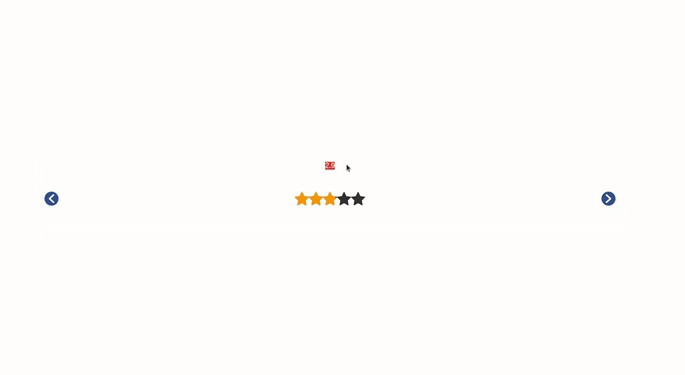
Vue3StarRatings uses v-model to sync the rating between the components and its parent :
<vue3-star-ratings v-model="rating"/>.
You can customize the component by taking a look at the props table below.
Props
| Prop | Description | Type | Default |
|---|---|---|---|
| starSize | This is the height and width of the stars in pixels | String Or Number | 32 |
| starColor | This is the color of the stars when active | String | #ff9800 |
| inactiveColor | This is the color of the stars when inactive | String | #333 |
| numberOfStars | This is the number of stars shown and also the totalRating rating possible | Number | 5 |
| step | This is the increment or decrement when the control buttons are clicked | Number | 0.5 |
| controlBg | This is the background of the control buttons | String | #2e5090 |
| controlColor | This is the color of the color buttons | String | #fff |
| controlSize | This is the size of the the control buttons | String Or Number | 24 |
| showControl | This is the option to choose if the control buttons are being shown | Boolean | true |
| disableClick | This is the option to disabled click on the stars, use in conjunction with the showControl Prop |
Boolean | false |
| v-model | Sync the rating between the component and its parent ('Where it is been used') |