? NuxtRating
Features
- Use whatever you like as a star
- View or retrieve a note
- Customisable colors.
- Customisable number of stars.
- Create read-only stars.
- SSR Friendly.
Quick Setup
- Add
nuxt-ratingdependency to your project
# Using pnpm
pnpm add nuxt-rating

# Using yarn
yarn add nuxt-rating

# Using npm
npm install nuxt-rating
- Add
nuxt-ratingto themodulessection ofnuxt.config.ts
export default defineNuxtConfig({
  modules: ["nuxt-rating"],
});
- Use
nuxt-ratingcomponent
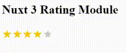
<NuxtRating :read-only="false" :ratingValue="1.2" />
Props Explanation
The following props can be passed to customize the appearance and behavior of the component:
ratingCount(optional, default: 5): The total number of rating levels available.ratingSize(optional, default: “32px”): The size of the rating meter.activeColor(optional, default: “#ffc700”): The color of the active rating level.inactiveColor(optional, default: “gray”): The color of the inactive rating levels.ratingValue(optional, default: 3.7): The initial rating value.ratingContent(optional, default: “★”): The content to be displayed for each rating level.readOnly(optional, default: true): Specifies whether the rating meter is read-only or interactive.
Events Explanation
The component emits the following events:
ratingSelected: Triggered when a rating level is selected. The event payload is the selected rating value.hoverRating: Triggered when the mouse hovers over the rating meter. The event payload is the mouse event object.