Vue Step Progress Bar
A simple Vue component that displays a Progress Bar with labels for each step.
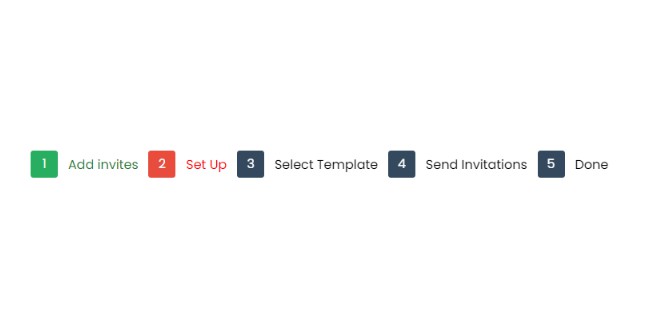
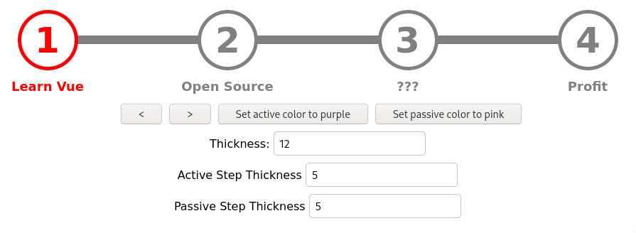
Demo
Installation
Install the plugin with npm:
npm install --save vue-step-progress
Usage
⚠️ The default settings use Font Awesome for the checkmark icon. You can change the css icon class by using the
'icon-class' prop.
Add the Library import in the components you want to use the progress bar in:
import StepProgress from 'vue-step-progress';

// import the css (OPTIONAL - you can provide your own design)
import 'vue-step-progress/dist/main.css';

// ...
// register the component in your Vue instance
  components: {
    'step-progress': StepProgress
  },
// ...
Put the step-progress element into your HTML where you want the Component to appear and pass the steps Array Prop
and the current-step Number prop.
<div>
  <step-progress :steps="mySteps" :current-step="currentStep" icon-class="fa fa-check"></step-progress>
</div>
Props
steps
A string array of all steps to be displayed. The Strings will be present as labels in the component. Example:
['Step 1', 'Step 2', 'Step 3']
current-step
A simple Number prop that defines the index of the active step. Example:
2
icon-class
Optional
The css class of the checkmark icon. Default:
fa fa-check
active-color
Optional
A String prop that defines the active step color. It is red by default. Example:
blue
passive-color
Optional
A String prop that defines the passive step color. It is gray by default. Example:
black
active-thickness
Optional
A Number prop that defines the active step thickness. It is 5 by default. Example:
10
passive-thickness
Optional
A Number prop that defines the passive step thickness. It is 5 by default. Example:
10
line-thickness
Optional
A Number prop that defines the line thickness. It is 12 by default. Example:
10
Development
It is recommended to develop and build inside a docker container. start.sh is a convenience script to help you with that.
To start a development server, execute:
./start.sh dev-container
This will setup a new docker container, install npm dependencies and start the development server under http://localhost:3000
Document all user-visible changes in the "Unreleased" section in CHANGELOG.MD.
Publishing (maintainer only)
In order to rebuild the files for publishing a new version on npm, execute this command:
./start.sh build
Create a the .npmrc file:
//registry.npmjs.org/:_authToken=<token>
Run
npm publish