storybook-addon-vue-info
A Storybook addon that shows component's information.
Install
npm install --save-dev storybook-addon-vue-info
Usage
Wrap story with withInfo function.
import { storiesOf } from '@storybook/vue'

import { withInfo } from 'storybook-addon-vue-info'

storiesOf('MyComponent', module)
  .add('foo', withInfo({
    summary: 'Summary for MyComponent'
  })(() => ({
    components: { MyAwesomeComponent },
    template: '<my-awesome-component/>'
  })))
Or, set this addon as a decorator.
import { storiesOf } from '@storybook/vue'

import VueInfoAddon from 'storybook-addon-vue-info'

storiesOf('MyComponent', module)
  .addDecorator(VueInfoAddon)
  .add('foo', () => ({
    components: { MyAwesomeComponent },
    template: '<my-awesome-component/>'
  })
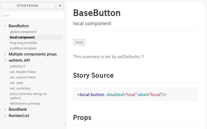
You can specify default options with setDefaults.
// config.js
import { setDefaults } from 'storybook-addon-vue-info'

setDefaults({
  header: false
})
Options
This addon accepts @storybook/addon-info like options.
| Name | Data type | Default value | Description |
|---|---|---|---|
header |
boolean |
true |
Whether to show header or not. |
source |
boolean |
true |
Whether to show source(usage) or not. |
styles |
object |
{} |
Styles override. See src/options/InfoAddonOptions.ts for available fields. |
summary |
string |
'' |
Summary for the story. Accepts Markdown. |
propTables |
(string\|Component)[]\|null |
null |
Display prop tables with these components. string[] is recommended. If specified null or false, this addon use outermost tag in template. |
Example
For real example, see example directory.