tb-skeleton
a vue component about toy bricks of skeleton screen loading.
install
$ npm i tb-skeleton -s
use npm
  import Vue from 'Vue'
  import skeleton from 'tb-skeleton'
  import  'tb-skeleton/dist/skeleton.css'
  Vue.use(skeleton)
use cdn
<script src="https://cdn.jsdelivr.net/npm/[email protected]/dist/tb-skeleton.js"></script>
<link ref="stylesheet" href="https://cdn.jsdelivr.net/npm/[email protected]/dist/skeleton.css"></script>
live example
start
<template>
  <div width="20%">
    <tb-skeleton :aspect-ratio="1" :theme="opacity" :shape="circle"></tb-skeleton>
  </div>
</template>
<script>
</script>
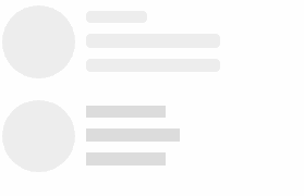
use skeleton
use skeleton component, you can set common props
<template>
  <div>
    <skeleton :theme="opacity" :shape="radius" :bg-color="#dcdbdc">
     <tb-skeleton  width="30%" :aspect-ratio="1"  :shape="circle" :bg-color="#eee"></tb-skeleton>
     <tb-skeleton  width="30%" :aspect-ratio=".3"></tb-skeleton>
     <tb-skeleton  width="30%" :aspect-ratio=".3"></tb-skeleton>
   </skeleton>
  </div>
</template>
<script>
  import {TbSkeleton,Skeleton} from 'tb-skeleton'
  export default {
    components: {
      TbSkeleton,
      Skeleton
    }
  }
</script>
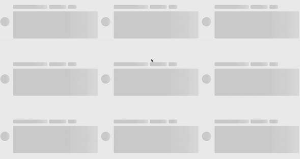
use grid layout
about grid layout,please see simple-grid
<template>
<skeleton theme="opacity" style="width:200px" shape="radius">
    <row>
      <col :span="8">
        <tb-skeleton :aspect-ratio="1" shape="circle">
        </tb-skeleton>
      </col>
      <col :span="16">
        <row>
          <col :span="12" style="padding-left: 10px;margin-top: 5px">
            <tb-skeleton :aspect-ratio="0.2"></tb-skeleton>
          </col>
          <col :span="24" style="padding-left: 10px;margin-top: 10px">
            <tb-skeleton :aspect-ratio="0.1"></tb-skeleton>
          </col>
          <col :span="24" style="padding-left: 10px;margin-top: 10px">
            <tb-skeleton :aspect-ratio="0.1"></tb-skeleton>
          </col>
        </row>
      </col>
    </row>
  </skeleton>
</template>
<script>
  import {Col,Row} from 'simple-grid'
  import {TbSkeleton,Skeleton} from 'tb-skeleton'
  export default {
    components: {
      tb-skeleton,
      skeleton,
      Col,
      Row
    }
  }
</script>
skeleton Component
props
| param | description | type | default |
|---|---|---|---|
| theme | opacity,gradient,flex-outer,flex-inner, normal |
String | normal |
| shape | tb-skeleton shape, circle、rect、radius |
String | |
| bgColor | tb-skeleton background-color | String | |
| duration | tb-skeleton animation duration | String,Number |
tb-skeleton Component
props
| param | description | type | default |
|---|---|---|---|
| theme | the same as skeleton theme | String | normal |
| shape | the same as skeleton shape | String | rect |
| bgColor | the same as skeleton bgColor | String | #dcdcdc |
| aspectRatio | ratio about width,height | Number | 1 |
| height | the tb-skeleton height | Number,String | |
| width | the tb-skeleton width | Number,String | 100% |
| duration | the tb-skeleton animation duration | String,Number |