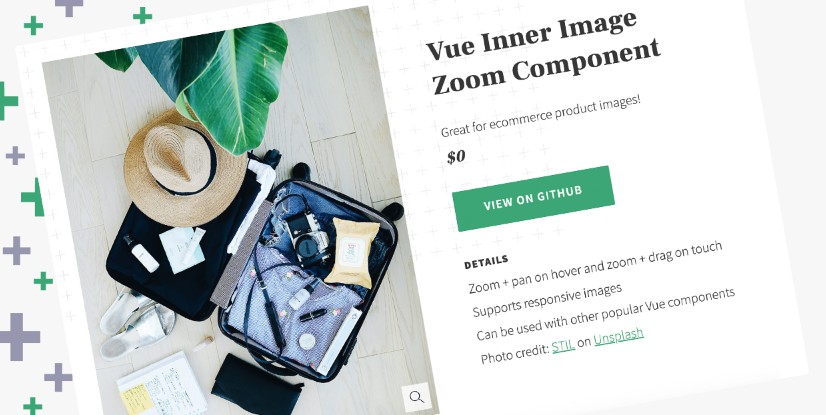
vue-inner-image-zoom
A Vue component for magnifying an image within its original container. The zoom behavior is triggered on click and the image can be moved by dragging on touch devices and by either dragging or hover panning on non-touch devices. The component supports responsive images and optional fullscreen zoom on mobile.
Installation
NPM
npm install vue-inner-image-zoom
Yarn
yarn add vue-inner-image-zoom
Styling
Import the CSS from your node_modules directory using:
import 'vue-inner-image-zoom/lib/vue-inner-image-zoom.css';
Usage
Import the component and include in your template:
import InnerImageZoom from 'vue-inner-image-zoom';

...

export default {
  components: {
    'inner-image-zoom': InnerImageZoom
  }
}

...

<inner-image-zoom src="/path/to/image.jpg" zoomSrc="/path/to/zoom-image.jpg" />
This is the simplest usage. For additional examples, visit the demo page.
Props
| Prop | Type | Default | Description |
|---|---|---|---|
| src | String | (Required) URL for the original image. | |
| srcSet | String | Default srcset attribute for a responsive original image. | |
| sizes | String | Default sizes attribute for use with srcset. | |
| sources | Array | A list of image sources for using the picture tag to serve the appropriate original image (see below for more details). | |
| zoomSrc | String | URL for the larger zoom image. Falls back to original image src if not defined. | |
| alt | String | Alternative text for the original image. | |
| moveType | String | pan | pan or drag. The user behavior for moving zoomed images on non-touch devices. |
| fadeDuration | Number | 150 | Fade transition time in milliseconds. If zooming in on transparent images, set this to 0 for best results. |
| fullscreenOnMobile | Boolean | false | Enables fullscreen zoomed image on touch devices below a specified breakpoint. |
| mobileBreakpoint | Number | 640 | The maximum breakpoint for fullscreen zoom image when fullscreenOnMobile is true. |
| className | String | Custom classname for styling the component. | |
| afterZoomIn | Function | Function to be called after zoom in. | |
| afterZoomOut | Function | Function to be called after zoom out. |
Sources
This prop accepts an array of objects which it uses to create a picture tag and source elements. The component looks for the following optional properties and you can find additional details on responsive images here:
| Prop | Type | Default | Description |
|---|---|---|---|
| srcSet | String | Srcset attribute for source tag. | |
| sizes | String | Sizes attribute for source tag. | |
| media | String | An attribute containing a media condition for use with the srcset. | |
| type | String | An image MIME type. This is useful for using newer formats like WebP. |
Issues
Please submit issues or requests here.
Most of the implementation choices for this component are based on use cases I've encountered in the past. For example, I chose a click to zoom trigger because it was requested on previous product detail pages I've worked on. If there's a demand for zoom on hover or other additional functionality, I'd be open to taking a look.
One of my big motivations for adapting this component from the original React Inner Image Zoom was to give Vue a try so don't hesitate to flag any areas in the code or the documentation where I'm not following Vue's best practices.