A Vue component to easily render tabs dynamically
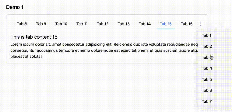
The package contains a Vue 3 component to easily display some tabs.
Along with the standard Features of the original tabs component, Vue 3 Dynamic Tabs allows you to:
- Set content of tabs to be whatever you want, using vue 3 teleport.
- Set tab buttons to be wherever you want.
- Style tabs to look however you want.
This is how it can be used:
<div>
    <tabs :options="{ useUrlFragment: false }" @clicked="tabClicked" @changed="tabChanged" nav-item-class="nav-item">
        <tab name="First tab">
            This is the content of the first tab
        </tab>
        <tab name="Second tab">
            This is the content of the second tab
        </tab>
        <tab name="Disabled tab" :is-disabled="true">
            This content will be unavailable while :is-disabled prop set to true
        </tab>
        <tab id="oh-hi-mark" name="Custom fragment">
            The fragment that is appended to the url can be customized
        </tab>
        <tab prefix="<span class='glyphicon glyphicon-star'></span> "
             name="Prefix and suffix"
             suffix=" <span class='badge'>4</span>">
            A prefix and a suffix can be added
        </tab>
    </tabs>
</div>
When reloading the page the component will automatically display the tab that was previously opened.
The rendered output adheres to the ARIA specification.
Installation
You can install the package via yarn:
yarn add vue3-tabs-component
or npm:
npm install vue3-tabs-component --save
Usage
The most common use case is to register the components globally:
import { createApp } from 'vue'
import {Tabs, Tab} from 'vue3-tabs-component';

createApp(App)
    .component('tabs', Tabs)
    .component('tab', Tab)
    .mount('#app')
Alternatively you can do this to register the components:
import Vue from 'vue';
import {Tabs, Tab} from 'vue3-tabs-component';

Vue.component('tabs', Tabs);
Vue.component('tab', Tab);
On your page you can now use html like this to render tabs:
<div>
    <tabs>
        <tab name="First tab">
            First tab content
        </tab>
        <tab name="Second tab">
            Second tab content
        </tab>
        <tab name="Third tab">
            Third tab content
        </tab>
    </tabs>
</div>
By default, it will show the first tab.
If you click on a tab a href representation of the name will be append to the url. For example clicking on the tab Second tab will append #second-tab to the url.
When loading a page with a fragment that matches the href of a tab, it will open up that tab. For example visiting /#third-tab will open up the tab with name Third tab.
Remembering the last opened tab
By default, the component will remember which was the last open tab for 5 minutes. If you, for instance, click on Third tab and then visit / the third tab will be opened.
You can change the cache lifetime by passing the lifetime in minutes in the cache-lifetime property of the tabs component.
<tabs cache-lifetime="10">
  ...
</tabs>
Disable modifying the url fragment
When using with other libraries that use the url fragment, you can disable modifying the url fragment by passing the useUrlFragment options. This helps using it with vue-router, or using vue3-tabs-component twice in the same page.
<tabs :options="{ useUrlFragment: false }">
  ...
</tabs>
Callbacks
Tabs have two events to which you can bind: changed and clicked
<tabs @clicked="tabClicked" @changed="tabChanged">
  ...
</tabs>
For example:
export default {
    methods: {
        tabClicked (selectedTab) {
            console.log('Current tab re-clicked:' + selectedTab.tab.name)
        },
        tabChanged (selectedTab) {
            console.log('Tab changed to:' + selectedTab.tab.name)
        }
    }
}
changed is emitted when the tab changes and can be used as handle to load data on request.
clicked is emitted when an active tab is re-clicked and can be used to e.g. reload the data in the current tab.
Adding a suffix and a prefix to the tab name
You can add a suffix and a prefix to the tab by using the suffix and prefix attributes, which can contain HTML.
<tab prefix="my prefix - " name="First tab" suffix=" - my suffix">
    First tab content
</tab>
The title of the tab will now be my prefix - First tab - my suffix.
The fragment that’s added to the url when clicking the tab will only be based on the name of a tab, the name-prefix and name-suffix attributes will be ignored.
Customizing fragments
When clicking on a tab it’s name will be used as a fragment in the url. For example clicking on the Second tab will append #second-tab to the current url.
You can customize that fragment by using the id attribute.
<div>
    <tabs>
        <tab id="custom-fragment" name="My tab">
            First tab content
        </tab>
    </tabs>
</div>
Clicking on My tab will then append #custom-fragment to the url.
Setting a default tab
When disabling the cache, it can be useful to specify a default tab to load which is not the first one. You can select this by passing the defaultTabHash option.
<tabs :options="{ defaultTabHash: 'second-tab' }">
    <tab id="first-tab" name="First tab">
        First tab content
    </tab>
    <tab id="second-tab" name="Default tab">
        Second tab content
    </tab>
</tabs>
CSS
Each node can be styled by specifying classes.
The output HTML classes can be overridden by using the following Tabs component attributes:
wrapper-classpanels-wrapper-classnav-classnav-item-classnav-item-active-classnav-item-disabled-classnav-item-link-classnav-item-link-active-classnav-item-link-disabled-class
The Tab content (section) class can be overridden with the panel-class attribute
If no custom classes are set, the following classes are used as default:
<div class="tabs-component"> // wrapper-class
    <ul class="tabs-component-tabs"> // nav-class
        <li class="tabs-component-tab is-disabled"> // nav-item-class + nav-item-disabled-class
            <a class="tabs-component-tab-a is-disabled">…</a> // nav-item-link-class + nav-item-link-disabled-class
        </li>
        <li class="tabs-component-tab is-active"> // nav-item-class + nav-item-active-class
            <a class="tabs-component-tab-a is-active">…</a> // nav-item-link-class + nav-item-link-active-class
        </li>
    </ul>
    <div class="tabs-component-panels"> // panels-wrapper-class
        <section class="tabs-component-panel"> // Tab > panel-class
            …
        </section>
    </div>
</div>
Security
If you discover any security related issues, please contact Jakub Potocký instead of using the issue tracker.
Credits
This package is a fork of a fork of the popular spatie/vue-tabs-component Vue 2 package, which has been discontinued by Spatie. As well as most recently, the jacobs63/vue3-tabs-component by Jakub Potocký.
License
The MIT License (MIT). Please see License File for more information.


