Nice-Numeric-Input
Nice-Numeric-Input is a modern, rich featured and highly customisable numeric input built on Vue. Capable of formatting as the user types, including currency formatting. With no extra dependencies other than Vue itself.
Getting Started
Installation
> npm install nice-numeric-input
Usage
Import
import NiceNumericInput from 'nice-numeric-input'
Register
export default Vue.extend({
    //...
    components: { NiceNumericInput }
    //...
});
For a full list of props see the Reference Props section.
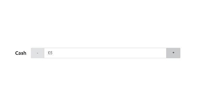
<nice-numeric-input v-model="cashValue"
                    placeholder="Enter a cash value"
                    label="Cash"
                    name="example"
                    currency="GBP"
                    locale="en-GB"
                    :max="100"
                    :min="0" />
Reference
Props
| Prop | Type | Required | Default Value | Notes |
|---|---|---|---|---|
| value | Number |
Yes | 0 |
Use v-model to get two-way binding |
| id | String |
No | "nice-numeric-input" |
|
| name | String |
No | "nice-numeric-input" |
|
| label | String |
Yes | Required for accessibility, use hide-label to remove the visual label |
|
| placeholder | String |
No | ||
| step | Number |
No | 1 |
The amount to increase or decrease when using the step buttons |
| min | Number |
No | NEGATIVE_INFINITY |
Anything entered below this will fail the isValid check |
| max | Number |
No | POSITIVE_INFINITY |
Anything entered above this will fail the isValid check |
| isValid | Boolean |
No | Basic internal validation, use the .sync modifier to get changes |
|
| disabled | Boolean |
No | false |
Disable the entire component |
| locale | String |
No | window.navigator.language \|\| "en-US" |
Standard BCP 47 language tag |
| currency | String |
No | null |
When null currency formatting is turned off. Otherwise it can be any currency code e.g. USD, EUR, JPY |
| minDecimalPlaces | Number |
No | 0 |
|
| maxDecimalPlaces | Number |
No | 2 |
|
| integerOnly | Boolean |
No | false |
Prevents decimal numbers being entered, entries are rounded to the nearest integer |
| noControls | Boolean |
No | false |
Removes the step buttons |
| hideLabel | Boolean |
No | false |
Removes the visual label |
| decreaseTitle | String |
No | "Decrease" |
The button title for accessibility |
| increaseTitle | String |
No | "Increase" |
The button title for accessibility |
| increaseText | String |
No | "+" |
The text displayed on the increase step button |
| decreaseText | String |
No | "-" |
The text displayed on the decrease step button |
| superIncreaseText | String |
No | "++" |
The text displayed on the increase step button when super step is active (Ctrl or Alt) |
| superDecreaseText | String |
No | "--" |
The text displayed on the decrease step button when super step is active (Ctrl or Alt) |
| ultraIncreaseText | String |
No | "+++" |
The text displayed on the increase step button when ultra step is active (Ctrl + Alt) |
| ultraDecreaseText | String |
No | "---" |
The text displayed on the decrease step button when ultra step is active (Ctrl + Alt) |
| superStep | Number |
No | 10 |
The amount to change during a super step |
| ultraStep | Number |
No | 100 |
The amount to change during an ultra step |
| labelClass | String |
No | A custom class to apply to the visual label | |
| inputClass | String |
No | A custom class to apply to the input field | |
| decreaseButtonClass | String |
No | A custom class to apply to the decrease step button | |
| increaseButtonClass | String |
No | A custom class to apply to the increase step button | |
| wrapperClass | String |
No | A custom class to apply to the top level component element | |
| superStepClass | String |
No | A custom class to apply to both step buttons when super step is active | |
| ultraStepClass | String |
No | A custom class to apply to both step buttons when ultra step is active |
Events
| Event | Emitted Type | Notes |
|---|---|---|
| input | Number |
Used automatically by a v-model binding. Can be bound manually, fires when the value is changed |
| update:isValid | Boolean |
Used automatically by the .sync modifier on isValid prop. Can be bound manually, fires when the valid value changes. |