k-progress
A Vue plugin, linear progress bar.
? Install
npm install -S k-progress
# or
yarn add k-progress
? Begin Start
// main.js
import KProgress from 'k-progress';
Vue.component('k-progress', KProgress);
? Attributes
| Attribute | Type | Default | Optional | explain |
|---|---|---|---|---|
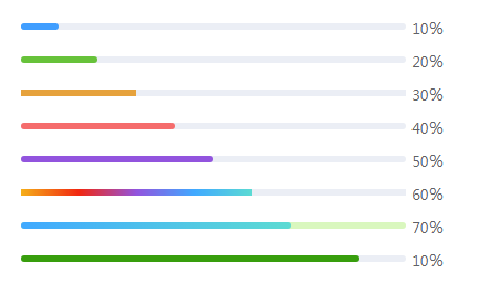
| percent | Number | 0 | 0-100 | Percent (Required) |
| line-height | Number | 6 | Progress bar height | |
| type | String | line |
line / lump |
Progress bar type |
| status | String | success / warning / error |
Progress bar status | |
| color | String / Array / Function | Progress bar color; When using Array, the limit is 6; When using Function, the argument is percent |
||
| color-flow | Boolean | false |
Whether to enable color flow | |
| flow-second | Number | 5 | 1-6 | The time required for the flow, that is, the smaller the time, the faster the speed |
| bg-color | String | #ebeef5 |
Color code | Progress bar background color |
| border | Boolean | true |
Whether arc | |
| show-text | Boolean | true |
Whether to show progress bar text | |
| format | Function | Custom text display, parameter is percent |
||
| cut-width | Number | 1 | lump width |
|
| cut-color | String | #ebeef5 |
Color code | lump color |
| active | Boolean | false |
Whether to enable dynamic effects | |
| active-color | String | Dynamic effect color |