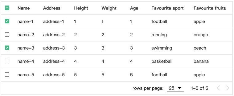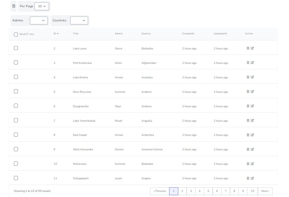
VUE DATA TABLE
VueDataTable is a Vue plugin that adds advanced features to an HTML table. It was inspired by DataTable jQuery Plugin, but it was written from scratch using Vue.
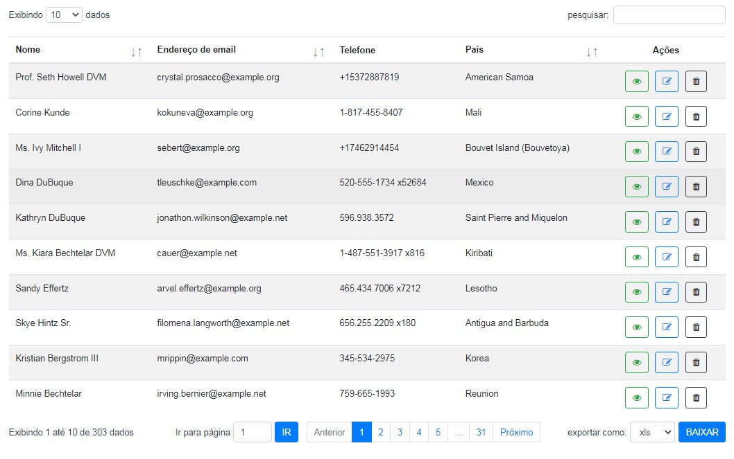
Features
- Multiple Column Sorting
- Pagination
- Search Filter
- Export data (XLS, JSON, CVS, or TXT)
- Custom component cell
- Custom Text
Demo
The best way to see if a package suits your needs is by viewing and editing a
demo project. Here are some code playgrounds in which you can test
VueDataTable.
Getting started
Installation
npm install --save @andresouzaabreu/vue-data-table
Set up
import DataTable from "@andresouzaabreu/vue-data-table";
Vue.component("data-table", DataTable);
Don"t forget to add the style sheets
import "bootstrap/dist/css/bootstrap.min.css";
import "@andresouzaabreu/vue-data-table/dist/DataTable.css";
Use
<template>
    <div>
        <data-table v-bind="bindings"/>
    </div>
</template>
<script>
export default {
    computed: {
        bindings() {
            return {
                columns: [/*the columns*/]
                data: [/*the data*/]
                /* other props...*/
            }
        }
    },
}
</script>
Note Notice that v-bind will take all key-value pairs in the object (in
this case, the bindings), and pass them as props to the VueDataTable. So,
this is a shortcut to pass multiple props at once.
Configuration
Only data e columns are required. Other props are optional.
| prop | type | default | description |
|---|---|---|---|
| data | Array |
- | An array of objects with the data to be displayed in the table |
| columns | Array |
- | An array of objects that specifies how to render each column. Not required if columnKeys is presented. |
| columnKeys | Array |
- | An array of strings corresponding to the keys of each object in data. This is discarded if columns is set. |
| lang | String |
en |
The default language |
| perPageSizes | Array |
[10, 25, 50, 100] | The options for the number of rows being displayed per page |
| defaultPerPage | Number |
10 | The default number of entries. If unset, then it will be the first value of perPageSizes |
| showPerPage | Bool |
true |
Whether to show the PerPage component |
| showEntriesInfo | Bool |
true |
Whether to show the EntriesInfo component |
| showSearchFilter | Bool |
true |
Whether to show the SearchFilter component |
| showPagination | Bool |
true |
Whether to show the Pagination component |
| showDownloadButton | Bool |
true |
Whether to show the button to download the table's data |
| tableClass | String |
table table-striped table-hover |
The css classes of the table |
| sortingMode | String |
multiple |
multiple enables multiple-column sorting. single enables single-column sorting. |
| sortingIndexComponent | Object, String |
DataTableSortingIndex |
The Vue component for the sort index for sortable columns |
| sortingIconComponent | Object, String |
DataTableSortingIcon |
The Vue component for the sort icon for sortable columns |
| footerComponent | Object, String |
null |
The Vue component for a custom table footer |
| allowedExports | Array |
["xls", "csv", "json", "txt"] |
The options the user can export the data to. Only four export types are available. |
Columns
| key | type | default | description |
|---|---|---|---|
| key | String |
- | The key of the objects in the data prop. The value of the matching key will be displayed in a table cell |
| title | String |
titleCase(key) |
The title to be displayed in the th element. If not specified, it will capitalize the key and then remove its dashes and underscores |
| searchable | Bool |
true |
Whether to allow filtering the objects in data by matching the search text in the object's key |
| sortable | Bool |
true |
Whether to allow sorting the column. It will use the key to sort the objects in the data |
| type | String |
string |
Where to sort the column as a string or as a number. Allowed values are string and number. |
| sortingFunction | Function |
- | Custom function provided by the user to sort the column. |
| index | Number |
0 | A higher index puts the column to the right of the table. A lower index puts the column to the left of the table. |
| component | Object,String |
- | Custom Vue Component provided by the user. This component should have a prop called data, which contains the data of current row. |
If columns is not defined, then columnKeys must be defined and it will be
mapped to a columns array with the default parameters. Example:
// we can define the columns
config = {
    data: users,
    columns: [
        {
            key: "name",
        },
        {
            key: "email",
            title: "Email Address",
            sortable: false,
        },
        {
            key: "phone",
            sortable: false,
            searchable: false,
            /* this will make this column appear to the right of the table
            since its index is greater than others*/
            index: 100,
        },
        {
            key: "permissions",
            /* custom function sort users by which user has more permissions */
            sortingFunction: function(a, b) {
                // permissions is an array
                return a.permissions.length - b.permissions.length;
            },
            /* custom component to display the permissions */
            component: UserPermissionList,
        }
    ]
}

// or use columnKeys shortcut
config = {
    data: user,
    columnKeys: ["name", "email", "registered_at", "last_access_at"]
},

// which will take the default column and map the array into this
[
    {
        key: "name",
        title: "Name",
        sortable: true,
        searchable: true,
        index: 0
    },
    {
        key: "email",
        title: "Email",
        sortable: true,
        searchable: true,
        index: 0
    },
    {
        key: "registered_at",
        title: "Registered at",
        sortable: true,
        searchable: true,
        index: 0
    },
    {
        key: "last_access_at",
        title: "Last access at",
        sortable: true,
        searchable: true,
        index: 0
    },
]
Custom component
In the example above, we used a custom component called UserPermissionList.
Below is a sample of that custom component.
<template>
    <div>
        List of permissions for the user {{ data.name }} :
        <ul>
            <li v-for="(permission, i) in data.permissions" :key="i">
                {{ permission }}
            </li>
        </ul>
    </div>
</template>
<script>
export default {
    name: "UserPermissionList",
    props: {
        data: {
            type: Object,
            required: true
        }
    }
}
</script>
Another example, using action buttons:
<template>
    <div class="action-buttons">
        <button class="btn btn-outline-success" @click="handleAction('view')">
            <i class="fa fa-eye"></i>
        </button>
        <button class="btn btn-outline-primary" @click="handleAction('edit')">
            <i class="fa fa-edit"></i>
        </button>
        <button class="btn btn-outline-dark" @click="handleAction('delete')">
            <i class="fa fa-trash"></i>
        </button>
    </div>
</template>
<script>
export default {
    name: "ActionButtons",
    methods: {
        handleAction(actionName) {
            /* when the user clicks a button, that will trigger a mutation on our Vuex store
            The mutation may show a form for editing a resource, or maybe a popup box asking
            the user to confirm deleting a resource, or open a new page for the user to view
            a resource.
             */
            this.$store.commit(actionName, this.data)
        }
    },
    props: {
        data: {
            type: Object,
            required: true,
        },
    },
};
</script>
Text
Currently, VueDataTable has support for three languages: English (en),
Brazilian Portuguese (pt-br), and Spanish(es). The lang prop specifies in
which language to display the text in our table.
If we want to add a custom text (maybe because there is no language support or
because we want something else), we have to set it in the text prop.
The following table shows the texts we can customize and their default values
for the English language.
| key | default |
|---|---|
| perPageText | "Show :entries entries" |
| infoText | "Showing :first to :last of :total entries" |
| infoTextFiltered | "Showing :first to :last of :filtered (filtered from :total entries)" |
| nextButtonText | "Next" |
| previousButtonText | "Previous" |
| paginationSearchText | "Go to page" |
| paginationSearchButtonText | "GO" |
| searchText | "search:" |
| downloadText | "export as:" |
| downloadButtonText | "DOWNLOAD" |
| emptyTableText | "No matching records found" |
Note: Notice that the placeholders :first, :last, :total, and
filtered will be automatically replaced with the proper numbers.
Example code:
parameters() {
    return {
        data: [/**/],
        columns: [/**/],
        text: {
            PerPageText: "Number of users per page :entries",
            infoText: "Displaying :first to :last of :total users",
            emptyTableText: "No users found :(",
        }
    }
}
Adding global custom language
If your lang is not yet supported, you can add a new language and use it in any
VueDataTable instance as follow:
import { languageServiceProvider } from "@andresouzaabreu/vue-data-table";
const loremIpsumLanguage = {
    perPageText: "lorem ppsum",
    nextButtonText: "labore nostrud",
    /* more ... */
};
languageServiceProvider.setLang("lorem", loremIpsumLanguage)

/**
 * @function setLang
 * @param {String} lang           the name of the language
 * @param {Object} translations   an object with the translated text
*/
You can also change any default text for an existing language and that will
reflect the changes globally. For example:
// the default text for the download button in the export component is "export as"
// we may want change that to "download as"
languageServiceProvider.setLangText("en", "downloadText", "download as:")

/**
 * @function setLangText
 * @param lang
 * @param {String} key     the key in the lang object
 * @param {String} text    the text will be display to the user
*/
Custom order of components
VueDataTable uses CSS's grid display to specify the position of its components
(search filter, pagination, entries info, per page options, download button).
We can specify the position of the components by including our custom
CSS/SCSS and overriding the defaults.
By default, this is how VueDataTable displays the components:
.data-table {
    display: grid;
    width: 100%;
    grid-template-columns: 25% 25% 25% 25%;
    &> div {
        margin-top: 1rem;
        max-width: 100%;
    }
    & > .data-table-search-filter, .data-table-pagination, .data-table-export-data {
        margin-left: auto
    }
    @media (min-width: 1401px) {
        grid-template-areas:
            "perPage search search search"
            "table table table table"
            "info pagination pagination download";
    }
    @media (min-width: 1051px) AND (max-width: 1400px) {
        grid-template-areas:
            "perPage search search search"
            "table table table table"
            "info pagination pagination pagination"
            ". . download download";
    }
    @media (min-width: 851px) AND (max-width: 1050px) {
        grid-template-areas:
            "perPage search search search"
            "table table table table"
            "pagination pagination pagination pagination"
            "info info download download";
    }
    @media (max-width: 800px) {
        & > .data-table-pagination {
            flex-wrap: wrap;
        }
    }
    @media (min-width: 651px) AND (max-width: 850px) {
        grid-template-areas:
            "perPage search search search"
            "table table table table"
            "pagination pagination pagination pagination"
            "info info info info"
            "download download download download";
    }
    @media (max-width: 650px) {
        grid-template-areas:
            "search search search search"
            "perPage perPage perPage perPage "
            "table table table table"
            "pagination pagination pagination pagination"
            "info info info info"
            "download download download download";
        & > .data-table-per-page {
            margin-left: auto
        }
    }
}
Feel free to copy the styles above, modify it, and then set the position of the
components as you want.
Custom Components
Besides a custom component for each column, you provide custom components
for the table's footer, the column's sorting icon (the icon displayed if
the columns is sorted), and the column's sorting index (the index of the
current column if it is being sorted and multi column sorting is enabled).
Footer
The property footerComponent sets the component to render the table's footer.
The component can be either the component Object, or a String equals to the
name of the registered component.
The footerComponent must be a <tfoot> HTML element and it must have the
properties data, dataDisplayed, dataFiltered. If the component does not
specify those properties in props, Vue will probably think they are some
custom HTML attribute and their values will be show as HTML attributes, which
is really messy.
The property data correspond to all data passed to VueDataTable. The
dataDisplayed corresponds to all data that is currently visible on the table.
The dataFiltered corresponds to all data that was filtered by a search query.
These properties can be used to perform common operations such as calculating
the sum of the values of the total rows of a certain column.
Example
Suppose we have a table that of fruits. The data is an array of objects
whose properties are name, price, and amount. We can provide a custom
footer to show the total amount of fruits bought and the total price.
The footer component would be something like:
<template>
  <tfoot v-show="dataDisplayed.length > 0">
    <td>Total</td>
    <td></td>
    <td>{{ totalAmount }}</td>
    <td>{{ totalPrice }}</td>
  </tfoot>
</template>
<script>
export default {
  name: "TableFooter",
  computed: {
    totalPrice() {
      let s = 0;
      for (let f of this.dataDisplayed)
        s += f.price * f.amount;
      return s;
    },
    totalAmount() {
      let s = 0;
      for (let f of this.dataDisplayed)
        s += f.amount;
      return s;
    }
  },
  props: {
    data: Array,
    dataDisplayed: Array,
    dataFiltered: Array,
  }
}
</script>
And we pass this component as follow:
<template>
	<data-table v-bind="tableProps"/>
</template>
<script>
import TableFooter from './TableFooter.vue'

export default {
	/* ... some code */
	data() {
		return {
			tableProps: {
				columns: [ /* ... code */ ],
				data: [ /* ... more code */ ],
				footerComponent: TableFooter,
			}
		}
	}
}
</script>
Alternately, you can register the component and pass a string:
/* earlier on */
import TableFooter from './TableFooter.vue'
Vue.component("table-footer", TableFooter)

/* later on */
	footerComponent: "table-flooter"
Sorting icon
By default, VueDataTable will display arrows to indicate the sorting direction
when sorting a column. The SortingIcon component is wrapped in a th
element. The th element has a data-sorting attribute that may be asc or
desc only. Based on this value, we display an arrow_up or an arrow_down
icon using CSS rules.
<template>
<span class="data-table-sorting-icon"> </span>
</template>
<style lang="scss" scoped>
.data-table-sorting-icon {
&::after {
content: "\2193";
}
&::before {
content: "\2191";
}
&::after, &::before {
opacity: 0.5;
}
[data-sorting="asc"] &::before, [data-sorting="desc"] &::after {
opacity: 1;
}
}
</style>
Note: Some code was omitted to keep it clean.
If we want to add our custom icons for this, then we can register our
component.
import SortingIcon from "./path/to/SortIcon.vue";

export default {
    computed: {
        bindings() {
            return {
                SortingIconComponent: SortingIcon,
                data: [],
                /**/
            };
        }
    }
}
Sorting Index Icon
When sorting multiple columns, VueDataTable will display an icon with a index
indicating which column has the priority in the sorting process.
<template>
    <span class="data-table-sort-index">
        {{ index }}
    </span>
</template>
If we want to add our own component for this, we can register it just like we
did before.
import SortingIndex from "./path/to/SortingIndex.vue";

export default {
    computed: {
        bindings() {
            return {
                SortingIndexComponent: SortingIndex,
                data: [],
                /**/
            };
        }
    }
};
In our SortingIndex component, we must have a index property, which
correspondent to the index of the column in the sorting process.
export default {
    name: "SortingIndex",
    props: {
        index: {
            type: Number,
            required: true
        }
    }
};
Author
- André Souza Abreu