vue-my-toasts
A Vue toast plugin that finally lets you create your own toast component.
❓ Why another toast plugin ?
Most toast plugins out here comes with a pre-defined style.
I love some of these plugins, but you can't assume that your design will be used in every projects.
This plugin aims to abstract what is boring in creating a toast notification plugin, and let you focus on designing your toast component while keeping a simple API to interact with.
? Setup
Add it to your project with your favorite package manager.
npm install vue-my-toasts
yarn add vue-my-toasts
⚙ Configure
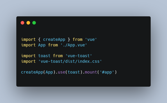
Inject the plugin to your Vue instance, and configure it using the parameters.
Do not forget to import the css file, it is needed to display the wrapper component properly.
import VueMyToasts from 'vue-my-toasts'
import 'vue-my-toasts/dist/vue-my-toasts.css'
import YourToastComponent from '~/components/toasts/YourToastComponent'

Vue.use(VueMyToasts, {
  component: YourToastComponent,
  options: {
    width: '400px',
    position: 'bottom-right',
    padding: '1rem'
  }
})
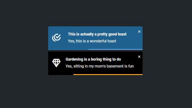
The whole principle of this package is to build your own toast component.
It comes with two included components, based on Tailwind and Bootstrap.
Both of those components are ready to be used straight from your app, or to be copy/pasted to create your own implementation.
If you want to see the included component, you can watch the demo here.
import VueMyToasts from 'vue-my-toasts'
// import BootstrapComponent from "vue-my-toasts/src/components/toasts/BootstrapComponent";
import TailwindComponent from 'vue-my-toasts/src/components/toasts/TailwindComponent'

Vue.use(VueMyToasts, {
  // component: BootstrapComponent,
  component: TailwindComponent,
  options: {
    width: '400px',
    position: 'bottom-right',
    padding: '1rem'
  }
})
Base parameters
width: The max width for a toast (as CSS attribute)padding: The padding of the box handling the toasts list (as CSS attribute)position: The position of the toast list, can be:bottom-right,bottom-left,top-right,top-left,top-middle,bottom-middle
Note that you can add as many parameters you want, they will be passed as props to your toast component.
?? Usage
vue-my-toasts come with a simple API that you can use from anywhere in your codebase.
As it is a Vue plugin, we inject our main functions and helpers in the Vue prototype under the key $toasts.
You can so access this from anywhere in your Vue components, and generally from anywhere you have access to your Vue instance.
export default {
  name: 'MyComponent',

  mounted() {
    // From helpers
    this.$toasts.success('This is my favorite toasts plugin.', {
      // Any other parameter...
    })

    // From base function
    this.$toasts.push({
      type: 'warning',
      message: 'This is definitely my favorite toasts plugin.'
      // Any other parameter...
    })
  }
}
API
$toasts.base('message', options): Push a base message (options is facultative)$toasts.success('message', options): Push a success message (options is facultative)$toasts.warning('message', options): Push a warning message (options is facultative)$toasts.error('message', options): Push a error message (options is facultative)$toasts.push(options): Push a message from a raw toast payload$toasts.remove(id): Remove a toast from its unique id$toasts.updateConfig(newConfig): Update the toasts base config
Note that you can add as many parameters you want to options object, they will be passed as props to your toast component.
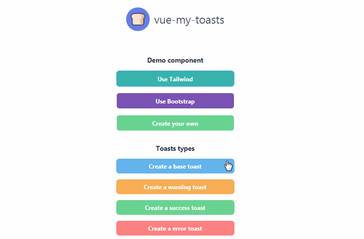
?? Create your own
If you want to create your own component, you can start from the Demo one.
You need to import the ToastMixin in your component, so you have a good start with the default configuration.
If you want to have a timer inside your component, you can import the TimerMixin.
Attributes
Attributes accessible by using the included mixins:
-
Using ToastMixin:
-
this.id: The ID of the toast, you can provide it yourself or it will be auto-generated. -
this.index: The index of the toast inside the currently visible list -
this.type: The type of the toast, can be:base,warning,error,success -
this.position: The position of the toast, can be:bottom-right,bottom-left,top-right,top-left,top-middle,bottom-middle -
this.message: The message of the toast. -
Using TimerMixin:
-
this.duration: The duration for which the toast will be shown (in ms) -
this.percentageElapsed: The percentage elapsed of the toast duration -
this.remaining: The remaining time of the toast visible duration
Events
$emit('remove'): Remove event, that will close the current current toast.