A Vue component to easily render tabs
The package contains a Vue component to easily display some tabs.
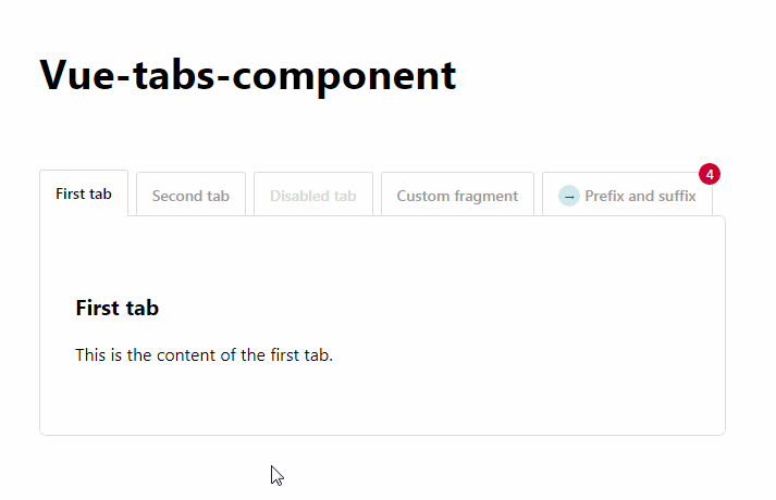
This is how they can be used:
<div>
    <tabs>
        <tab name="First tab">
            This is the content of the first tab
        </tab>
        <tab name="Second tab">
            This is the content of the second tab
        </tab>
        <tab name="Disabled tab" :is-disabled="true">
            This content will be unavailable while :is-disabled prop set to true
        </tab>
        <tab id="oh-hi-mark" name="Custom fragment">
            The fragment that is appended to the url can be customized
        </tab>
        <tab prefix="<span class='glyphicon glyphicon-star'></span> "
             name="Prefix and suffix"
             suffix=" <span class='badge'>4</span>">
            A prefix and a suffix can be added
        </tab>
    </tabs>
</div>
Installation
You can install the package via yarn:
yarn add vue-tabs-component
or npm:
npm install vue-tabs-component --save
Usage
The most common use case is to register the component globally.
//in your app.js or similar file
import Vue from 'vue';
import {Tabs, Tab} from 'vue-tabs-component';

Vue.component('tabs', Tabs);
Vue.component('tab', Tab);
Alternatively you can do this to register the components:
import Tabs from 'vue-tabs-component';

Vue.use(Tabs);
On your page you can now use html like this to render tabs:
<div>
    <tabs>
        <tab name="First tab">
            First tab content
        </tab>
        <tab name="Second tab">
            Second tab content
        </tab>
        <tab name="Third tab">
            Third tab content
        </tab>
    </tabs>
</div>
By default it will show the first tab.
If you click on a tab a href representation of the name will be append to the url. For example clicking on the tab Second tab will append #second-tab to the url.
When loading a page with a fragment that matches the href of a tab, it will open up that tab. For example visiting /#third-tab will open up the tab with name Third tab.
Remembering the last opened tab
By default the component will remember which was the last open tab for 5 minutes . If you for instance click on Third tab and then visit / the third tab will be opened.
You can change the cache life time by passing the lifetime in minutes in the cache-lifetime property of the tabs component.
<tabs cache-lifetime="10">
  ...
</tabs>
Disable modifying the url fragment
When using with other libraries that use the url fragment, you can disable modifying the url fragment by passing the useUrlFragment options. This helps using it with vue-router, or using vue-tabs-component twice in the same page.
<tabs :options="{ useUrlFragment: false }">
  ...
</tabs>
Adding a suffix and a prefix to the tab name
You can add a suffix and a prefix to the tab by using the suffix and prefix attributes.
<tab prefix="my prefix - " name="First tab" suffix=" - my suffix">
    First tab content
</tab>
The title of the tab will now be my prefix - First tab - my suffix.
The fragment that's added to the url when clicking the tab will only be based on the name of a tab, the name-prefix and name-suffix attributes will be ignored.
Customizing fragments
When clicking on a tab it's name will be used as a fragment in the url. For example clicking on the Second tab will append #second-tab to the current url.
You can customize that fragment by using the id attribute.
<div>
    <tabs>
        <tab id="custom-fragment" name="My tab">
            First tab content
        </tab>
    </tabs>
</div>
Clicking on My tab will then append #custom-fragment to the url.
CSS
You can use the CSS from the docs as a starting point for your own styling.
The output HTML has namespaced classes to target all nodes directly.
<div class="tabs-component">
    <ul class="tabs-component-tabs">
        <li class="tabs-component-tab">
            <a class="tabs-component-tab-a">…</a>
        </li>
    </ul>
    <div class="tabs-component-panels">
        <section class="tabs-component-panel">
            …
        </section>
    </div>
</div>