vue-basic-alert
Basic Vue Alert Component for basic use cases.
Demo
Installation
Use the node package manager npm to install vue-basic-alert.
npm i --save vue-basic-alert
Usage
Import Vue Basic Alert Component first.
import VueBasicAlert from 'vue-basic-alert'

export default defineComponent({
  ...
  components: {
    VueBasicAlert
  }
  ...
});
Add <vue-basic-alert ref="alert" /> to your app.
To interact with vue-basic-alert, you can use $ref.alert.
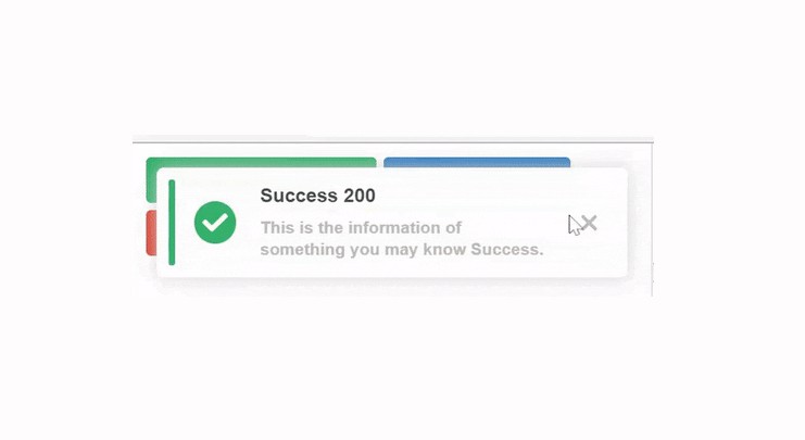
There are 2 methods: showAlert(alertType: string, iconSize: number, iconType: string ,alertHeader: string, alertMessage: string) and closeAlert()
<template>
<div id="app">
<button
@click="$refs.alert
.showAlert(
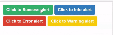
'success', // There are 4 types of alert: success, info, warning, error
35, // Size of the icon (px)
'solid', // Icon styles: now only 2 styles 'solid' and 'regular'
'Success 200', // Header of the alert
'This is the information of something you may know Success.' // Message of the alert
)"
>
Click to Success alert
</button>
<vue-basic-alert
:duration="300" // duration of transistions (ms)
:closeIn="300" // if you dont have this, you can close the alert manually
ref="alert" />
</div>
</template>
vue-basic-alert props:
duration: duration of transistions (ms)closeIn: Automatically close the alert incloseIn(ms). If you dont have this, you can close the alert manually
Contributing
Pull requests are welcome. For major changes, please open an issue first to discuss what you would like to change.
Please make sure to update tests as appropriate.
Project Status
Ready for production. We will update more styles in the 2.0.0.
1.0.4: 4 types of alert in just 1 style.readme.md,vue-basic-alertis really basic.1.0.5: Fixed bugs2.0.0:To-do2 more styles and customizable icons, etc.
License
Copyright (c) 2022-present, Jason Anger (An Do)