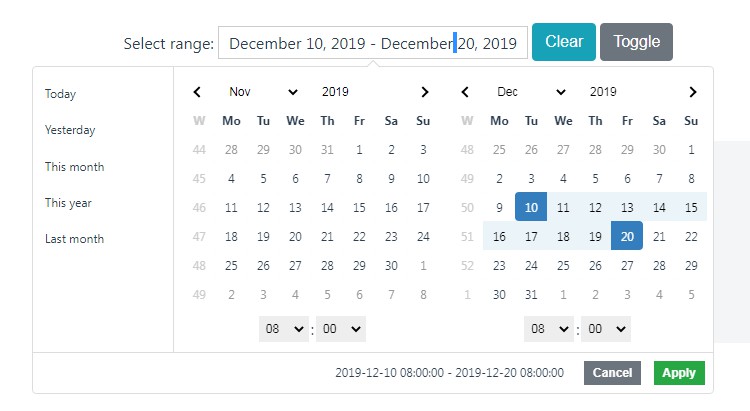
Vuetify Date Range Picker
This component supports the latest version if Vue(2.x) and compatible with Vuetify JS 1.x+ and it looks nice and clean looking too.
The missing date range picker for Vuetify JS you have been looking for.
Requirements
You must have...
VuetifyJS
Vue.JS
date-fns
Features
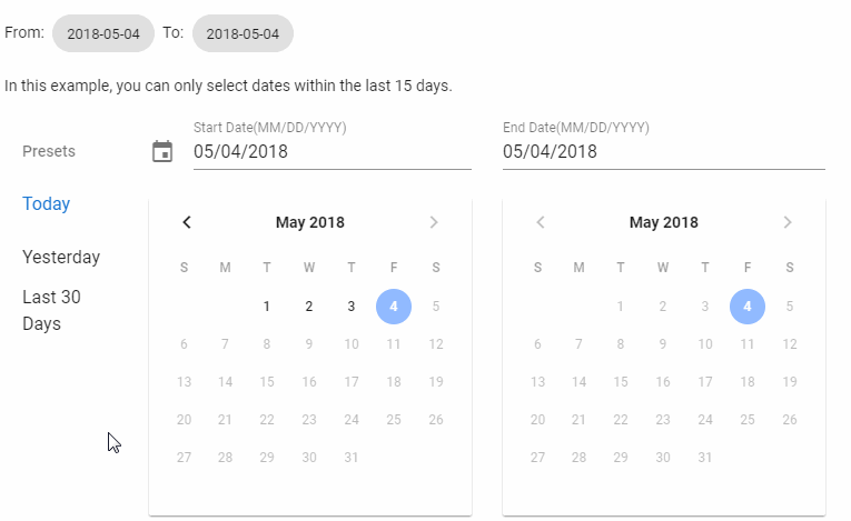
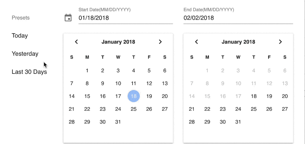
- Preset Selection
- Automatically highlight preset based on chosen date.
- Custom format
- Material Design (Obviously!)
- Light & Dark Themes
- Custom Prev & Next buttons
Installation
npm install vuetify-daterange-picker
OR
yarn add vuetify-daterange-picker
The latest version(2.x) is compatible with Vuetify JS 1.x+. If you use vuetify JS you can use the version 1.2.0 or lower.
Usage
<template>
    <v-daterange :options="dateRangeOptions" @input="onDateRangeChange"></v-daterange>
</template>

<script>
// If you want to register this as a global component then
// in main.js
import VDateRagnge from 'vuetify-daterange-picker';
import 'vuetify-daterange-picker/dist/vuetify-daterange-picker.css';

Vue.use(VDateRange);
</script>

<script>
// If you want to use in one of your components.
import DateRange from 'vuetify-daterange-picker';
import 'vuetify-daterange-picker/dist/vuetify-daterange-picker.css';

export default {
  components: { DateRange.name: DateRange },
  ...
};
</script>
Props
options : Object
Options is an object that helps set up the component.
startDate: String. InYYYY-MM-DDformat. Prefill value for start date picker.endDate: String. InYYYY-MM-DDformat. Prefill value for end date picker.minDate: String. The earliest date a user can select inYYYY-MM-DDformat.format: String. The format in which you want the user to see the dates in the inputs. E.g.MM/DD/YYYY.presets: Array. An array of preset values likeToday,Yesterdayetc. It's an array of object that looks like this.
presets: [
  {
    label: 'Today',
    range: [
      '2018-01-01', //start date. YYYY-MM-DD
      '2018-02-01', // end date. YYYY-MM-DD
    ],
  },
];
no-presets : Boolean
If you do not want a presets list you can use this boolean and you'll only see the pickers with input.
dark : Boolean
Switches the list of presets and the datepickers into dark mode.
next-icon : String
Name of the Material Icon that you want to use as custom icon for next buttons in datepickers.
prev-icon : String
Name of the Material Icon that you want to use as custom icon for prev buttons in datepickers.
Events
input: Array. An array with start date and end date, triggered after every date selection.