VueTippy
Directive wrapper for Tippy.js.
Installation
npm install --save vue-tippy
# or
yarn add vue-tippy
Usage
Bundler (Webpack, Rollup)
import Vue from "vue";
import VueTippy, { TippyComponent } from "vue-tippy";

Vue.use(VueTippy);
Vue.component("tippy", TippyComponent);

// or
Vue.use(VueTippy, {
  directive: "tippy", // => v-tippy
  flipDuration: 0,
  popperOptions: {
    modifiers: {
      preventOverflow: {
        enabled: false
      }
    }
  }
});
Vue.component("tippy", TippyComponent);


// Add additional themes.
import "tippy.js/themes/light.css";
import "tippy.js/themes/light-border.css";
import "tippy.js/themes/google.css";
import "tippy.js/themes/translucent.css";
Browser
<!-- From CDN -->
<script src="https://unpkg.com/vue-tippy/dist/vue-tippy.min.js"></script>
<script src="https://cdn.jsdelivr.net/npm/vue-tippy/dist/vue-tippy.min.js"></script>
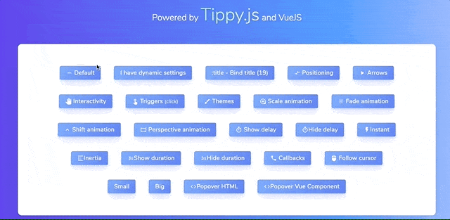
Basic Usage
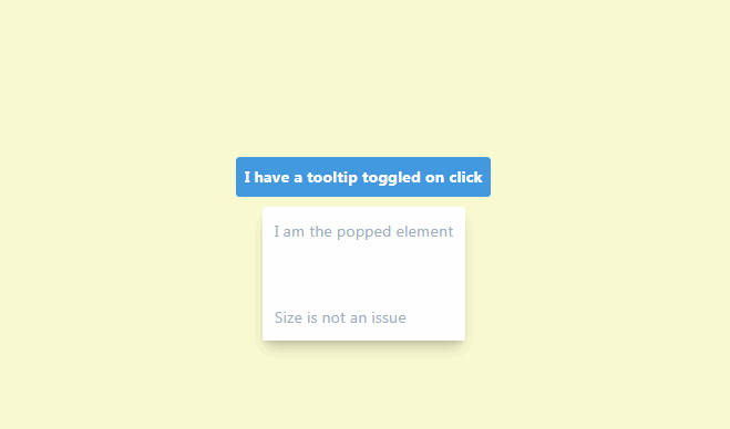
<button content="Hi!" v-tippy>My Button!</button>
<button :content="dynamicTitle" v-tippy>My Button!</button>
<button content="Hello" v-tippy="{ placement : 'top',  arrow: true }">
  My Button!
</button>
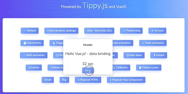
Using Vue component
<tippy to="myTrigger" arrow>
  <div>
    <h3>Header</h3>
    <p style="color: black">{{ message }} - data binding</p>
    <button @click="clicked">Click</button>
  </div>
</tippy>

<button name="myTrigger">Tippy Trigger</button>
<tippy arrow>
  <template v-slot:trigger>
    <button>Tippy Trigger</button>
  </template>

  <div>
    <h3>Header</h3>
    <p style="color: black">{{ message }} - data binding</p>
    <button @click="clicked">Click</button>
  </div>
</tippy>
<tippy :content="`tooltip: ${message}`" arrow>
  <template v-slot:trigger>
    <button>Tippy Trigger</button>
  </template>
</tippy>