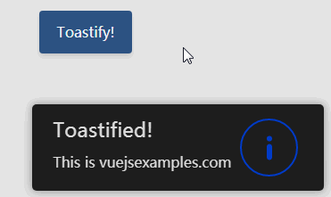
Vue Toastify
I wanted a component which I can use by passing props from the server on the first paint but which can also take statuses at run time. With this component it's has just become super easy.
To Install:
npm i vue-toastify
To Use:
1| Import the component:
import VueToastify from 'vue-toastify';
or with CDNs:
2| Register the component with Vue:
Vue.component('vue-toastify', VueToastify);
3| Add it inside your application:
<vue-toastify :your-props="here"></vue-toastify>
Props
| prop | type | default | details |
|---|---|---|---|
| status | Object | null | Not required, you may just let the component listen for future statuses. |
| canPause | Boolean | false | Enables pausing of the loader and the timeout on hover. |
| defaultTitle | Boolean | true | Enables the fallback to the type as the title. |
| eventHandler | String | "EventBus" | This entity will handle the events eg.: Eventbus.$on('notify', ...) |
| lightTheme | Boolean | false | Change to the light theme. |
| errorDuration | Number | 8000 | The duration in milliseconds the error notification should be visible for. |
| successDuration | Number | 4000 | The duration in milliseconds the error notification should be visible for. |
| alertInfoDuration | Number | 6000 | The duration in milliseconds the error notification should be visible for. |
| initialDelay | Number | 750 | If a status passed as a prop, it may already starts the script before the page's content fully loaded. With this you can specify delay in milliseconds for the initial notification. |
| bodyMaxWidth | Number | 250 | Maximum width the body can take up. in px The rest of the notification will always be the same width. |
| position | String | "bottom-right" | Controls where the notification should appear. Accepted values are: 'top-left', 'top-center', 'top-right', 'left-center', 'right-center', 'bottom-left', 'bottom-center', 'bottom-right'. (when using centered positions the manual displacement will not work for the axis it's centered on) |
| positionXDistance | String | "10px" | Distance from the left or right depending on the position prop. All css values are accepted. |
| positionYDistance | String | "10px" | Distance from the top or bottom depending on the position prop. All css values are accepted. |
The status object takes the following attributes:
- body = this is binded using v-html so you can go crazy with it
- (optional) title = if left empty, the type will be set as the title (first letter will always be capitalized)
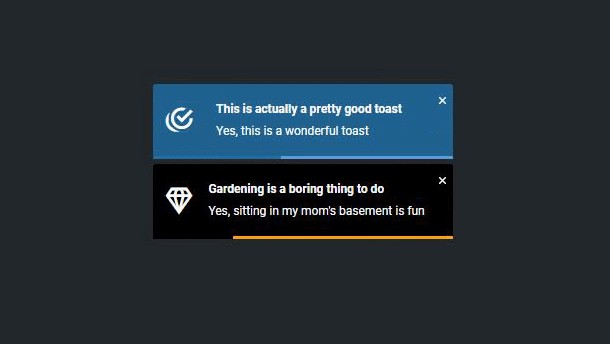
- (optional) type = accepted values are: 'success', 'alert', 'info', 'error'. If no type given, it falls back to info
- (optional) canPause = you can overwrite what has already been set as
a prop - (optional) canTimeout = if set to false the notification has to be dismissed manually, otherwise it defaults to true
- (optional) defaultTitle = should the title fall back to the type as the title
- (optional) duration = this will take priority over all other duration settings
- (optional) icon = you can customize the displayed icon within the circle using v-html
- (optional) mode = available modes: 'prompt' which will display a yes/no button and emits the vtPrompt event with the respective boolean value (canTimeout automatically gets disabled) or 'loader' which will stay present until it hears the vtLoaderStop event
Miscellaneous info
-
Events:
- To add an event at runtime us the "vtNotify" event, passing the status object
- Manually dismissing notification will emit the event "vtDismissed"
- Timer events are triggered at the corresponding points: "vtStarted", "vtPaused", "vtResumed", "vtFinished"
- Loader can be dismissed using the "vtLoadStop" event
- Prompt on answer will emit the "vtPrompt" event with a boolean value
-
Pausing the notification is not supporting touch gestures but might work with long press on some devices.
-
1.0.0 will be released once the notification container has been added.
Todos
-
Add a notification container which will enable displaying multiple notifications at the same time.
- queueing notification
-
Add option that if url attribute specified on the status object, clicking on the notification
will point the user to the url (SPA supported) -
Increase test coverage
-
Add backdrop
-
Move the progress animation to use purely css
Contribution
- Fork the project
- Set up project
npm install - Compile and use hot-reloads for development
npm run serve - Make your changes
- Lint and fix the code
npm run lint - Run your tests
npm run test - Push to git and create a pull request.