vue-scrollactive
Lightweight and simple to use vue component that highlights menu items as you scroll the page, also scrolling to target section when clicked.
This vue 2 component makes it simple to highlight a menu item with an 'active' class as you scroll.
- Highlights menu items as you scroll
- Scrolls to item's section on click
- Customizable easing for scrolling on click
- Vue2
- Uses pure JS!
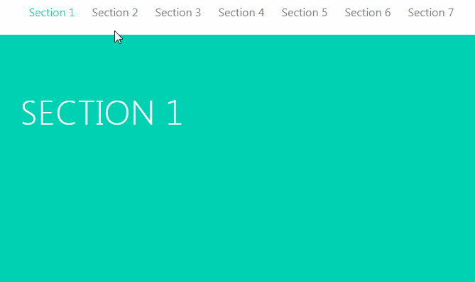
Live Demo
https://eddiemf.github.io/vue-scrollactive/examples/example-1.html
Installation
Install via npm and use it as a vue plugin in your app.
npm install --save-dev vue-scrollactive
var Scrollactive = require('vue-scrollactive');
Vue.use(Scrollactive);
Usage
You should wrap your menu in a <scrollactive> tag (which will be your nav) and add a .scrollactive-item class in your <a> tags as I show in the example below:
<scrollactive ref="scrollactive" class="my-nav">
    <a href="#home" class="scrollactive-item">Home</a>
    <a href="#about-us" class="scrollactive-item">About Us</a>
    <a href="#portfolio" class="scrollactive-item">Portfolio</a>
    <a href="#contact" class="scrollactive-item">Contact</a>
</scrollactive>
You can follow whatever structure you wish, just make sure to set the .scrollactive-item class in the items you want to highlight and set its href with a valid ID that you would like to track while scrolling.
Events
Scrollactive will emmit an itemchanged(event, currentItem, lastActiveItem) event when an active menu item is changed to another, you can catch that event doing as the example below:
<scrollactive ref="scrollactive" class="my-nav" v-on:itemchanged="yourFunction()">
    <a href="#home" class="scrollactive-item">Home</a>
    <a href="#about-us" class="scrollactive-item">About Us</a>
    <a href="#portfolio" class="scrollactive-item">Portfolio</a>
    <a href="#contact" class="scrollactive-item">Contact</a>
</scrollactive>
Dynamic menu items
In order for the component to update when you add a new menu item, you must call the setScrollactiveItems() function. You can do that as I do in the example below:
methods: {
    dynamicItemsFunction() {
        // Add your items
        this.$refs.scrollactive.setScrollactiveItems();
    }
}
Make sure to set the ref="scrollactive" property when you call the component in order to access the function as I do, or feel free to do it in any other way you would like, you just need to call the setScrollactiveItems() function.
Configuration
All options should be passed as a prop in the <scrollactive> component as you can see in the example below:
<scrollactive
	active-class="active"
	:offset="80"
	:duration="800"
	bezier-easing-value=".5,0,.35,1">
</scrollactive>
Remember that all options are optional and you can see the default values in the Options sections.
Options
/**
 * Class that will be applied in the menu item.
 *
 * @default  'is-active'
 * @type {String}
 */
activeClass: {
	type: String,
	default: 'is-active'
},

/**
 * Amount of space between top of screen and the section to
 * highlight. (Usually your fixed header's height)
 *
 * @default 20
 * @type {Number}
 */
offset: {
	type: Number,
	default: 20
},

/**
 * Enables/disables the scrolling when clicking in a menu item.
 * Disable if you'd like to handle the scrolling by your own.
 *
 * @default true
 * @type {Boolean}
 */
clickToScroll: {
	type: Boolean,
	default: true
},

/**
 * The duration (milliseconds) of the scroll animation when clicking to scroll
 * is activated.
 *
 * @default 600
 * @type {Number}
 */
duration: {
	type: Number,
	default: 600
},

/**
 * Defines if the plugin should track the section change when
 * clicking an item to scroll to its section. If set to true,
 * it will always keep track and change the active class to the
 * current section while scrolling, if false, the active class
 * will be immediately applied to the clicked menu item, ignoring
 * the passed sections until the scrolling is over.
 *
 * @default false
 * @type {Boolean}
 */
alwaysTrack: {
	type: Boolean,
	default: false
},

/**
 * Your custom easing value for the click to scroll functionality.
 * It must be a string with 4 values separated by commas in a
 * cubic bezier format.
 *
 * @default '.5,0,.35,1'
 * @type {String}
 */
bezierEasingValue: {
	type: String,
	default: '.5,0,.35,1'
}