vue-notifyjs
Minimalist notification component for Vue 2.x
Why use it?
- Small: 1.5kb (minified & gzipped), 4kb (minified)
- Simple this.$notify({message:'My message'})
- Has multiple themes
- The animations can be customized through Vue transitions
- Can be used both through npm and as a script tag
Demos:
3 themes supported
Default theme
Material design theme
Now-ui theme
Install
yarn add vue-notifyjs
CDN JS:
* https://unpkg.com/vue-notifyjs/dist/vue-notifyjs.min.js
* https://unpkg.com/vue-notifyjs/dist/vue-notifyjs.js
CDN CSS:
* https://unpkg.com/vue-notifyjs/themes/default.css
* https://unpkg.com/vue-notifyjs/themes/material.css
* https://unpkg.com/vue-notifyjs/themes/now-ui.css
Usage
<template>
<notifications></notifications>
</template>
<script>
import Notify from 'vue-notifyjs'
Vue.use(Notify)
export default {
methods: {
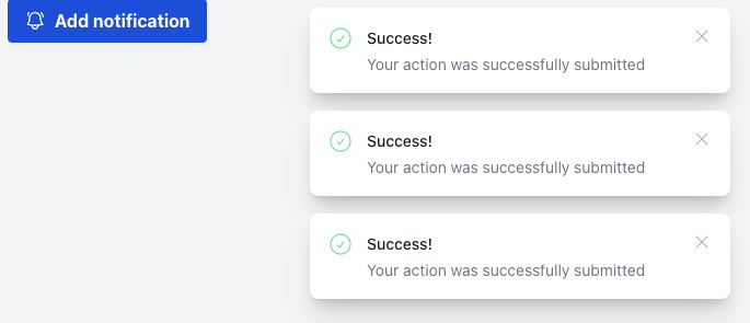
addNotification() {
this.$notify({
message: 'Welcome',
type: 'success'
})
}
}
}
</script>
<!-- import styles -->
<style src="vue-notifyjs/themes/default.css"></style>
Note: <notifications></notifications> can be declared only once anywhere in your app,
preferably in your root component so the notification component is alive inside any other components.
Notification options
You can set notification options in 3 ways
- Upon plugin initialization
import Notify from 'vue-notifyjs'
Vue.use(Notify, {type: 'primary', timeout: 2000})
- Dynamically via
setOptionsmethod
this.$notifications.setOptions({
                            type: 'primary',
                            timeout: 2000,
                            horizontalAlign: 'right',
                            verticalAlign: 'top'
                          })
- When using
$notify
this.$notify({
        message: 'Welcome',
        type: 'success'
      })
Note: Options sent through this.$notify will override default options and will have higher priority than default options.
Props
Notifications
transitionName: {
 type:String,
 default:'list'
},
transitionMode: {
 type:String,
 default:'in-out'
},
overlap: {
 type: Boolean,
 default: false
}
Notification (passed through the object sent to $notify method)
props: {
message: String,
title: String,
icon: String,
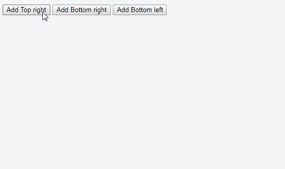
verticalAlign: {
type: String,
default: 'top' // top | bottom
},
horizontalAlign: {
type: String,
default: 'center' // right | center | left
},
type: {
type: String,
default: 'info' // info | warning | danger | success
},
timeout: {
type: Number,
default: 5000
},
component: { //is rendered instead of notification message
type: [Object, Function]
}
},