sf-vue-animated-cursor
Parameterizable animated cursor for vue 3.
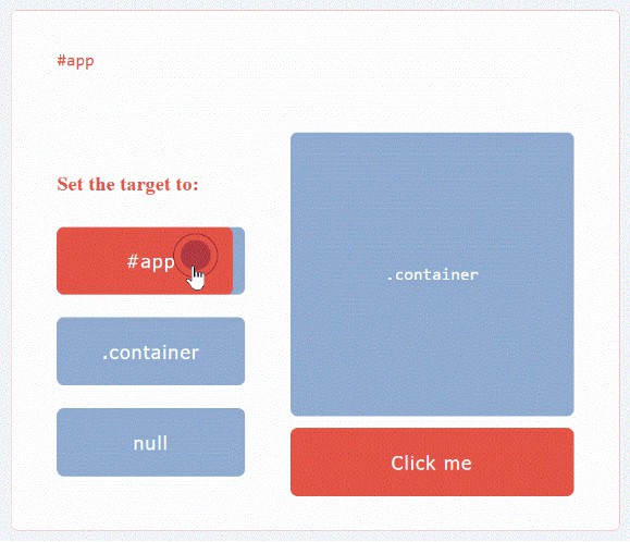
Preview

Installing
npm install sf-vue-animated-cursor
Usage
Two things can be called from the plugin.
- basic cursor, which can be easily parameterized and with which you can build according to your own taste
- default cursor, which is a built-in cursor that can only set the target, teleportTo, watch properties
Options
- basic: if you want to use the built-in cursor instead of the basic cursor, you only need to specify ‘basic: false’ in the options
main.js
import { createApp } from 'vue'
import App from './App.vue'
import SfVueAnimatedCursor from 'sf-vue-animated-cursor'

const app = createApp(App)

app.use(SfVueAnimatedCursor, { basic: false });

app.mount('#app')
Then it can be placed anywhere, but make sure that the target value (by default #app) is valid.
Example
App.vue
<template lang="pug">

#app
    sf-vue-animated-cursor(
		target="#app"
		teleport-to="body"
  		@move="onMove"
  		@click="onClick"
  		@hover="onHover"
	)

</template>
Tip: With the teleport property, you can set where the cursor should be located in the html.
Props
All properties can be used only with the basic cursor. For the default cursor, you can only set the target, teleportTo, and watch properties.
| Name | Type | Description | Possible values | Defaults |
|---|---|---|---|---|
| teleportTo | String |
teleports the cursor to the specified selector | any html element | body |
| target | String |
the cursor works within the specified selector | any html elemen | #app |
| show | Boolean |
cursor visibility | true, false | true |
| watch | Boolean |
if the emitted values are not needed, set it to false | true, false | true |
| width | Number |
cursor width | any number | 6px |
| height | Number |
cursor height | any number | 6px |
| bgColor | String |
cursor background color | any color | #657786 |
| borderColor | String |
cursor border color | any color | #657786 |
| borderWidth | Number |
cursor border width | any number | 1px |
| borderRadius | Number |
cursor border radius | any number | 50% |
| slowDown | Number |
slowing down the speed of the animated cursor | any number | 0s |
| hoverable | String |
the class name that activates the hover effect | any html elemen | hoverable |
| hoverAnimation | Boolean |
hover animation on/off | true, false | true |
| clickAnimation | Boolean |
click animation on/off | true, false | true |
| mixBlendMode | String |
mix blend mode | any valid css value | difference |
| scaleOnClick | Number |
the scale value of the click event | any number | 2 |
| scaleOnHoverClick | Number |
the scale value of the click event, while hovering | any number | 2 |
| scaleOnHover | Number |
the scale value of the hover event | any number | 3 |
| opacityOnHover | Number |
the opacity value of the hover event | any number | 0.5 |
Emits
| Event | Emited values |
|---|---|
| move | position x, position y, cursorvisibility |
| click | true, false |
| hover | true, false |
License
Released under MIT by Schön Ferenc.