vue-progress-path
Customizable progress indicators and spinners that support any custom SVG path.
Installation
npm i -S vue-progress-path
yarn add vue-progress-path
Usage
import 'vue-progress-path/dist/vue-progress-path.css'
import VueProgress from 'vue-progress-path'

Vue.use(VueProgress, {
  // defaultShape: 'circle',
})
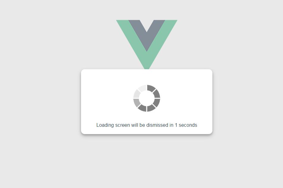
You can now use the <loading-progress> component.
CSS customization example
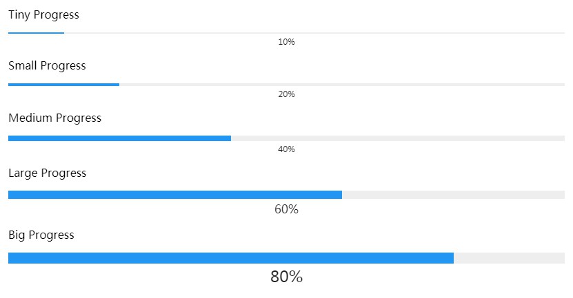
You can customize the progress components with CSS:
.vue-progress-path path {
  stroke-width: 12;
}

.vue-progress-path .progress {
  stroke: red;
}

.vue-progress-path .background {
  stroke: #edd;
}
Examples
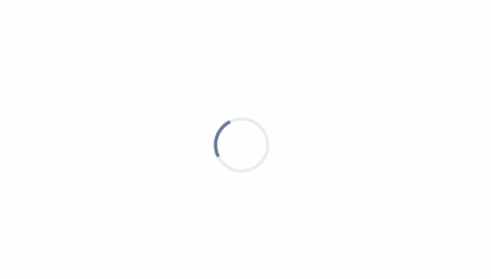
Google Material Design-like spinner:
<loading-progress
  :progress="progress"
  :indeterminate="indeterminate"
  :counter-clockwise="counterClockwise"
  :hide-background="hideBackground"
  size="64"
  rotate
  fillDuration="2"
  rotationDuration="1"
/>
Semi-circle:
<loading-progress
  :progress="progress"
  :indeterminate="indeterminate"
  :counter-clockwise="counterClockwise"
  :hide-background="hideBackground"
  shape="semicircle"
  size="64"
/>
Custom SVG path:
<loading-progress
  :progress="progress"
  :indeterminate="indeterminate"
  :counter-clockwise="counterClockwise"
  :hide-background="hideBackground"
  shape="M10 80 C 40 10, 65 10, 95 80 S 150 150, 180 80"
  size="180"
  fill-duration="2"
/>