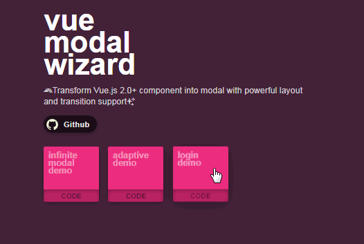
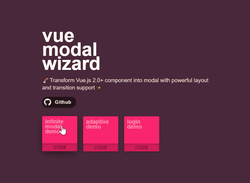
Vue Modal Wizard
Simple and intuitive, highly customizable modal component for Vue.js.
Install
npm i vue-modal-wizard
import ModalWizard from 'vue-modal-wizard'
Vue.use(ModalWizard)

//use it in your vue component
this.$modal.open(modalComponent, opts)

//or
ModalWizard.open(modalComponent, opts)

/*
The default plugin name is 'modal'.
You can manually define it by giving a name option.
e.g.
Vue.use(ModalWizard, {name: 'coolModal'})
this.$coolModal.open(modalComponent, opts)
*/
Usage
There are three different ways to create a modal.
Define in inline template:
this.$modal.open(`
  <div>
    {{ message }}
    <button :click="onOk" }>ok</button>
  </div>
`, {
  props: {
      message: 'here is a message',
      onOk: () => {console.log('ok')}
    }
})
Define in inline render function:
// P.S. I use JSX here for simplicity. You can use normal render function if you like.
this.$modal.open((h, props) => {
  return (
    <div>
      { props.message }
      <button onClick={ props.onOk }>ok</button>
    </div>
  )
}, {
  props: {
    message: 'here is a message',
    onOk: () => {console.log('ok')}
  }
})
Define in component (Recommended):
// define the modal using vue component
<template>
  <div>
    {{ message }}
    <button :click="onOk" }>ok</button>
  </div>
</template>

<script>
  export default {
    props: ['message', 'onOk']
  }
</script>
// use component as modal
import modal from 'component.vue'
this.$modal.open(modal /* or 'componentName' */, {
  props: {
    message: 'here is a message',
    onOk: () => {console.log('ok')}
  }
})
Positioning
Modal Wizard provides four different types of layout: point, column, sticky-column, and viewport.
(naming is based on the type of anchor)

Include a position option when creating modal:
this.$modal.open(`
  <div>
    ...
  </div>
`, {
  position: {
    type: 'point',
    anchorLeft: '100px',
    left: '0'
  }
})
Also, you can define the position option in your modal component:
methods: {
  _modalPosition: function() {
    return {
      type: 'point',
          anchorLeft: '100px',
          left: '0'
    }
  }
}
Adaptive layout (only for component approach)
You can dynamically change the layout type and position when the window size change by adding a handler in your component:
methods: {
  _modalFlexPosition: function(width, height) {
    return width > 500 ? {
      type: 'column'
    } : {
      type: 'viewport'
    }
  }
}
Properties
| Property | Value | Default | Description |
|---|---|---|---|
| type | 'point', 'column', 'sticky-column', 'viewport' | 'point' | The type of anchor |
| top | e.g. '100px', '0' | null | Position relative to the anchor. Under 'point' mode, when both top and bottom have value null, the modal will be centered vertically. For other anchor mode, it will be regarded as margin |
| bottom | same as above | null | same as above |
| left | same as above | null | Position relative to the anchor. Under 'viewport' mode, it will be regarded as margin. For other anchor mode, when both left and right have value null, the modal will be centered horizontally. |
| right | same as above | null | same as above |
| anchorTop | e.g. '100px', '50%' | '50%' | Position relative to the top of the window. Only works under 'point' mode. |
| anchorBottom | same as above | null | Position relative to the bottom of the window. Only works under 'point' mode. |
| anchorLeft | same as above | '50%' | Position relative to the left of the window. Does not work under 'viewport' mode |
| anchorLeft | same as above | null | Position relative to the right of the window. Does not work under 'viewport' mode |
P.S. For 'sticky-column', the element's height should be set to 'auto'. For 'viewport' mode, both height and width should be set to 'auto'.
Close Modal
User can click the area outside the modal or press esc to close it. You can do it manually by
this.$modal.close()
This will close the modal on the top.
You can disable esc detection by
this.$modal.open(`
  <div>
    ...
  </div>
`, {
     ...
     escOff: true
     ...
})
When the modal is being closed, an onClose handler will be trigger. You can define it in the option.
this.$modal.open(`
  <div>
    ...
  </div>
`, {
     ...
     onClose: () => {console.log('on close')}
     ...
})
Setting Style
You can set the lightbox color and transition by
this.$modal.open(`
  <div>
    ...
  </div>
`, {
     ...
     style: {
       lightboxColor: 'rgba(0,0,0,0.8)',
       transition: 'pop-out',
       fadeDuration: '0.4s',
       colorChangeDuration: '300ms'
     }
     ...
})
In your css file
.pop-out-enter,
  .pop-out-leave-to {
    transform: translateY(-20px);
  }

  .pop-out-enter-active,
  .pop-out-leave-active {
    /*do not use 'all' for transition, as positioning of modal will be animated*/
    transition: transform 0.4s;
  }
Same as positioning, there's a handler for defining style inside your modal component
methods: {
  _modalStyle() {
    return {
      lightboxColor: 'rgba(0,0,0,0.8)',
      transition: 'pop-out',
      fadeDuration: '0.4s',
      colorChangeDuration: '300ms'
    }
  }
}
Change color (only for component approach)
You can change the lightbox color dynamically by emitting a changeColor event
this.$emit('changeColor', 'rgba(255,255,255,0.8)');
Properties
| Property | Value | Default | Description |
|---|---|---|---|
| transition | string | null | Name of transition |
| lightboxColor | e.g. 'black', '#000', 'rgba(0,0,0,0.8)' | 'rgba(0,0,0,0.8)' | Lightbox color |
| fadeDuration | e.g. '0.3s', '300ms' | '200ms' | The duration of fade in or fade out transition |
| colorChangeDuration | e.g. '0.3s', '300ms' | '200ms' | The duration of lightbox color transition |
Keep in memory
By default, modal will be created dynamically, and will be destroyed after being closed. However, you can keep it in the memory by giving it a name.
this.$modal.open(`
  <div>
    ...
  </div>
`, {
     ...
     name: 'modal-one'
     ...
})
If you create several modal with the same name, only the first one will be saved.
For component approach, you can define a handler for recovery (for reusing modal)
methods: {
  _modalRecover: function() {
    // do something
  }
}