Awesome Vue Star Rating
Simple and Easy Customisable Awesome Vue Star Rating using Pure Vue application without any external package.
Installing
npm install --save awesome-vue-star-rating
Features
- Font icon stars — scale without loss of quality
- Customisable ratings and rating descriptions
- Customisable results of selected value and description
- Customisable number of stars
- Create read-only stars
- Customisable Colors
Options
| Property | Type | Required | Description |
|---|---|---|---|
| star | Number | Required. | Default value of Star. Default value is 2 |
| maxstars | Number | Required. | Default value is 5. |
| hasresults | Boolean | Optional. | Displaying the result values. Default value is true. |
| hasdescription | Boolean | Optional. | Default value is true. |
| ratingdescription | Array | Required. | Displaying the rating values. Ex. [{
text: 'Poor',
class: 'star-poor'
},
{
text: 'Below Average',
class: 'star-belowAverage'
},
{
text: 'Average',
class: 'star-average'
},
{
text: 'Good',
class: 'star-good'
},
{
text: 'Excellent',
class: 'star-excellent'
}] |
| starsize | String | Optional. | Displaying the size of the stars. Default value is lg. We have list of [xs,lg,1x,2x,3x,4x,5x,6x,7x,8x,9x,10x] other optional values too. |
| disabled | Boolean | Optional. | Enable or disable the star selection. Default value is false. |
Usage
Step 1: import AwesomeVueStarRating in our component
import AwesomeVueStarRating from 'awesome-vue-star-rating'

export default {
  name: 'app',
  components: {
    AwesomeVueStarRating
  }
}
</script>
Step 2: Load default values to the component
data() {
    return {
      star: 5, // default star
      ratingdescription: [
        {
          text: 'Poor',
          class: 'star-poor'
        },
        {
          text: 'Below Average',
          class: 'star-belowAverage'
        },
        {
          text: 'Average',
          class: 'star-average'
        },
        {
          text: 'Good',
          class: 'star-good'
        },
        {
          text: 'Excellent',
          class: 'star-excellent'
        }
      ],
      hasresults: true,
      hasdescription: true,
      starsize: 'lg', //[xs,lg,1x,2x,3x,4x,5x,6x,7x,8x,9x,10x],
      maxstars: 5,
      disabled: false
    }
}
Step 3: Place the Rate component inside the template
<template>
  <div id="app">
    <AwesomeVueStarRating :star="this.star" :disabled="this.disabled" :maxstars="this.maxstars" :starsize="this.starsize" :hasresults="this.hasresults" :hasdescription="this.hasdescription" :ratingdescription="this.ratingdescription" />
  </div>
</template>
Step 4: Customize the star color styles like below
<style lang="scss">
 .star {
  color: red;
 }
 .star.active {
  color: red;
 }
 .list, .list.disabled {
  &:hover {
    .star {
      color: red !important;
    }
    .star.active {
      color: red;
    }
  }
}
</style>
Compiles and hot-reloads for development
npm run serve
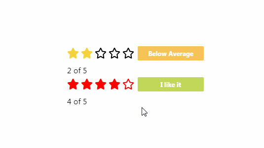
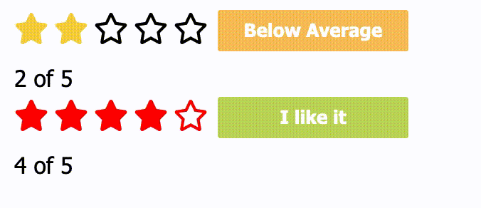
Screen Shot


Compiles and minifies for production
npm run build
Run your tests
npm run test