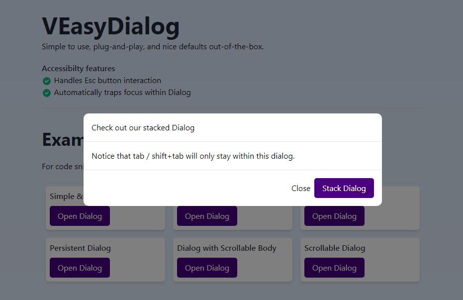
v-easy-dialog
Simple to use, plug-and-play, and nice defaults out-of-the-box.
Features
- Handles Esc button interaction
- Automatically traps focus within Dialog
- Stackable
- Handles scrollable dialog content
- Dialogs will mount to body instead of inline
- Smooth transition
- Optional
persistentprop for when you require user's input to proceed - Optional
fullscreenmode. - Can automatically focus on desired element when launched.
Installation
npm i v-easy-dialog
or
yarn add v-easy-dialog
Usage
Import as component
import VEasyDialog form 'v-easy-dialog'

export default {
    components: {
        VEasyDialog
    }
}
Examples
These examples use TailwindCSS to illustrate how you might want add your own styling to achieve certain effects (e.g. scrollable dialog content) but TailwindCSS is NOT a requirement.
Simple Dialog
<v-easy-dialog v-model="simpleDialog">
    <div class="flex flex-col">
        <div>Check out our stacked Dialog</div>

        <div>
            Notice that tab / shift+tab will only stay within this dialog.
        </div>

        <div class="flex justify-end space-x-2">
            <button @click="simpleDialog = false">Close</button>
        </div>
    </div>
</v-easy-dialog>
Fullscreen Dialog
<v-easy-dialog v-model="fullscreenDialog" fullscreen>
    <div class="flex flex-col">
        <div>I am fullscreen!</div>

        <div class="flex justify-end space-x-2">
            <button @click="fullscreenDialog = false">Close</button>
        </div>
    </div>
</v-easy-dialog>
Autofocus Dialog
<v-easy-dialog v-model="focusDialog" focus-on="#my-input">
    <div class="flex flex-col">
        <div>I am fullscreen!</div>
        <div>
            <input
                class="p-3 border-gray-200"
                id="my-input"
                type="text"
                placeholder="I am automatically focused!"
            />
        </div>

        <div class="flex justify-end space-x-2">
            <button @click="focusDialog = false">Close</button>
        </div>
    </div>
</v-easy-dialog>
Persistent Dialog
<v-easy-dialog v-model="persistentDialog" :persistent="persistent">
    <template v-slot:default="{ deactivate }">
        <div class="flex flex-col">
            <div>I am persistent!</div>
            <div>
                <p class="mb-4">
                    Pressing "Esc", or the backdrop can't close me. Updating my
                    state will.
                </p>
                <input
                    id="persistent-check"
                    v-model="persistent"
                    type="checkbox"
                />
                <label for="persistent-check"
                    >Click me to toggle persistence</label
                >
            </div>

            <div class="flex justify-end space-x-2">
                <button @click="deactivate">Close</button>
            </div>
        </div>
    </template>
</v-easy-dialog>
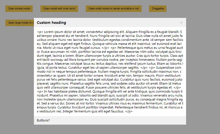
Dialog with Overflow Body
<v-easy-dialog v-model="overflowDialog">
    <div class="flex flex-col">
        <div>
            The title and action stays visible, only the body will scroll!
        </div>

        <div class="flex-grow overflow-y-auto">
            <p v-for="n in 20" :key="n">
                Lorem ipsum dolor sit amet consectetur, adipisicing elit. Qui
                excepturi quis ad deserunt, praesentium cupiditate alias saepe!
                Magni maiores odio architecto! Optio nisi et corporis possimus
                quo neque rerum dicta?
            </p>
        </div>

        <div class="flex justify-end space-x-2">
            <button @click="overflowDialog = false">Close</button>
        </div>
    </div>
</v-easy-dialog>
Scrollable Dialog
<v-easy-dialog v-model="scrollDialog">
    <div class= overflow-y-auto">
        <div>The entire content scrolls!</div>

        <div>
            <p v-for="n in 20" :key="n">
                Lorem ipsum dolor sit amet consectetur, adipisicing elit. Qui
                excepturi quis ad deserunt, praesentium cupiditate alias saepe!
                Magni maiores odio architecto! Optio nisi et corporis possimus
                quo neque rerum dicta?
            </p>
        </div>

        <div class="flex justify-end space-x-2">
            <button @click="scrollDialog = false">Close</button>
        </div>
    </div>
</v-easy-dialog>