vue-trend-chart
Simple trend charts for Vue.js.
:cd: Installation
npm i vue-trend-chart
:rocket: Usage
import Vue from "vue";
import TrendChart from "vue-trend-chart";

Vue.use(TrendChart);
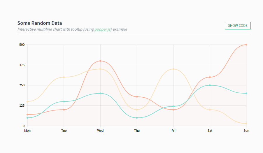
Example:
<TrendChart
  :datasets="[
    {
      data: [10, 50, 20, 100, 40, 60, 80],
      smooth: true,
      fill: true
    }
  ]"
  :grid="{
     verticalLines: true,
     horizontalLines: true
  }"
  :labels="{
     xLabels: ["Mon", "Tue", "Wed", "Thu", "Fri", "Sat", "Sun"],
     yLabels: 5
  }"
  :min="0">
</TrendChart>
:wrench: Props
datasets
Required
Type: Array
Array of objects with properties for each dataset.
grid
Type: Object
labels
Type: Object
min
Type: Number
Default: min value from datasets
max
Type: Number
Default: max value from datasets
padding
Type: String
Default: "5"
If you set a large stroke-width on your lines, you may notice that it gets "cropped" towards the edges. It's similar to "padding" CSS property but without specifying units.
Examples:
"5" apply to all four sides
"5 10" vertical | horizontal
"5 15 10" top | horizontal | bottom
"5 10 15 20" top | right | bottom | left
interactive
Type: Boolean
Default: false
Allows to set onmousemove interaction. Set to true to enable.
:zap: Events
mouse-move
Callback function for onmouseover interaction.
Receives an object {index: Number, data: Array} parameter based on current active line.
This function has no effect if interactive isn't set to true.
:chart_with_upwards_trend: Dataset Props
Chart line (curve) properties
data
Type: Number|Object
Example: [70, 100, 400, 180, 100] or [{ value: 70 }, { value: 100 }, { value: 400 }, { value: 180 }, { value: 100 }]
For object type you can also add other properties to use them in interactive mode.
className
Type: String
Allows to append custom class to chart line for future styling.
smooth
Type: Boolean
Default: false
Allows the peaks to be 'rounded' out.
stroke
Type: Boolean
Default: true
If false, the line is not drawn for this dataset.
fill
Type: Boolean
Default: false
Allows to fill the area under the line. Set to true to enable.
showPoints
Type: Boolean
Default: false
Allows to show points. Set to true to enable.
:hash: Grid Props
verticalLines
Type: Boolean
Default: false
Allows to show vertical gridlines. Set to true to enable.
verticalLinesNumber
Type: Number
Default: number of xLabels
Allows to set custom number of vertical gridlines.
This prop has no effect if verticalLines isn't set to true.
horizontalLines
Type: Boolean
Default: false
Allows to show horizontal gridlines. Set to true to enable.
horizontalLinesNumber
Type: Number
Default: number of yLabels
Allows to set custom number of horizontal gridlines.
This prop has no effect if horizontalLines isn't set to true.
:abc: Labels Props
xLabels
Type: Array
X axis labels.
Example: ["Mon", "Tue", "Wed", "Thu", "Fri", "Sat", "Sun"]
yLabels
Type: Number
Number of Y axis labels. Labels text is based on data values.
yLabelsTextFormatter
Type: Function
Allows to format Y axis labels text.
Example: val => "$" + Math.round(val * 100) / 100.
This function has no effect if yLabels prop has no value.
:art: Styling
Just use CSS to style your charts.
Here is an example of a tree structure with available class names:
<svg class="vtc">
  <g class="grid">
    <g class="vertical">
      <line class="line"></line>
      ...
    </g>
    <g class="horizontal">
      <line class="line"></line>
      ...
    </g>
  </g>

  <g class="labels">
    <g class="x-labels">
      <g class="label">
        <text></text>
      </g>
      ...
    </g>
    <g class="y-labels">
      <g class="label">
        <text></text>
      </g>
      ...
    </g>
  </g>

  <g class="curve">
    <path class="fill"></path>
    <path class="stroke"></path>
    <g class="points">
      <circle class="point"></circle>
      ...
    </g>
  </g>
  ...

  <line class="active-line"></line>
</svg>
:hammer: Development
npm install
npm run dev