vue-popper-component
Simple Vue.js component for Popper.js plugin.
Dependencies:
- Vue 1.*
- Popper.js 1.*
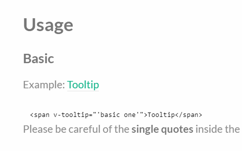
Usage:
const
	Vue = require('vue'),
  VuePopper = require('vue-popper-component');

new Vue({
  el: '#app',

  components: {
    'popper': VuePopper
  },

  data: {
    showPopperParentVar: true
  }
});
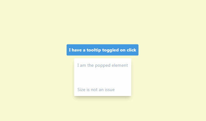
<popper
	:show-popper.sync="showPopperParentVar"
	content="Some plain text message here"
	placement="right"
	close-button="Close me!">

    <span @click.prevent="showPopperParentVar = !showPopperParentVar">
      ?
    </span>

</popper>
Usage with html in slots:
<popper
  :show-popper.sync="showPopperParentVar"
  content="Lorem ipsum dolor"
  placement="top"
  close-button="1">

    <div slot="close-button">
      <i class="glyphicon glyphicon-remove"></i>
    </div>

    <div slot="content">
      <h2><i class="glyphicon glyphicon-star"></i> <b>us</b> <i>on</i> <u>github</u>!</h2>
      <a @click.prevent="showPopperParentVar = false" href="#">Close this popover from the content!</a>
    </div>

    <button class="btn btn-default" @click.prevent="showPopperParentVar = !showPopperParentVar">
      Click to open popover on the bottom
    </button>
</popper>