vue-simple-suggest
Simple yet feature-rich autocomplete component for Vue.js.
Install
npm install --save vue-simple-suggest
What is it
This is a simple yet feature-rich suggestion/autocomplete component for Vue.js.
Actually, it's so feature rich, that it's possible to do crazy stuff with it, like
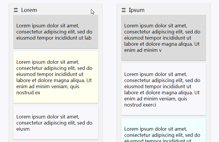
- Imitating drop-downs and drop-down menus
- Turn suggestions list into an actual suggestions table
- Work with ANY type of custom input passed (like type=button, radio and etc.)
- ... And many more things
And, as a bonus, it is very light.
Features
v-modelsupport.- Switching
v-modeltype (select/input). - Custom input element through default slot.
- Custom list items through named scoped slots.
- All HTML5-valid props for default input element are provided (
type,tabindexand etc...). - Customizable keyboard controls.
- Rich and simple API.
- CSS classes for quick and easy restyling.
- Many build variants to choose from.
- Flexible and customizable component design.
All of the props, events and slots are OPTIONAL for this component, so it can be used without any configuration at all.
New features?
If you feel that something important is missing (or found a bug) - feel free to create an issue. :)
Simple example
To use the component just install via NPM:
npm install --save vue-simple-suggest
Then, in your Vue.js component/page:
<!-- Some component.vue -->
<template>
  <vue-suggest
    v-model="chosen"
    :list="simpleSuggestionList"
    :filter-by-query="true">
<!-- Filter by input text to only show the matching results -->
  </vue-suggest>

  <br>

  <p>Chosen element: {{ chosen }}</p>
</template>

<script>
  import VueSuggest from 'vue-simple-suggest'
  import 'vue-simple-suggest/dist/styles.css' // Optional CSS

  export default {
    components: {
      VueSuggest
    },
    data() {
      return {
        chosen: ''
      }
    },
    methods: {
      simpleSuggestionList() {
        return [
          'Vue.js',
          'React.js',
          'Angular.js'
        ]
      }
    }
  }
</script>
Installation
NPM
npm install --save vue-simple-suggest
# or
yarn add vue-simple-suggest
Unpkg
If including via this method - the component will automatically install itself.
<!-- UMD Component, async/await polyfills through promises -->
<script type="text/javascript" src="https://unpkg.com/vue-simple-suggest"></script>
<script type="text/javascript" src="https://unpkg.com/[email protected]"></script>
                                                              <!-- Specific version -->

<!-- CSS -->
<link rel="stylesheet" href="https://unpkg.com/vue-simple-suggest/dist/styles.css">

<!-- If you need polyfills, use IIFE verision below -->
<!-- IIFE build includes ALL polyfills: Object.assign, Promises, Generators, Async/Await! -->
<script type="text/javascript" src="https://unpkg.com/vue-simple-suggest/dist/iife.js"></script>
Importing
/// ESNext (original code, no pollyfills, single-file .vue component, css included)
import VueSimpleSuggest from 'vue-simple-suggest/lib'
///

/// ES6 (async polyfills)
import VueSimpleSuggest from 'vue-simple-suggest'
// or, if you have problems importing:
import VueSimpleSuggest from 'vue-simple-suggest/dist/es6'
///

/// ES7 and above (no polyfills)
import VueSimpleSuggest from 'vue-simple-suggest/dist/es7'
///

/// CommonJS (async, Object.assign and promises are polyfilled)
const VueSimpleSuggest = require('vue-simple-suggest')
// or, if you have problems importing:
const VueSimpleSuggest = require('vue-simple-suggest/dist/cjs')
///

// Optional - import css separately with css loaders:
import 'vue-simple-suggest/dist/styles.css'
Usage
Globaly:
// You don't need to do it, if including via <script> (umd, iife)
Vue.component('vue-simple-suggest', VueSimpleSuggest)
In single-file .vue components:
<script>
  import VueSimpleSuggest from 'vue-simple-suggest'
  import 'vue-simple-suggest/dist/styles.css' // Using a css-loader

  export default {
    components: {
      VueSimpleSuggest
    }
  }
</script>
Build Setup
# clone the repo
git clone https://github.com/KazanExpress/vue-simple-suggest.git
cd ./vue-simple-suggest

# install dependencies
npm install

# serve example with hot reload at localhost
npm run dev

# build example & readme for static serving
npm run docs
Default Controls
New in v1.2.0
These are default keyboard shortcuts.
Can be customized with the controls prop. All fields in this controls object are optional.
Default scheme:
| Key (key code) | Description |
|---|---|
Escape (27) |
If the suggestions list is shown - hide it. Defined by hideList property. |
ArrowDown (40) |
If the suggestions list is hidden - show it. Defined by selectionDown property. |
ArrowUp (38) / ArrowDown (40) |
Cycle (hover) through suggestions. Defined by selectionUp/selectionDown properties respectfully. |
Enter (13) |
If the list is shown - chooses the highlighted element, if the list is hidden - refills the suggestions based on current input text. Defined by select property. |
(Ctrl/Shift) + Space (32) |
Select the first element in the list. Defined by autocomplete property. Works with Ctrl modifier key or Shift modifier key. |
(Ctrl/Shift) + Enter (13) |
Same as previous, but also hides the suggestions list. |
JS object:
{
  selectionUp: [38],
  selectionDown: [40],
  select: [13],
  hideList: [27],
  autocomplete: [32, 13]
}
Component API
TLDR
Click to expand
<!-- Ref to access the API, v-model for efficient query binding -->
<vue-simple-suggest ref="vueSimpleSuggest" v-model="model"
  value-attribute="id"
  display-attribute="title"
  mode="input"
  :placeholder="placeholder!!!"
  :list="getListFunction"
  :max-count="10"
  :min-length="3"
  :debounce="100"
  :destyled="false"
  :remove-list="false"
  :filter-by-query="false"
  :filter="customFilterFunction"
  :value="defaultValue"
  :controls="{
    selectionUp: [38, 33],
    selectionDown: [40, 34],
    select: [13, 36],
    hideList: [27, 35],
    autocomplete: [32, 13],
  }"
  @input="onInputEvent"
  @select="onSuggestSelect"
  @hover="onSuggestHover"
  @focus="onFocus"
  @blur="onBlur"
  @request-start="onRequestStart"
  @request-done="onRequestDone"
  @request-failed="onRequestFailed"
  @show-list="onShowList"
  @hide-list="onHideList"
>
  <!-- v-model on input itself is useless -->
  <input class="optional-custom-input">

  <!-- Appears o top of the list -->
  <template slot="misc-item-above" slot-scope="{ suggestions, query }">
    <div class="misc-item">
      <span>You're searching for {{ query }}.</span>
    </div>
    <div class="misc-item">
      <span>{{ suggestions.length }} suggestions are shown...</span>
    </div>
    <hr>
  </template>

  <div slot="suggestion-item" slot-scope="{ suggestion }" class="custom">{{ suggestion.title }}</div>

  <!-- Appears below the list -->
  <div class="misc-item" slot="misc-item-below" slot-scope="{ suggestions }" v-if="loading">
    <span>Loading...</span>
  </div>
</vue-simple-suggest>
CSS class structure
If there's a need to customize the appearance of the component, here's the internal class-structure:
// .designed is applied only if `destyled` prop is false
.vue-simple-suggest.designed.focus // .focus is applied whenever the component is focused.
  .input-wrapper
    .default-input // Replaced with your custom input if default slot is provided
  .suggestions
    .suggest-item
API definitions
Props
| Name | Type | Default | Description |
|---|---|---|---|
controls v1.2.0 |
Object | See default controls | Determines the keyboard shortcuts in key-codes (for browser-compatibility purposes). Arrays provide the ability to assign multiple keys to one action. Consists of 5 array fields: selectionUp, selectionDown, select, hideList and autocomplete, all of which are optional. |
max-suggestions |
Number | 10 |
The maximum amount of suggestions to display. Set to 0 for infinite suggestions. |
display-attribute |
String | 'title' |
The property in a suggestion object to display in a list. Supports dotted paths. |
value-attribute |
String | 'id' |
The property in a suggestion object to use as a unique key. Supports dotted paths. |
list |
Funciton or Array | () => [] |
The array provider function, must accept a query as its only argument. Can return an array or a promise. Can be async. The component behaves as a simple input without this function. |
debounce |
Number | 0 |
Determines the list debounce (a time between the input event and a function execution). |
destyled |
Boolean | false |
Whether to cancel the default styling of input and suggestions list. |
remove-list |
Boolean | false |
If true - the suggestion list will be always hidden. |
filter-by-query |
Boolean | false |
Whether to filter the resulting suggestions by input's text query (make it a search component). |
filter |
Function | - | A custom function for filtering the suggestion results. Used only if filter-by-query is set true. |
mode v1.4.0 |
String | 'input' |
The v-model event. Determines the event, that triggers v-model. Can be one of 'input' (v-model binds a displayed property) or 'select' (v-model binds a selected item). |
type, value, pattern, etc... |
All of the HTML5 input attributes with their respected default values. |
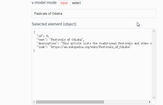
mode
New in v1.4.0
Determines the event, that triggers v-model. Can be one of 'input' (default) or 'select'.
For example, if 'input' is chosen - then v-model will update the value each time an input event is fired, setting the input's string.
Same is for 'select' - v-model changes only when something is selected from the list, setting the selected value (string, object or whatever) to its argument.
A proper use-case for it being when one wants to use the component only for selection binding and custom input for text binding:
<vue-simple-suggest v-model="selected" mode="select">
  <input v-model="text">
</vue-simple-suggest>
Emitted Events
| Name | Arguments | Description |
|---|---|---|
input |
HTML input event | An outward projection of the current input's event. |
focus |
HTML focus event | An outward projection of the current input's event. |
blur |
HTML focus event | An outward projection of the current input's event. |
select |
Selected suggestion | Fires on suggestion selection (via a mouse click or enter keypress). |
hover |
Hovered suggestion | Fires each time a new suggestion is highlighted (via a cursor movement or keyboard arrows). |
suggestion-click |
Selected suggestion, HTML click event | Fires on suggestion element click. |
show-list |
- | Fires each time the suggestion list is toggled to be shown. |
hide-list |
- | Fires each time the suggestion list is being hidden. |
request-start |
Current input value (query) | Fires each time a list function starts executing. |
request-done |
Resulting suggestions list | Fires when a list function successfully returns a result and forwards that result as an argument. |
request-failed |
The interrrupting exception | Fires if an exception occurs during the execution of a list funciton. |
Ref Methods
accessed via
$refs.*your ref name here*
| Name | Arguments | Description |
|---|---|---|
showList |
- | Shows the suggestion list. Emits the respected event. |
hideList |
- | Hides the suggestion list. Emits the respected event. |
getSuggestions |
query: string |
Gets and processes suggestions from the list prop. Returns a promise. Emits the requestStart, requestDone and requestFailed events. |
research |
- | Debounced getSuggestions on the current input value. |
clearSuggestions |
- | Clears the suggestions array. |
select |
suggestion | Selects the passed suggestion. Emits the respected event. |
hover |
suggestion | Hovers over the passed suggestion. Emits the respected event. |
displayProperty |
suggestion | Returns the displayed property of a suggestion. |
valueProperty |
suggestion | Returns the value property of a suggestion. |
Ref Event Handlers
accessed via
$refs.*your ref name here*
You can use these to imitate some of the component's behaviours.
| Name | Arguments | Description |
|---|---|---|
showSuggestions |
Alias for onInputClick. Will replace it in the future releases |
|
onInput |
HTML input event | Fires whenever the input text is changed. Emits the input event. |
onFocus |
HTML focus event | Fires whenever the input comes into focus, emits the focus event. |
onBlur |
HTML focus event | Antonym to onFocus. |
onAutocomplete |
- | Fires when the autocomplete keyboard shortcut is pressed. Selects the first suggestion. |
onListKeyUp |
HTML keyup event | Fires on component keyup. Internally used for hiding the list. |
moveSelection |
Alias for onArrowKeyDown. Will replace it in the future releases. |
Ref Data
accessed via
$refs.*your ref name here*
| Name | Default | Description |
|---|---|---|
selected |
null |
Currently selected element. |
hovered |
null |
Currently hovered element. |
suggestions |
[] |
Current suggestions list. |
listShown |
false |
Is suggestion list shown. |
inputElement |
null |
Currently used HTMLInputElement. |
canSend |
true |
Whether the assigned getListFuncion can be executed. |
timeoutInstance |
null |
The timeout until next getListFunction execution. |
text |
$props.value |
Current input text. |
slotIsComponent |
false |
Whether this current custom input is a vue-component. |
listIsRequest |
- | Whether the list prop is a function. |
input |
- | A ref to the current input (component or vanilla). |
hoveredIndex |
- | The current hovered element index. |
controlScheme |
Default Controls | The current controls scheme. |
isPlainSuggestion |
false |
Whether the current suggestions list consists of plain strings (not objects). |
isClicking |
false |
true if the user currently clicks. |
isOverList |
false |
true if the user currently hovers over suggestions list. |
isInFocus |
false |
true if the component is currently in focus. |
isTabbed |
false |
true if the user pressed tab, while the component is in focus. |
Slots
Custom input
default slot (optional)
Supports nesting. Input props can be passed to a custom input to avoid their processing by vue-simple-suggest.
Defaults to a simple input with props passed to vue-simple-suggest.
Warning: v-model on a custom input IS NOT the same as v-model on vue-simple-suggest!
<!--  Default HTMLInputElement example:  -->
<vue-simple-suggest v-model="model" placeholder="Text here" type="search" pattern="[a-z]+"/>
<!--  Vanilla HTMLInputElement example 1:  -->
<vue-simple-suggest>
  <input pattern="[a-z]+">
</vue-simple-suggest>
<!--  Vanilla HTMLInputElement example 2:  -->
<vue-simple-suggest v-model="model" placeholder="Text here" type="search">
</vue-simple-suggest>
<!--  Vanilla HTMLInputElement example 3 (fully equivalent to the second example):  -->
<vue-simple-suggest v-model="model">
  <input placeholder="Text here" type="search">
</vue-simple-suggest>
<!--  Vanilla HTMLInputElement example 4 (nested):  -->
<vue-simple-suggest>
  <div>
    <section>
      <input type="email">
    </section>
  </div>
</vue-simple-suggest>
<!--  Vue component example (also supports nesting):  -->
<vue-simple-suggest>
  <my-custom-input-somponent></my-custom-input-somponent>
</vue-simple-suggest>
Custom suggestion item
suggestion-itemslot (optional)
Description
Allows custom html-definitons of the suggestion items in a list.
Defaults to <span>{{ displayAttribute(suggestion) }}</span>
Accepts the suggestion object and a query text as a slot-scope attribute values.
<!-- Example: -->
<vue-simple-suggest>
  <div slot="suggestion-item" slot-scope="{ suggestion, query }">
    <div>{{ suggestion.title }} by {{ suggestion.author }}</div>
  </div>
</vue-simple-suggest>
Custom buttons inside of suggestion items
If you want to add some action buttons to the suggetion items, just use the .stop directive modifier to prevent the default suggestion-click:
<!-- Example: -->
<vue-simple-suggest>
  <div slot="suggestion-item" slot-scope="{ suggestion, query }">
    <span>{{ suggestion.title }} by {{ suggestion.author }}</span>
    <button @click.stop="remove(suggestion)">remove from list</button>
    <button @click.stop="like(suggestion)">add to favorites</button>
  </div>
</vue-simple-suggest>
In this case, the buttons will ONLY execute the bound method and will not select the suggested item.
Manual autocomplete
If there's a need to autocomplete the suggestion in the input instead of selecting it, you can use the autocomplete() function in the slot's scope:
<!-- Example: -->
<vue-simple-suggest>
  <div slot="suggestion-item" slot-scope="{ suggestion, autocomplete }">
    <span>{{ suggestion.title }} by {{ suggestion.author }}</span>
    <button @click.stop="autocomplete()">Complete input</button>
  </div>
</vue-simple-suggest>
Ref Data
In cooperation with ref fields this slot can be used to drastically transform the suggestion list behaviour.
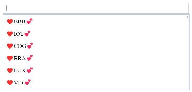
One of the simplest examples - highlighting the query text in the results:
<div slot="suggestion-item" slot-scope="scope">
  <span v-html="boldenSuggestion(scope)"></span>
</div>
boldenSuggestion({ suggestion, query }) {
  let result = this.$refs.vueSimpleSuggest.displayProperty(suggestion);

  if (!query) return result;

  const replace = str => (result = result.replace(str, str.bold()));
  const texts = query.split(/[\s-_/\\|\.]/gm).filter(t => !!t) || [''];
  const processors = [
    s => s[0].toUpperCase() + s.substr(1),
    s => s.toLowerCase(),
    s => s.toUpperCase(),
    s => s
  ];
  texts.forEach(text => processors.forEach(processor => replace(processor(text))));

  return result;
}
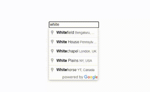
Result via Google Books search API:

Custom miscellanious item slots
misc-item-aboveandmisc-item-belowslots (optional)
Allow custom elements to be shown in suggestion list. These elements never dissapear from the list, niether can they be selected nor hovered on.
These can be used for decoration, loaders, error messages and etc.
Do not have defaults, so are not shown until defined.
Accept the suggestions array and a query text as a slot-scope attribute values.
<!-- Examples: -->
<vue-simple-suggest>
  <template slot="misc-item-above" slot-scope="{ suggestions, query }">
    <div class="misc-item">
      <span>You're searching for {{ query }}.</span>
    </div>
    <div class="misc-item">
      <span>{{ suggestions.length }} suggestions are shown...</span>
    </div>
  </template>

  <div slot="misc-item-below" slot-scope="{ suggestions }" v-if="isLoading" class="misc-item">
    <span>Loading...</span>
  </div>
</vue-simple-suggest>
These slots can also be used to handle empty results, like this:
<!-- Main slot template -->
<template slot="misc-item-above" slot-scope="{ suggestions, query }">

  <!-- Sub-template if have any suggestions -->
  <template v-if="suggestions.length > 0">
    <div class="misc-item">
      <span>You're searching for '{{ query }}'.</span>
    </div>
    <div class="misc-item">
      <span>{{ suggestions.length }} suggestions are shown...</span>
    </div>
    <hr>
  </template>

  <!-- Show "No result" otherwise, if not loading new ones -->
  <template v-else-if="!loading">
    <div class="misc-item">
      <span>No results</span>
    </div>
  </template>

</template>