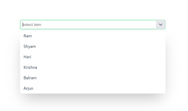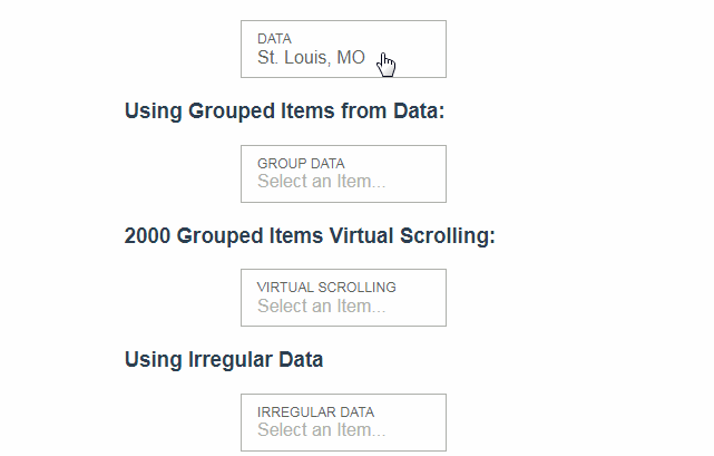
v-super-select
An accessible and customizable select/drop down component that features searching, grouping, and virtual scrolling.
Props
| Name | Description | Type | Required | Default |
|---|---|---|---|---|
| label | The label of the dropdown field. | String |
false |
- |
| name | The label of the text input. | String |
false |
- |
| value | For v-model binding to selected value. | String |
false |
- |
| items | Data items to display in the drop down. | Array |
false |
- |
| placeholder | Placeholder text to display when no value is selected. | String |
false |
'Select an Item...' |
| disabled | If true the control is disabled from user interaction |
Boolean |
false |
false |
| autocomplete | Value for autocomplete of input tag. | String |
false |
'nope' |
| groupNameField | Property of the top level item that indicates the name of the group. | String |
false |
'groupName' |
| childrenField | Property of the top level item that contains child items of a group. | String |
false |
'items' |
| valueField | Property of the item that contains its value. | String |
false |
'value' |
| textField | Property of the item that contains its text to display. | String |
false |
'text' |
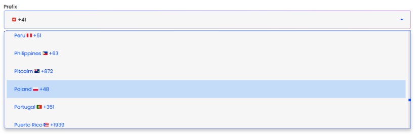
| iconUrlField | Property of the item that contains the icon url. | String |
false |
'iconUrl' |
| iconClassField | Property of the item that contains the icon class. | String |
false |
'iconClass' |
| showValue | Indicates if the value of each item should be shown on the right side of the item. | Boolean |
false |
true |
| noneFoundText | Text to display when no items are found. | String |
false |
'No Results Found' |
| itemHeight | Height in pixels of each individual item | Number |
false |
40 |
| inputHeight | Css height of the textbox container | String |
false |
'52px' |
| inputWidth | Css width of the textbox container | String |
false |
'185px' |
| dropDownMaxHeight | Css max height of dropdown. Will default to calculated bottom of textbox to bottom of window. | String |
false |
- |
| debounceTime | Amount of milliseconds to wait after inputs before search is performed. | Number |
false |
250 |
| searchFields | Additional item properties besides textField and valueField to include when searches are performed. Can be comma delimited string or array of strings. |
String | String[] |
false |
[] |
| spellcheck | Allows enabling browser spellcheck on input field. | Boolean |
false |
false |
Events
| Event Name | Description | Parameters |
|---|---|---|
| input | For v-model binding | The selected item |
| change | - | The selected item |
| selectedIndexChanged | - | The selected item index |
| opened | Fired when the dropdown is opened | - |
| closed | Fired when the dropdown is closed | - |
| keyup | Keyup event from filter input | - |
| keypress | Keypress event from filter input | - |
| keydown | Keydown event from filter input | - |
Slots
| Name | Description | Scope Variables |
|---|---|---|
| label | Use to format label | label |
| item | Use to format your list items however you like. Use item.$html to show bolded search values. |
item |
| group | Use to format your group header list items however you like. | group |
| none-found | Use to format your 'none found' item however you like. | text |
| default | Add items the old way with option tags, ex: <option value="1">Item 1</option> | - |
Methods
| Method | Description | Parameters |
|---|---|---|
| selectItem | Used to select an item. | The item to select |
| clearSelection | Clears the drop down selection. | - |
| hideDropdown | Used to hide the dropdown | - |
| showDropdown | Used to show the dropdown | - |