Tiny but powerful notification component
Tiny but powerful notification component with no dependencies.
Usage
Simply add "vs-notify.min.js" file into your project and insert one or more tags anywhere:
<vs-notify group="alert"></vs-notify>
Then you can send notifications from Javascript:
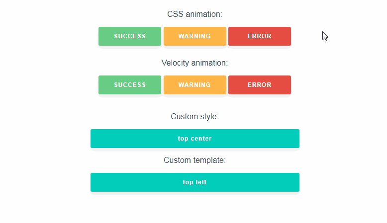
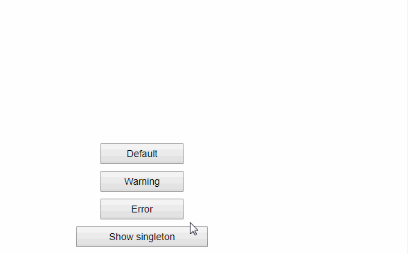
this.$notify("alert", "Hello, world!");
this.$notify("alert", "Ice caps are melting.", "warn");
You can also pass duration like this:
this.$notify("alert", "No more <b>ice cream</b>!", "error", 0);
To close all notifications in a group: this.$notify("alert");.
See 'test/index.html' for more examples.
Props
- group - name to send notifications to
- position - 'top/bottom' and 'left/right/center', for example: 'bottom left'
- duration - number of milliseconds to show the notification (0 = until user closes it)
- reverse - display notifications in reverse order
- transition - Vue transition name to use
There are several predefined transitions:
- ntf-left - slide notification from the left (default for 'left' position)
- ntf-right - slide notification from the right (default for 'right' position)
- ntf-fade - simply fade-in/fade-out notifications
- ntf-top - slide from the top
- ntf-bottom - slide from the bottom
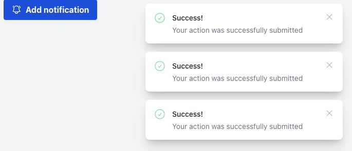
Custom notifications
You can use the slot "body" for custom notifications:
<template slot="body" scope="props">
	Look: <span class="content" v-html="props.item.text"></span>
</template>
props.close() closes the notification.
Styling
.vs-notify .ntf{ /* main notification container */ }

.vs-notify .ntf.success { }
.vs-notify .ntf.warn    { }
.vs-notify .ntf.error   { }
You can also use your own notification types:
this.$notify("alert", "Where are my keys?!", "panic");
.vs-notify .panic{ color: red; }