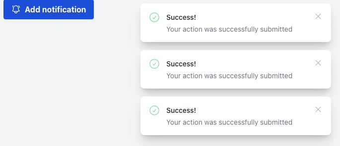
cxlt-vue2-toastr
cxlt-vue2-toastr is a non-blocking notifications for Vue2 ,Based on toastr stylings and design together with animate.css animation effects.
Setup
Using npm
npm install cxlt-vue2-toastr --save
Or using yarn
yarn add cxlt-vue2-toastr
Usage
Import Component
import CxltToastr from 'cxlt-vue2-toastr'

Vue.use(CxltToastr)
Optional Global configuration options
var toastrConfigs = {
    position: 'top right',
    showDuration: 2000
}
Vue.use(CxltToastr, toastrConfigs)
You can use All options mentioned in below options table except color option, instead, you should use below additional four color options in global configuration.
| Option | Type | Description |
|---|---|---|
| successColor | String | background color for success notificatoin |
| infoColor | String | background color for info notificatoin |
| warningColor | String | background color for warning notificatoin |
| errorColor | String | background color for error notificatoin |
Please note: if you pass color option in your notification instance, it will override above global color options.
Import styling files
import 'cxlt-vue2-toastr/dist/css/cxlt-vue2-toastr.css'
Or use it in .vue with style tag
<style src="cxlt-vue2-toastr/dist/css/cxlt-vue2-toastr.css"></style>
Call Notification Instance
this.$toast.success({
    title:'',
    message:''
})
cxlt-vue2-toastr support below functions
| functions |
|---|
| success |
| info |
| warn |
| error |
| removeAll |
You need to pass an option object which can have below values, used for controlling title, content, position etc.
options
| Option | Type | Description |
|---|---|---|
| title | String | Title for notification |
| message | String | Content for notification |
| closeButton | Boolean | Need close button or not, default as false |
| progressBar | Boolean | default as false |
| type | String | Type for notification,default as success |
| position | String | Position for notification,default as top right |
| icon | String | Custom Icon |
| showMethod | String | Animation class name for shown,default as fadeIn |
| hideMethod | String | Animation class name for hide,default as fadeOut |
| showDuration | Number | Duration of show animation,unit as ms,default as 1000 |
| hideDuration | Number | Duration of hide animation,unit as ms,default as 1000 |
| delay | Number | Delay of animation,unit as ms,default as 0, means no delay |
| timeOut | Number | Duration of notification displaying,Unit as ms,default as 1500 |
| color | String | background color of notification |
type
successinfowarningerror
position
top rightbottom rightbottom lefttop lefttop centerbottom centertop full widthbottom full width
icon
Any valid image url.
showMethod
bounceflashpulserubberBandshakeheadShakeswingtadawobblejellobounceInbounceInDownbounceInLeftbounceInRightbounceInUpfadeInfadeInDownfadeInDownBigfadeInLeftfadeInLeftBigfadeInRightfadeInRightBigfadeInUpfadeInUpBigflipInXflipInYlightSpeedInlightSpeedOutrotateInrotateInDownLeftrotateInDownRightrotateInUpLeftrotateInUpRighthingerollInzoomInzoomInDownzoomInLeftzoomInRightzoomInUpslideInDownslideInLeftslideInRightslideInUp
hideMethod
bounceflashpulserubberBandshakeheadShakeswingtadawobblejellobounceOutbounceOutDownbounceOutLeftbounceOutRightbounceOutUpfadeOutfadeOutDownfadeOutDownBigfadeOutLeftfadeOutLeftBigfadeOutRightfadeOutRightBigfadeOutUpfadeOutUpBigflipOutXflipOutYrotateOutrotateOutDownLeftrotateOutDownRightrotateOutUpLeftrotateOutUpRightrollOutzoomOutzoomOutDownzoomOutLeftzoomOutRightzoomOutUpslideOutDownslideOutLeftslideOutRightslideOutUp
Run this project
fork the repository,then follow below commands
git clone xxx
cd cxlt-vue2-toastr
yarn
npm run dev