Vue 3 Datepicker
A datepicker Vue component. Compatible with Vue 3 Only
To view demo examples locally clone the repo and run npm install && npm run dev
Install
npm install vuejs3-datepicker --save

yarn add vuejs3-datepicker
import Datepicker from 'vuejs3-datepicker';

export default {
  // ...
  components: {
    Datepicker
  }
  // ...
}
Usage
<datepicker></datepicker>
value prop if passed should be a Date object
<script>
var state = {
  date: new Date(2016, 9,  16)
}
</script>
<datepicker :value="state.date"></datepicker>
support name attribute for normal html form submission
<datepicker :value="state.date" name="uniquename"></datepicker>
Using v-model
<datepicker v-model="state.date" name="uniquename"></datepicker>
Emits events
<datepicker @selected="parentfunctionSelectedhandler" @opened="datepickerOpenedFunction" @closed="parentfunctionCloseHandler">
Inline always open version
<datepicker :inline="true"></datepicker>
Programtic Acess of value of datepicker
<datepicker ref="inputRef" @selected="handleSelectDate" :disabled-dates="disabledDates" :highlighted="highlightDates" :value="date" @closed="handleCalendarClose" ></datepicker>
const { selectedDate } = (inputRef.value as any).value;
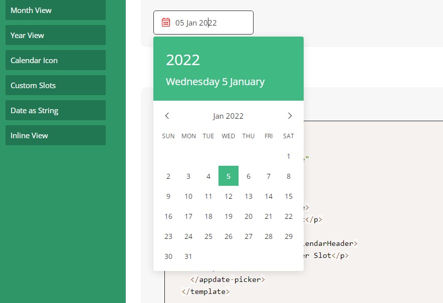
icon color, icon height, icon width of calendar
<datepicker :icon-color="color" :icon-width="width" :icon-height="height" ></datepicker>
Available props
| Prop | Type | Default | Description |
|---|---|---|---|
| modelValue | Date|String | Date value of the datepicker via v-model | |
| value | Date|String | Date value of the datepicker | |
| format | String|Function | dd MMM yyyy | Date formatting string or function |
| full-month-name | Boolean | false | To show the full month name |
| disabled-dates | Object | See below for configuration | |
| placeholder | String | Input placeholder text | |
| inline | Boolean | To show the datepicker always open | |
| calendar-class | String|Object | CSS class applied to the calendar el | |
| input-class | String|Object | CSS class applied to the input el | |
| wrapper-class | String|Object | CSS class applied to the outer div | |
| monday-first | Boolean | false | To start the week on Monday |
| clear-button | Boolean | false | Show an icon for clearing the date |
| clear-button-icon | String | Use icon for button (ex: fa fa-times) | |
| calendar-button | Boolean | false | Show an icon that that can be clicked |
| calendar-button-icon | String | Use icon for button (ex: fa fa-calendar) | |
| calendar-button-icon-content | String | Use for material-icons (ex: event) | |
| day-cell-content | Function | Use to render custom content in day cell | |
| initial-view | String | minimumView | If set, open on that view |
| disabled | Boolean | false | If true, disable Datepicker on screen |
| typeable | Boolean | false | If true, allow the user to type the date |
| use-utc | Boolean | false | use UTC for time calculations |
| open-date | Date|String | If set, open on that date | |
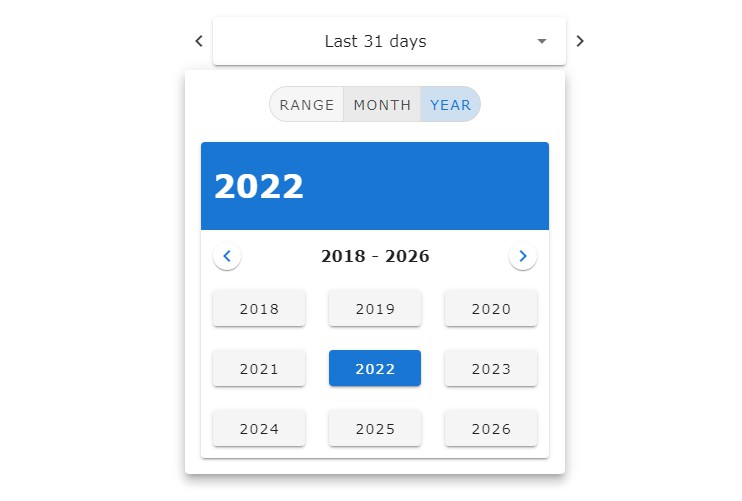
| minimum-view | String | 'day' | If set, lower-level views won't show |
| maximum-view | String | 'year' | If set, higher-level views won't show |
| preventDisableDateSelection | Boolean | true | will prevent selection of disabled date |
| iconColor | String | black | will change calendar icon color |
| iconWidth | String | Number | 16 |
| iconHeight | String | Number | 16 |
Events
These events are emitted on actions in the datepicker
| Event | Output | Description |
|---|---|---|
| opened | The picker is opened | |
| closed | The picker is closed | |
| selected | Date|null | A date has been selected |
| input | Date|null | Input value has been modified |
| cleared | Selected date has been cleared | |
| changed-month | Object | Month page has been changed |
| changed-year | Object | Year page has been changed |
| changed-decade | Object | Decade page has been changed |
Disabled Dates
Dates can be disabled in a number of ways.
<script>
var state = {
  disabledDates: {
    to: new Date(2016, 0, 5), // Disable all dates up to specific date
    from: new Date(2016, 0, 26), // Disable all dates after specific date

    dates: [ // Disable an array of dates
      new Date(2016, 9, 16),
      new Date(2016, 9, 17),
      new Date(2016, 9, 18)
    ],
    preventDisableDateSelection: true
  }
}
</script>

<datepicker :disabled-dates="state.disabledDates" :prevent-disable-date-selection="preventDisableDateSelection"></datepicker>
Highlighted Dates
<script>
var state = {
  highlighted: {
    to: new Date(2016, 0, 5), // Highlight all dates up to specific date
    from: new Date(2016, 0, 26), // Highlight all dates after specific date
    dates: [ // Highlight an array of dates
      new Date(2016, 9, 16),
      new Date(2016, 9, 17),
      new Date(2016, 9, 18)
    ]
    },
    includeDisabled: true // Highlight disabled dates
  }
}
</script>
<datepicker :highlighted="state.highlighted"></datepicker>
Add new Locale
new Locale can be added to the following file /src/components/datepicker/locale/index.ts

create a function with new Locale name & export that from data object at the bottom

e.g

const newLocale = (): any => {
  const langName = 'Hindi';
  const monthFullName = [
    'जनवरी',
    'फ़रवरी',
    'मार्च',
    'अप्रैल',
    'मई',
    'जून',
    'जुलाई',
    'अगस्त',
    'सितंबर',
    'अक्टूबर',
    'नवंबर',
    'दिसंबर',
  ];
  const shortName = ['जन', 'फ़र', 'मार्च', 'अप्रै', 'मई', 'जून', 'जुला', 'अगस्त', 'सितं', 'अक्टू', 'नवं', 'दिसं'];
  const days = ['रवि', 'सोम', 'मंगल', 'बुध', 'गुरु', 'शुक्र', 'शनि'];
  const daysNames = ['रविवार', 'सोमवार', 'मंगलवार', 'बुधवार', 'गुरुवार', 'शुक्रवार', 'शनिवार'];
  const rtl = false;
  const ymd = false;
  const yearSuffix = '';
  return {
    months: monthFullName,
    monthsAbbr: shortName,
    days,
    language: langName,
    yearSuffix,
    ymd,
    rtl,
    langName,
    daysNames,
  };
};

export const data = {
  af: af(),
  hi: hi(),
  de: de(),
  en: en(),
  fr: fr(),
  nl: nl()
  ...
  newLocale: newLocale()
};
Contributors: