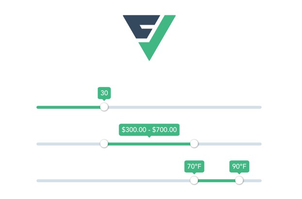
Vue 3 Slider
Vue 3 slider component with multihandles, tooltips merging and formatting.
Slider features
- Vue 2 & 3 support
- 100% coverage
- ESM support
- Fully configurable
- Single slider
- Multiple sliders
- Tooltips
- Formatting
Installation
npm install @vueform/slider
Usage with Vue 3
<template>
  <div>
    <Slider v-model="value" />
  </div>
</template>

<script>
  import Slider from '@vueform/slider'

  export default {
    components: {
      Slider,
    },
    data() {
      return {
        value: 20
      }
    }
  }
</script>

<style src="@vueform/slider/themes/default.css"></style>
Using with Vue 2
When using Vue 2 install @vue/composition-api via npm/yarn first:
npm i @vue/composition-api --save-dev
Then install the plugin for Vue:
import Vue from 'vue'
import VueCompositionAPI from '@vue/composition-api'

Vue.use(VueCompositionAPI)
After that make sure to change the imported Slider module to:
import Slider from '@vueform/slider/dist/slider.vue2.js'
Using with Nuxt.js
First you need install @nuxtjs/composition-api:
npm i @nuxtjs/composition-api --save-dev
Then you need to enable it as a module in nuxt.config.js:
{
  buildModules: [
    '@nuxtjs/composition-api'
  ]
}
After that make sure to change the imported module to Vue 2 version of Slider, as Nuxt.js still depends on that:
import Slider from '@vueform/slider/dist/slider.vue2.js'
Support
Join our Discord channel or open an issue.
Basic props
| Name | Type | Default | Description |
|---|---|---|---|
| id | string |
slider |
The id attribute of slider container DOM. |
| disabled | boolean |
false |
Whether the slider should be disabled. |
| min | number |
0 |
Minimum value of the slider. |
| max | number |
100 |
Maximum value of the slider. |
| step | number |
1 |
The jump between intervals. If -1 it enables fractions (eg. 1.23). |
| tooltips | boolean |
true |
Whether tooltips should show above handlers. |
| merge | number |
-1 |
The step distance between two handles when their tooltips should be merged (when step is -1 then 1 is assumed). Eg: { merge: 5, step: 10 } -> values: 0, <=50 will merge -> values: 0, 60 will not merge { merge: 5, step: -1 } -> values: 0, <=5 will merge -> values: 0, 5.01 will not merge |
| format | object\|function |
Formats the tooltip. It can be either a function that receives a value param and expects a string or number as return or an object with the following properties: prefix - eg $ -> $100 suffix - eg USD -> 100USD decimals - eg 2 -> 100.00 thousand - eg , - 1,000 |
|
| orientation | string |
'horizontal' |
The orientation of the slider. Possible values: horizontal|vertical |
| height | string |
'300px' |
The height of the slider when orientation is vertical. Can have any valid CSS measure suffix. |
| direction | string |
'ltr' |
The direction of the slider. By default value increases left-to-right and top-to-bottom, which is reversed when using rtl. Possible values: ltr|rtl |
Events
| Event | Attributes | Description |
|---|---|---|
| @change | value |
Emitted when dragging the slider is finished or it's value changed by clicking, keyboard or programmatical set. |
| @update | value |
Emitted in the same scenarios as changed, but also when the slider is being dragged. |
Examples
Single slider
<template>
  <Slider
    v-model="value"
  />
</template>

<script>
  import Slider from '@vueform/slider'

  export default {
    components: { Slider },
    data: () => ({
      value: 20
    })
  }
</script>
Multiple slider
<template>
  <Slider
    v-model="value"
  />
</template>

<script>
  import Slider from '@vueform/slider'

  export default {
    components: { Slider },
    data: () => ({
      value: [20, 40]
    })
  }
</script>
Tooltip formatting
<template>
  <Slider
    v-model="value"
    :format="format"
  />
</template>

<script>
  import Slider from '@vueform/slider'

  export default {
    components: { Slider },
    data: () => ({
      value: 20,
      format: function (value) {
        return `€${value}`
      }
    })
  }
</script>
Tooltip merging
<template>
  <Slider
    v-model="value"
    :merge="merge"
    :format="format"
  />
</template>

<script>
  import Slider from '@vueform/slider'

  export default {
    components: { Slider },
    data: () => ({
      value: [20, 30, 40],
      merge: 10,
      format: {
        prefix: '$',
        decimals: 2
      }
    })
  }
</script>
Vertical slider
<template>
  <Slider
    v-model="value"
  />
</template>

<script>
  import Slider from '@vueform/slider'

  export default {
    components: { Slider },
    data: () => ({
      value: 50,
      orientation: 'vertical',
      direction: 'rtl'
    })
  }
</script>